A BALANCED PERSPECTIVE FOR
CHOOSING A NEW WORKPLACE
‘If I go, there will be trouble, and if I stay there will be double.’ Although the lead singer of the Clash (Mick Jones) may not have been focused on real estate strategy at the time, the question remains one of the biggest conundrums companies must face as their workplace needs evolve… “should I stay or should I go now?”
As we navigate the turbulence of today’s economic uncertainty, companies struggle more than ever with how their workplace will need to look and function to attract and retain talent. With Hybrid work firmly planted among the corporate set, we are continuously reminded that the world’s workforce has developed a more voracious appetite for choice in how, when, and where they work. Paired with the daunting prospect of endlessly escalating construction costs and never-ending supply chain woes, the decision of whether a company should renew a lease and stay in their existing building, or venture out and secure new space elsewhere, has become much more complex.
Historically when making the decision, executives have often made the leap without a full understanding of the pros and cons of each scenario. In the following article, we explore some key considerations to help inform this decision, along with perspectives from leading experts in the fields of real estate brokerage, project management, interior design, and construction.
“As Interior Designers, we often find these decisions are driven largely by very quantitative measures, and more qualitative considerations such as the impact on corporate culture and brand opportunity are often overlooked.”
/ Eric Yorath, Principal, Figure3
Budget and Timing
In the current market where owners of office real estate are making significant efforts to keep their buildings occupied and protect the perceived asset value, tenants are seeing significant inducements from landlords to encourage their decision to stay.
Financial considerations are crucial in decision-making and each scenario has its pros and cons. Opting to renew a lease and undertake in-place renovations allows for the spreading of modification costs over an extended period, offering increased flexibility.
However, if significant modifications are needed to meet evolving company needs, costs may be substantial, spanning multiple construction phases and staff shuffling. Despite this, the advantage lies in the ability to spread these costs over a longer duration, providing the tenant with a level of choice and flexibility, unlike the quicker realization of construction costs in a typical relocation scenario.
Keen on retaining valued tenants, landlords may sweeten the deal with enticing incentives, ranging from free rent to substantial building upgrades. This includes offerings such as rent-free periods or the flexibility to relinquish space at specific lease intervals. Another emerging strategy involves landlords enhancing the tenant experience through significant building upgrades, introducing new amenities like conference facilities, food services, and outdoor patios. This trend is notably influenced by the introduction of premium office towers in the market.
“In today’s market, we are seeing a higher percentage of firms opting to renew leases and remain in place because their existing landlords have been so aggressive in their efforts to keep tenants in their buildings.”
/ Katya Shabanova, SVP of Office Leasing, Cushman & Wakefield
On the flip side, a pro of relocation includes potential cost absorption by landlords in returning a space to its base building condition to provide tenants a blank slate, or even aligning a new design with tenant needs. Negotiating terms, such as the positioning of building fixtures, becomes a strategic play on behalf of the tenant, in the cost-saving game.
Constructability and Logistical Challenges
From a practical perspective, it’s often the ‘better the devil you know’. In the stay-in-place scenario, a tenant often has the advantage of knowing the building as well as the landlord. The value of these relationships should not be underestimated.
When relocating to another existing building, unless the new landlord is providing the space in restored base building condition, the tenant may find they are inheriting all sorts of hidden surprises (ie: abandoned systems or material in the ceiling space). In contrast, if moving to a brand-new building where the tenant is essentially the first occupant, they may find themselves paying for a number of things not already in place.
“The first tenant in on a new build is often bearing the brunt of infrastructure costs like electrical and hvac; this is where a professional can help paint a clear picture on a case-by-case basis.”
/ Nathan Naka, Partner, Director Project Management, mform Construction Group
Another consideration for moving to a new building, especially a new building under construction, is access to the space during construction. Nothing will slow down the efficiency and timing of construction like restrictions to a loading dock or freight elevator. If a tenant finds themselves starting construction in tandem with other tenants in the building, there may be challenges to gaining access to freight elevators and/or loading docks.
In contrast, during a renovation in place, logistical considerations are needed for staff during the construction period, often emphasizing the need for swing space. Swing space can make the difference between a long and painful renovation and a more time-efficient project; something to be considered early on in lease negotiations.
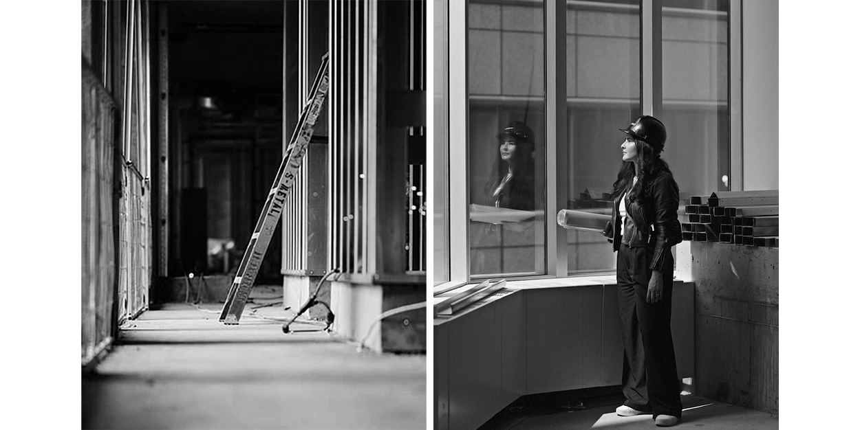
One key consideration in any scenario is to engage your project team sooner than later. Having input from a general contractor, project manager, and designer on the pros and cons can go a long way in mitigating risks, costs, and headaches later on.
“Hiring a seasoned and professional team is crucial for navigating the complexities of office renovation or relocation. With their expertise, they can swiftly uncover key considerations and potential challenges, mitigating risks and averting potential issues.”
/ Steven Demers, Senior Director, PM, CBRE

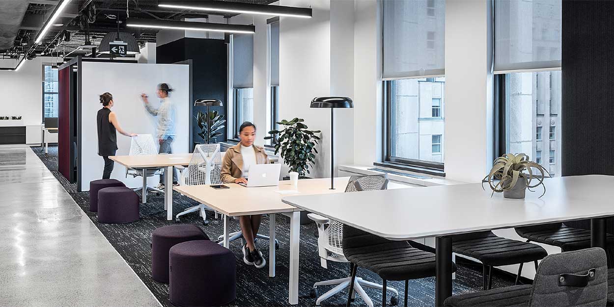
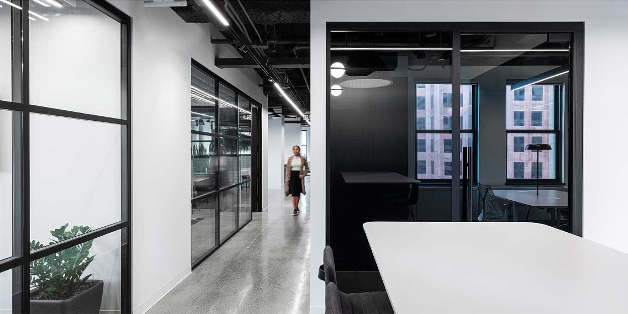
Impact on Culture
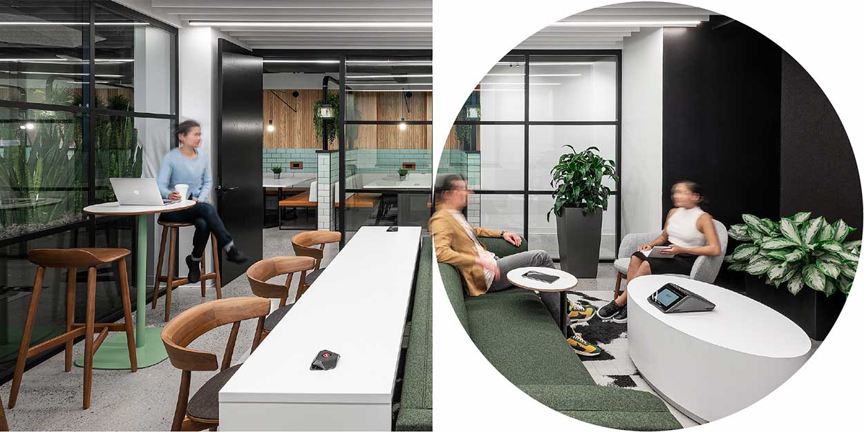
The human element often takes a back seat in the decision-making process, but the impact of an office renovation or relocation on a company’s staff and corporate culture should be a key consideration. Swing spaces emerge as a vital remedy, improving productivity and morale during the disruptive period, and potentially turning the disruptions into opportunities for piloting new workplace models and boosting staff enthusiasm.
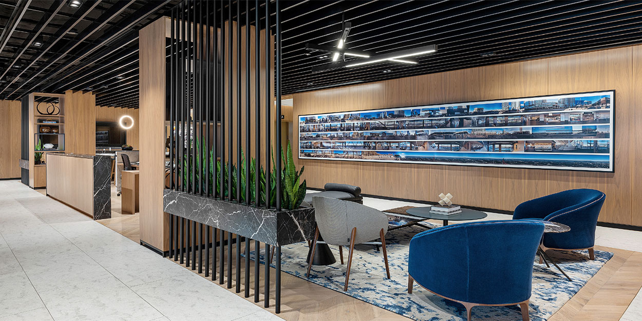
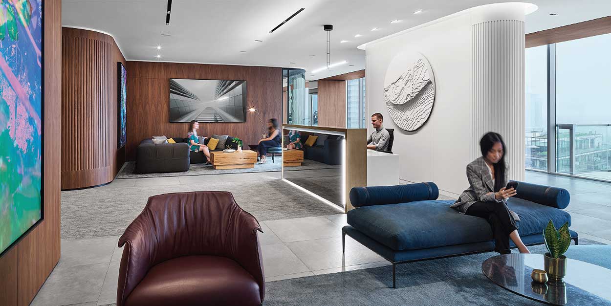
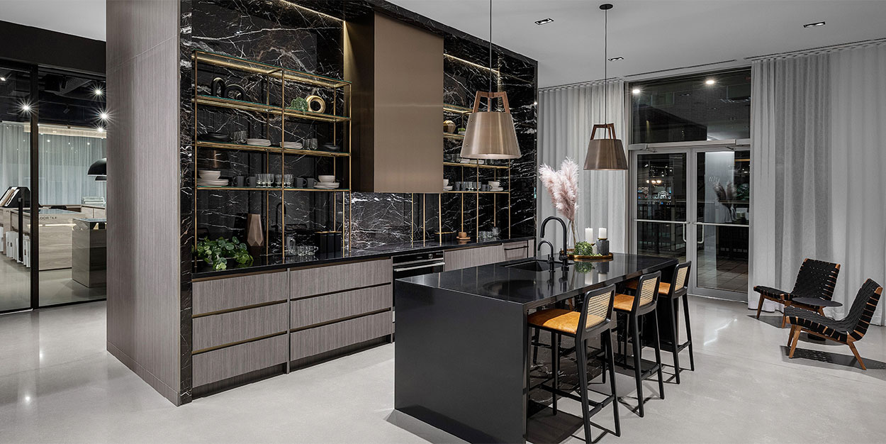
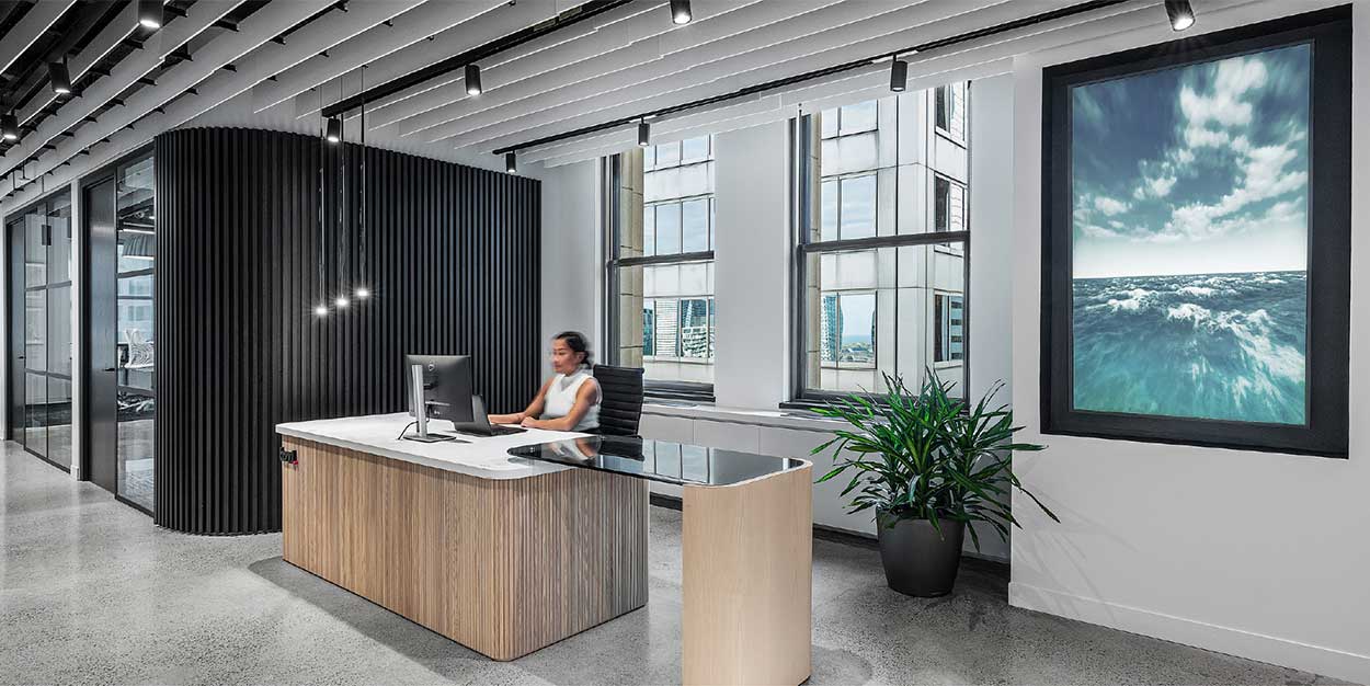
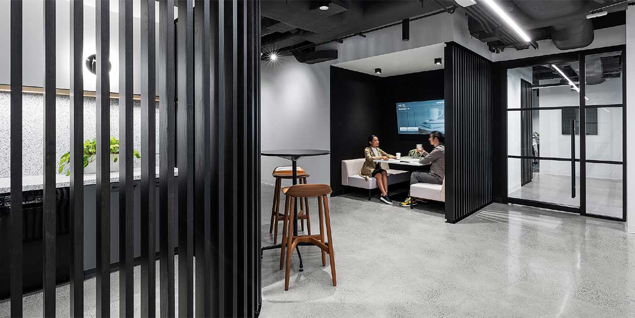
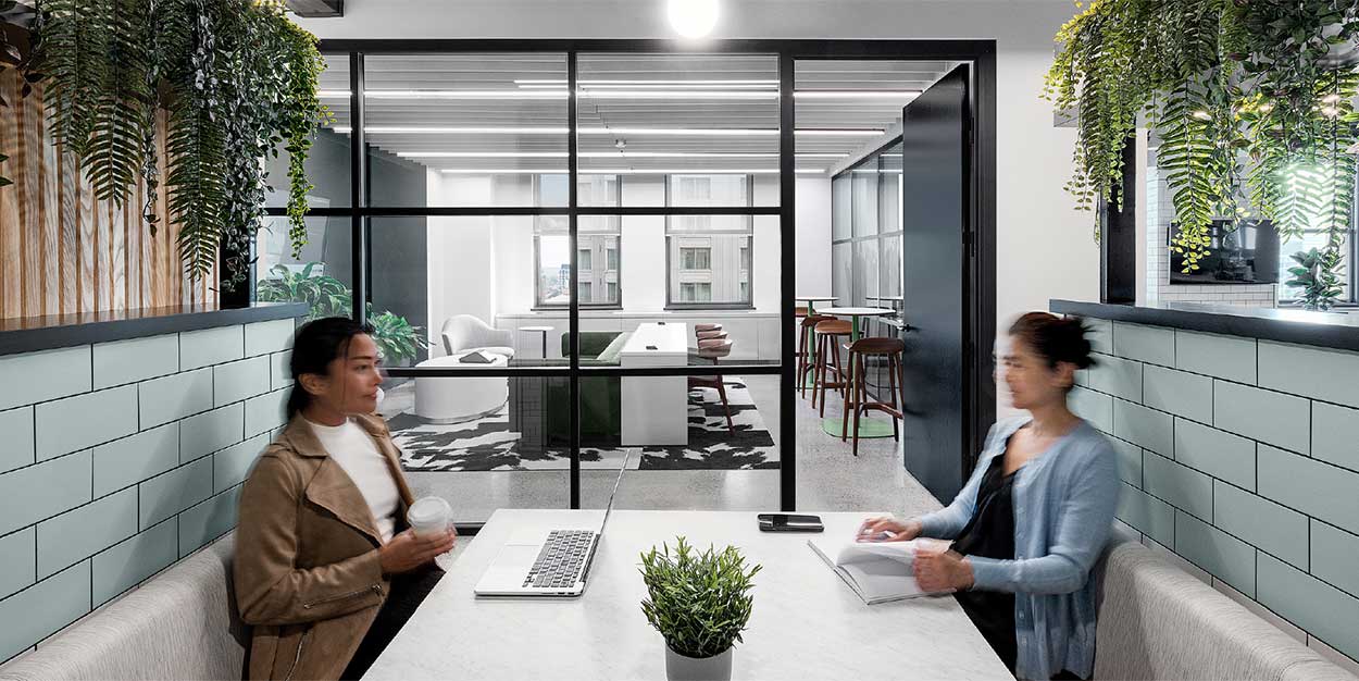
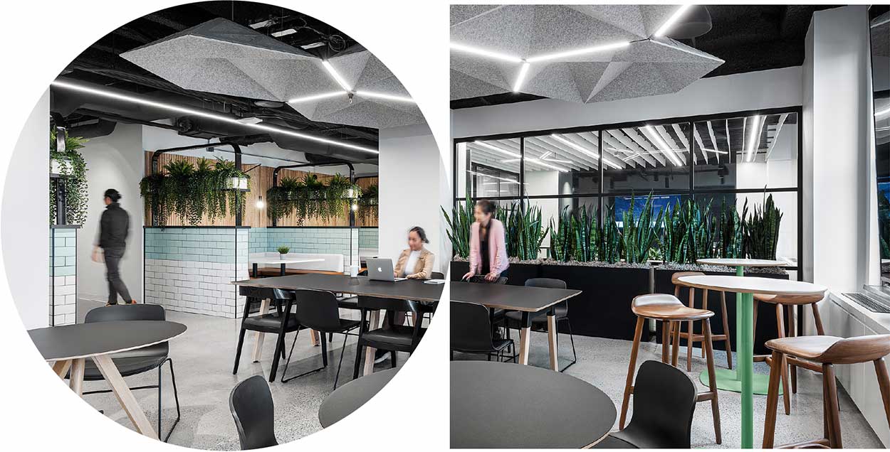
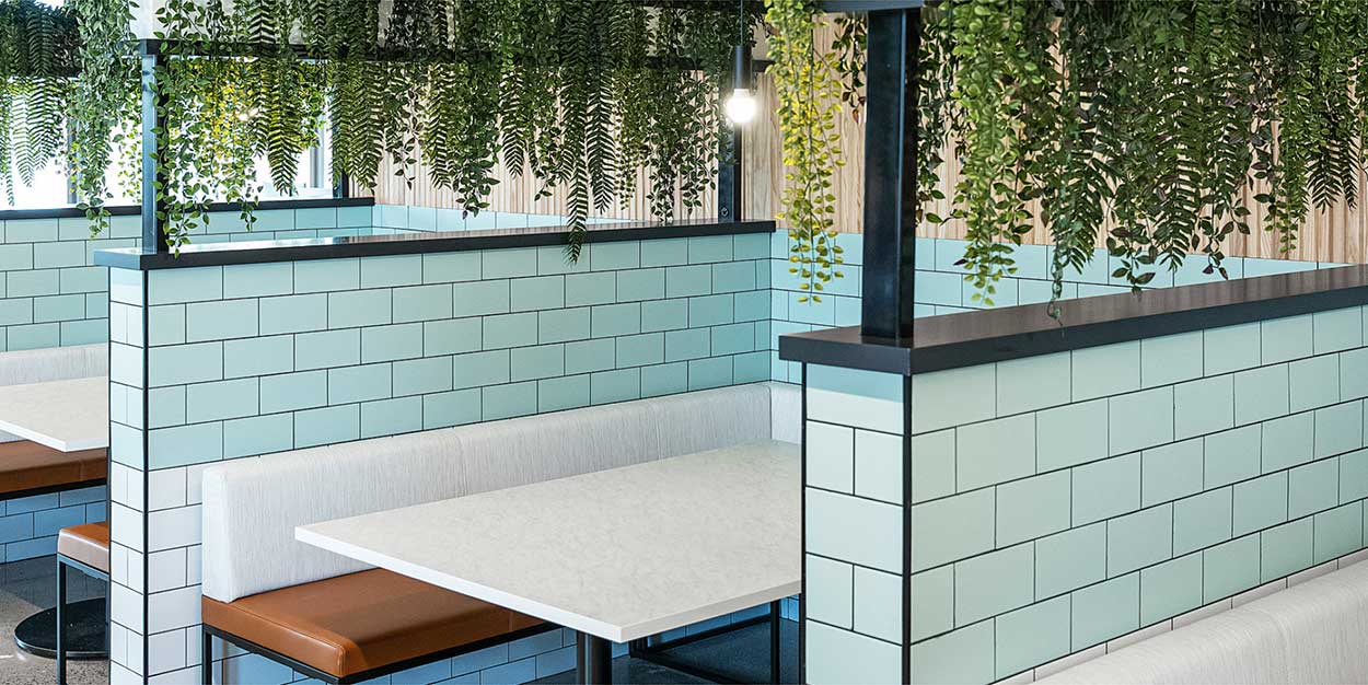
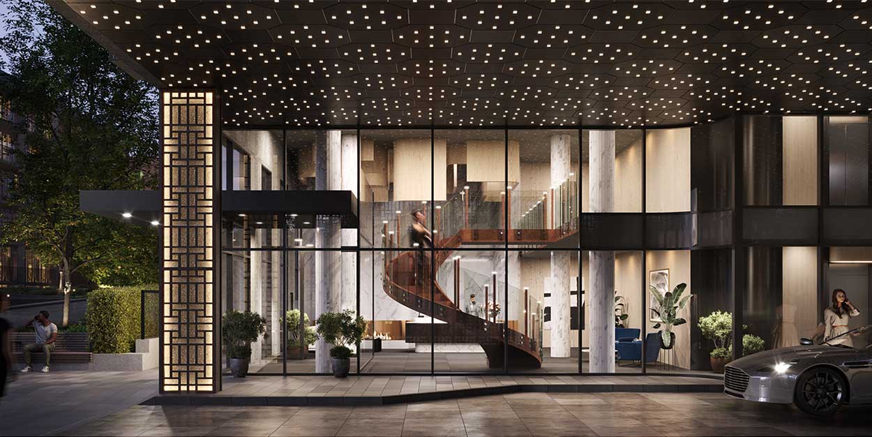
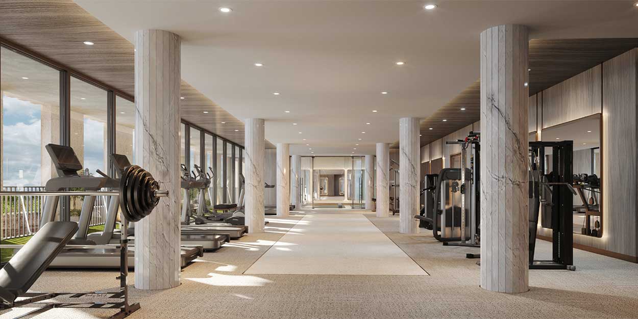
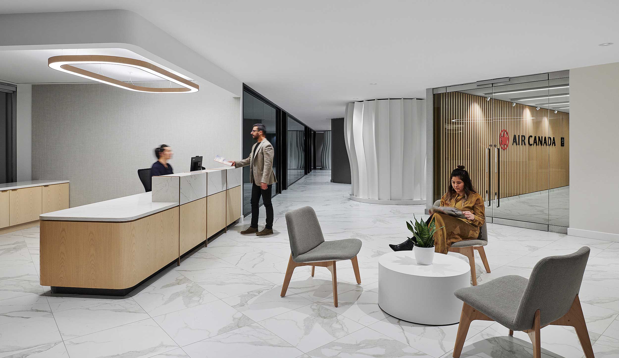
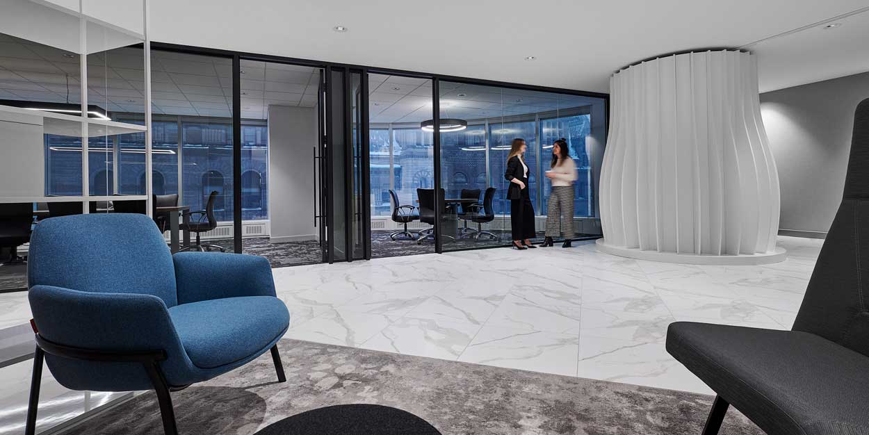
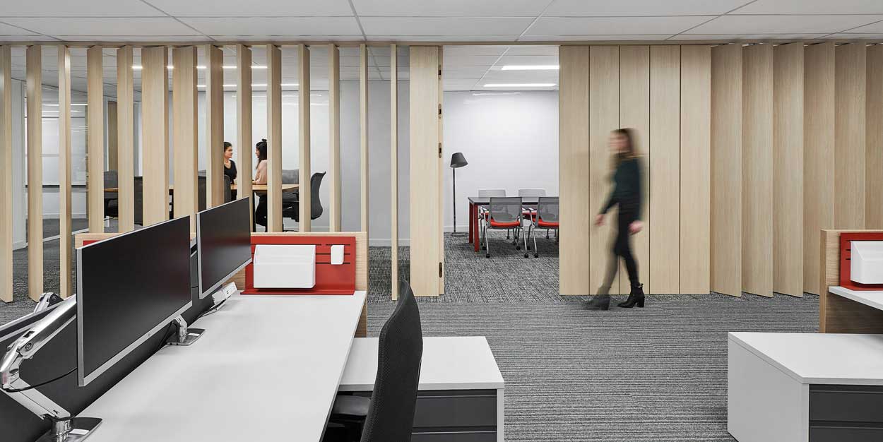
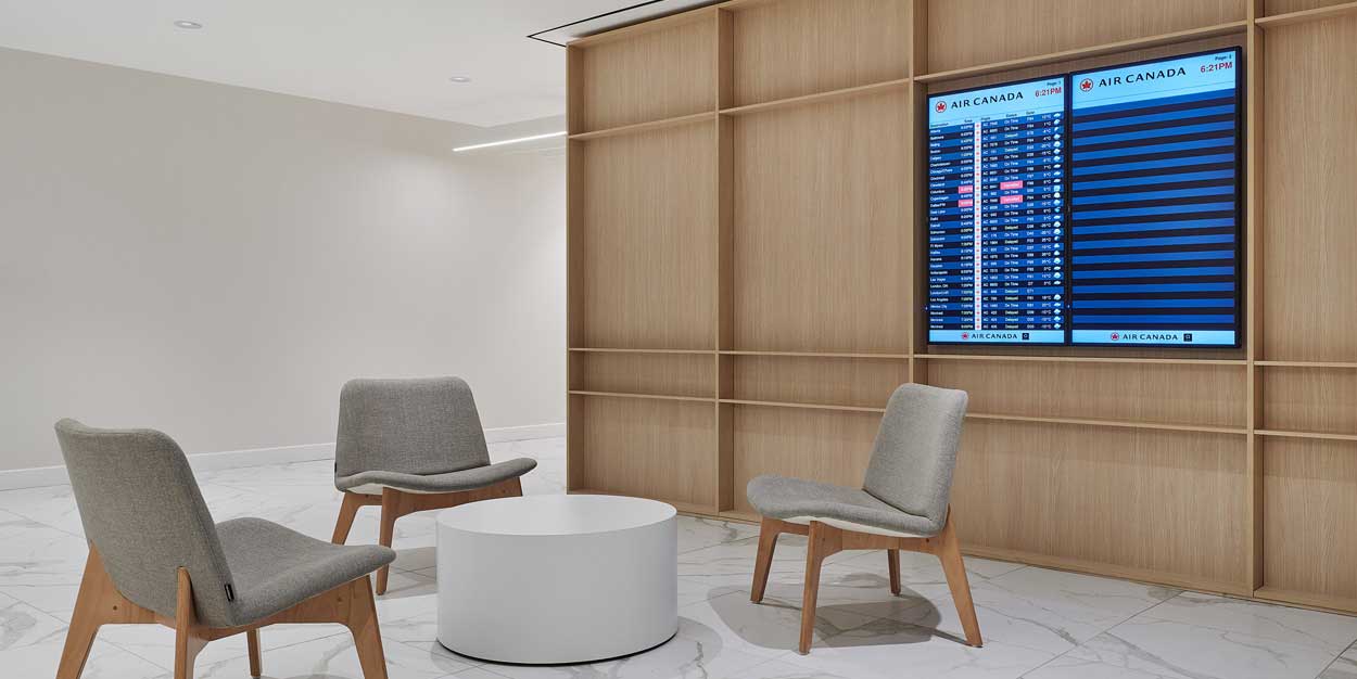
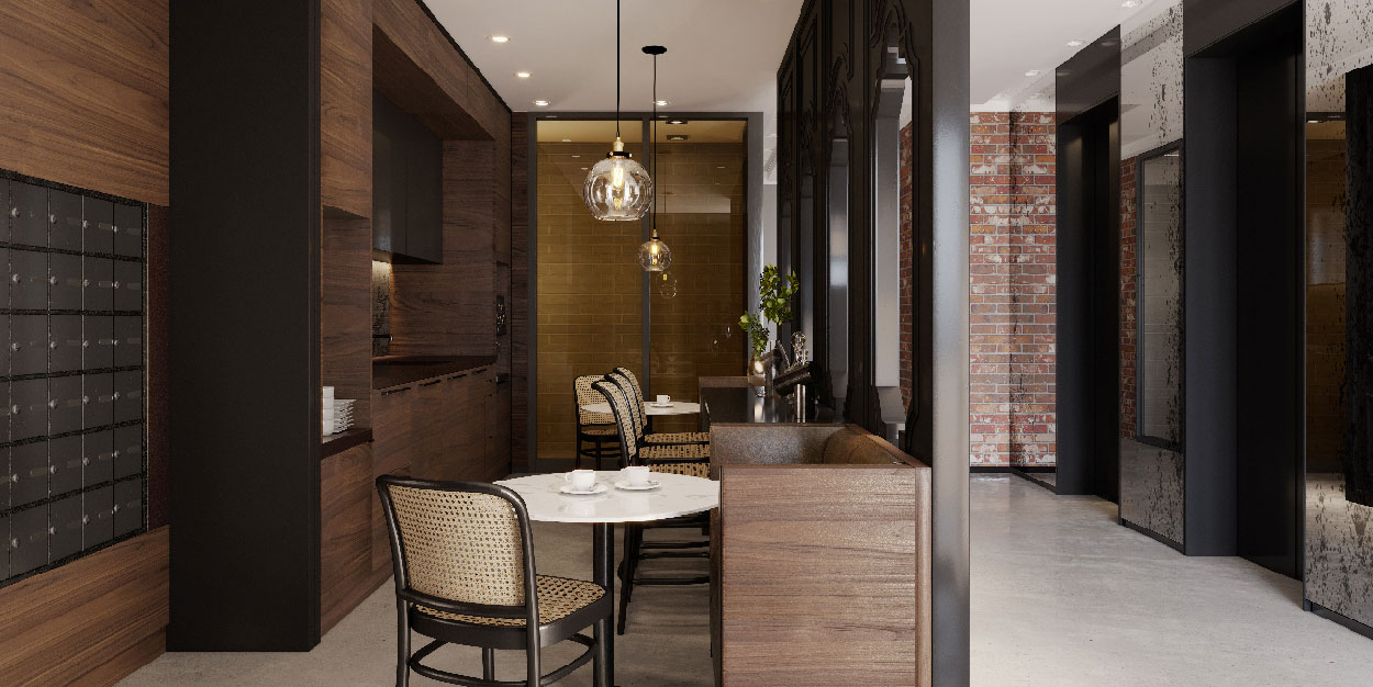
Whether you choose to move to a new location, or stay in place, a revitalized office environment provides a significant opportunity from a branding and culture perspective. Consider a grand reveal to activate your clients and the community and further boost staff morale and pride of place.
“At the end of the day the client is looking for something that is unique to their corporate culture and branding. It’s about creating an ownable design, one that the client can say is truly authentic to themselves.”
/ Suzanne Wilkinson, Principal, Figure3
Navigate the Complexities with Interior Design
When approaching this complex decision, an interior design team emerges as a critical player by offering an experienced perspective and valuable feedback based on your unique programming needs. They possess the ability to uncover cost savings by identifying the benefits and features of each space, ultimately saving money, identifying potential opportunities and otherwise costly risks.
The design team can conduct feasibility plan studies that visually showcase the impact of the various real estate scenarios. This collaboration helps understand the pros, cons, and costs of each option, while providing a non-biased third-party perspective and potential negotiation points with the landlord. In identifying these quantitative measures, and often overlooked qualitative considerations such as the impact on corporate culture and brand
opportunity, interior designers offer a specialized skillset in navigating the complexities and ensuring a balanced perspective for companies facing the dilemma of staying or going.
Key Takeaways and Advice from the Experts:
• Katya Shabanova: Time is your ally in this market. If you can avoid rushing decisions, focus on flexibility and what’s best for you.
• Steven Demers: Perspective is critical to make the most informed decision. It is important to bring your project team together sooner than later to gain this perspective.
• Nathan Naka: Consider the impact a multi-phased renovation-in-place project will have on your corporate culture and productivity.
• Suzanne Wilkinson: Every physical space provides a unique opportunity to tell your business’ story. It is critical to have a sound understanding of your vision from the start.