Inspiration / Thompson Dorfman Sweatman

PUTTING THE SPOTLIGHT ON
MANITOBA’S NATURAL BEAUTY
IN A WINNIPEG LAW OFFICE

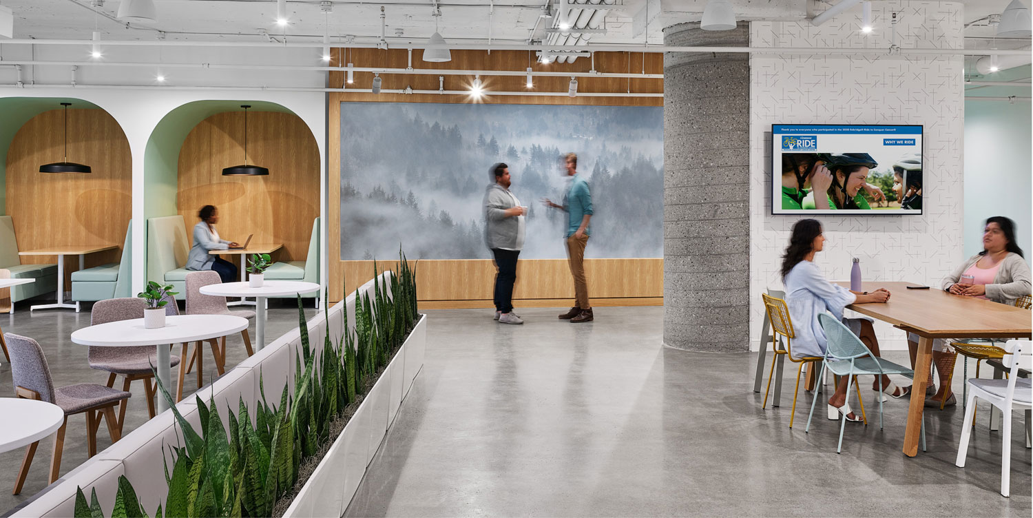
How does design shape behaviour at work? Especially in the formal confines of a law firm,
home to large libraries swathed in dark woods — and conservative values. The communal
quarters (replete with saggy sofas and vending machines) are small, dark spaces.

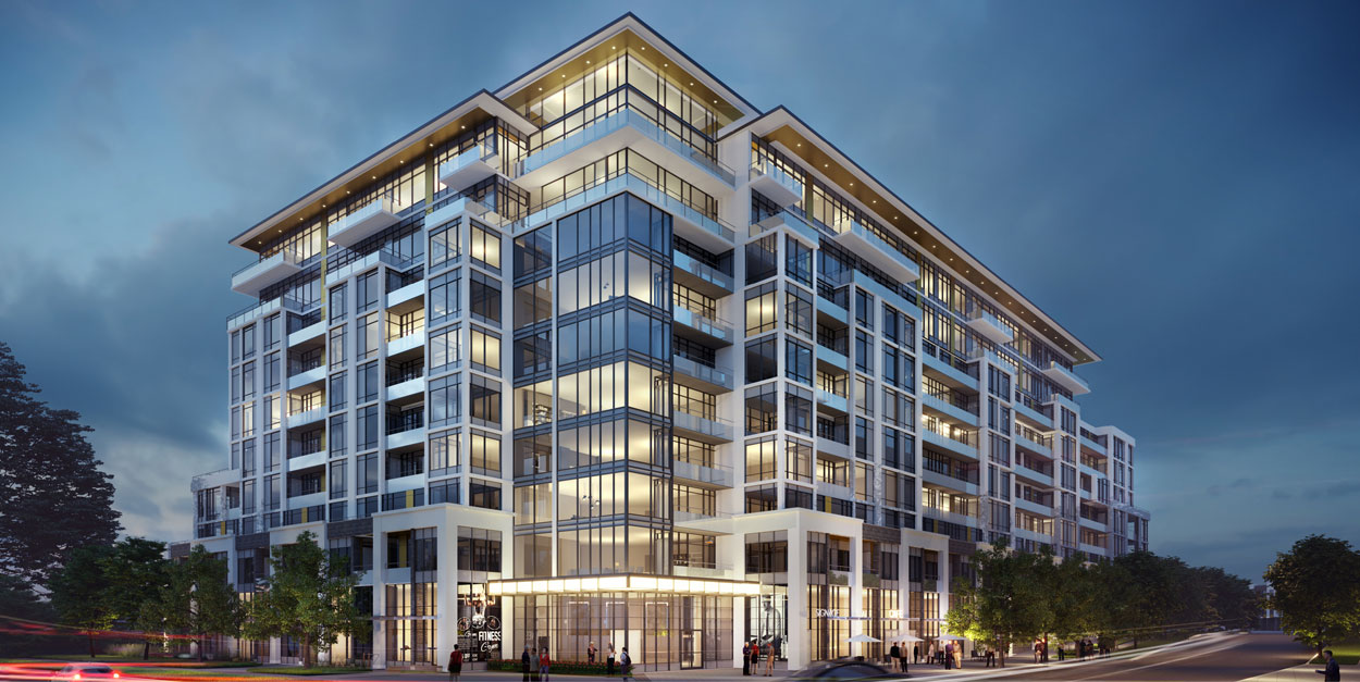
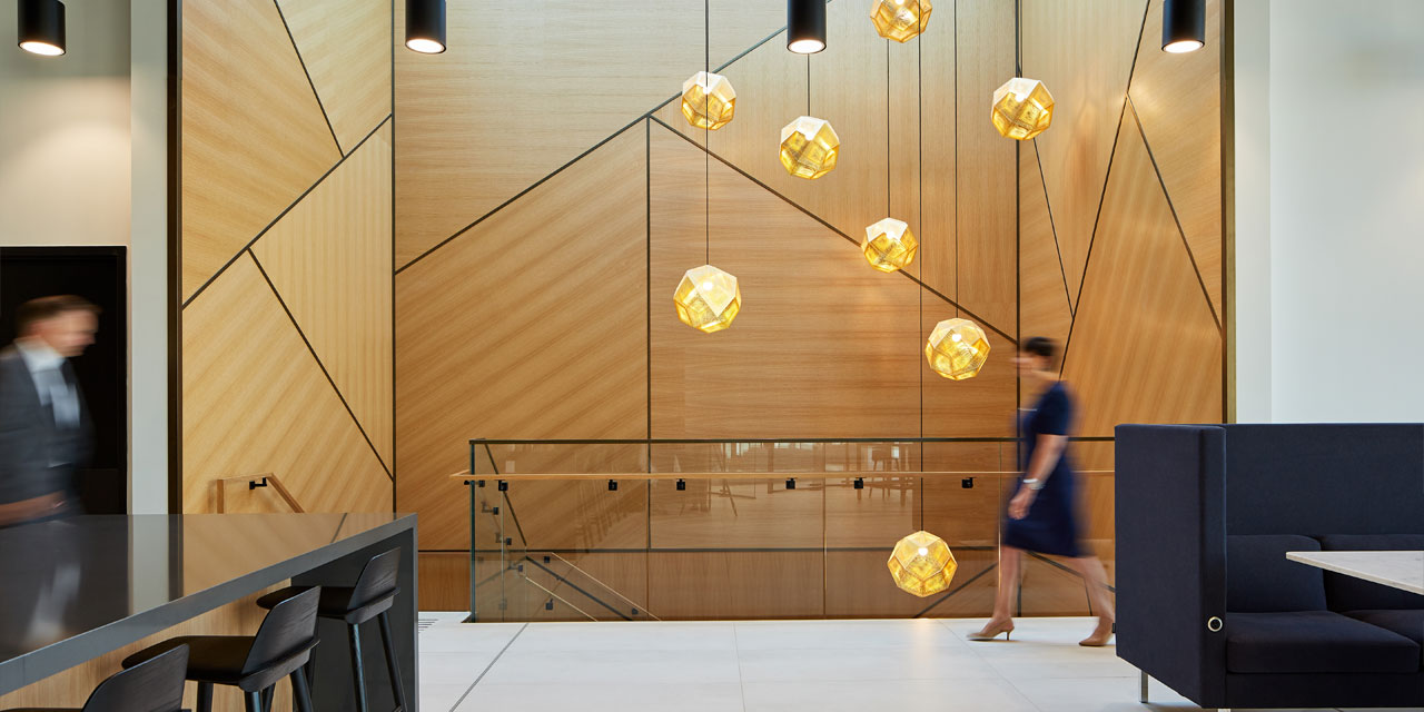
The answer for Winnipeg’s Thompson Dorfman Sweatman (TDS) was to literally blow the roof
off when they moved to True North Square. “It’s the first new office building in 20 years in the
city,” says Figure3 founder Allan Guinan. Now occupying the top three floors of the new 17-
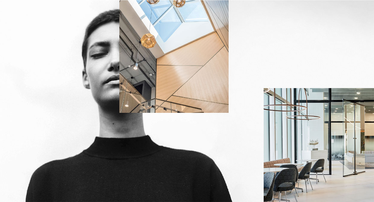
storey building, Figure3 suggested the landlord constructed a huge skylight over the central
staircase, creating a column of light to illuminate the centre of the offices for everyone traversing
the three floors. “Most ceilings in law offices are flat, at TDS you don’t feel like you’re in an
office tower which features open ceiling exposed to the structure,” Guinan says.

This project represented a full-circle moment for Guinan. Growing up in Manitoba, he knew one
of the selling features in the prairie city was the horizon, with an abundance of seemingly
limitless blue skies. One side of the building is curved, exposing a 60’ wide vista of Winnipeg’s
skyline. The access to natural light and views for everyone was a conduit to convey a new
corporate culture of openness, interconnectedness and yes, transparency..

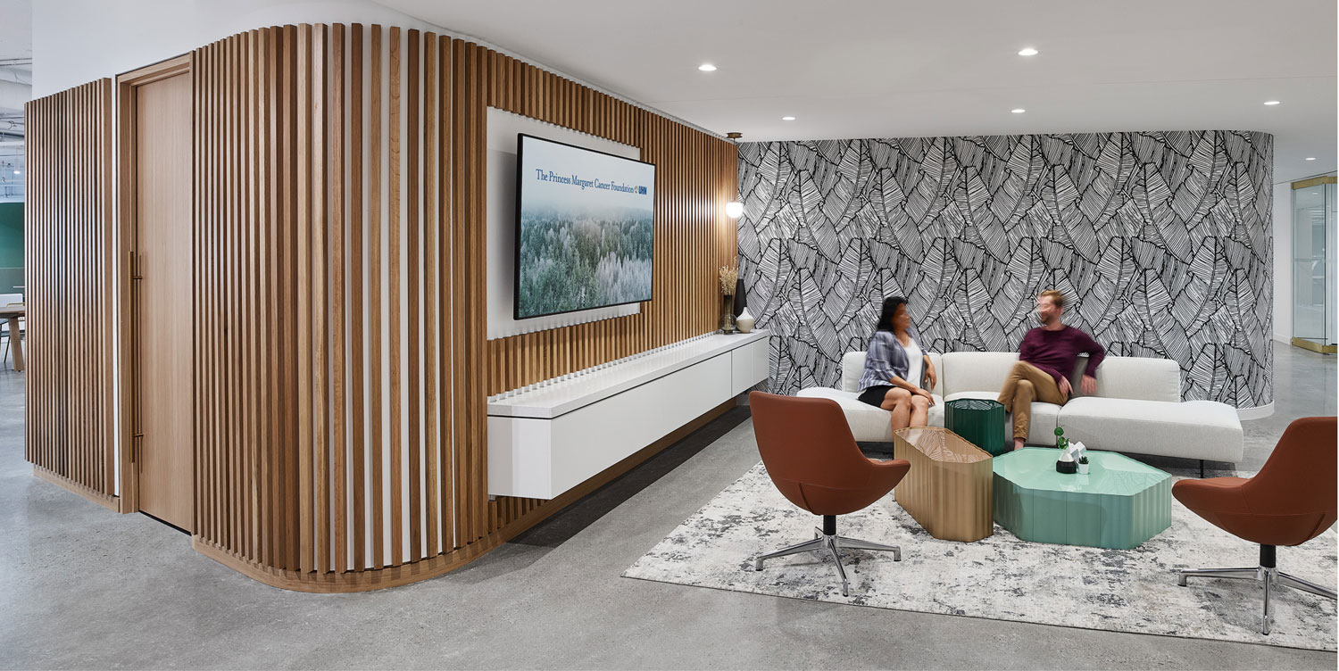
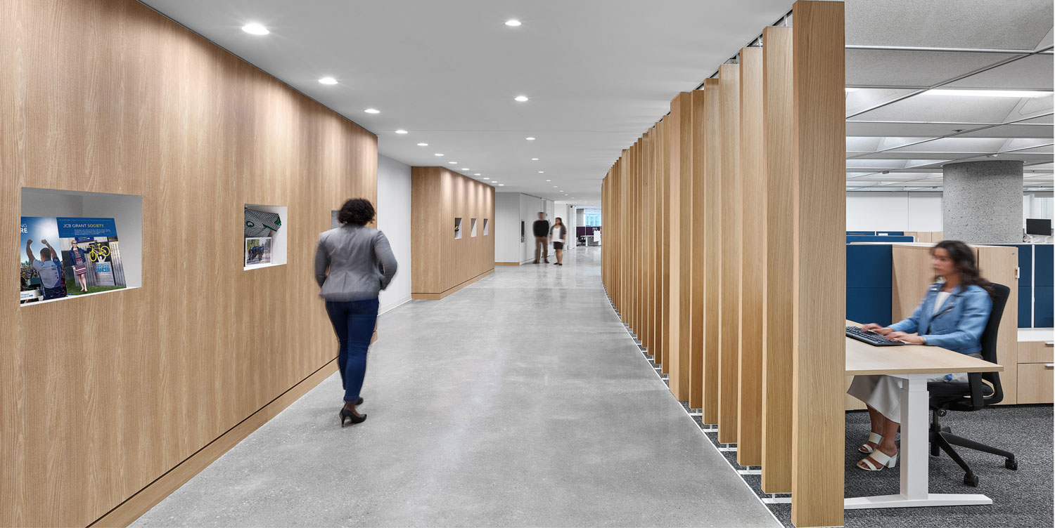
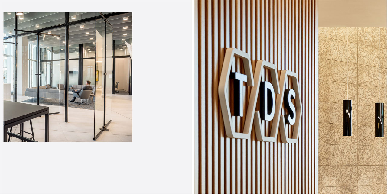
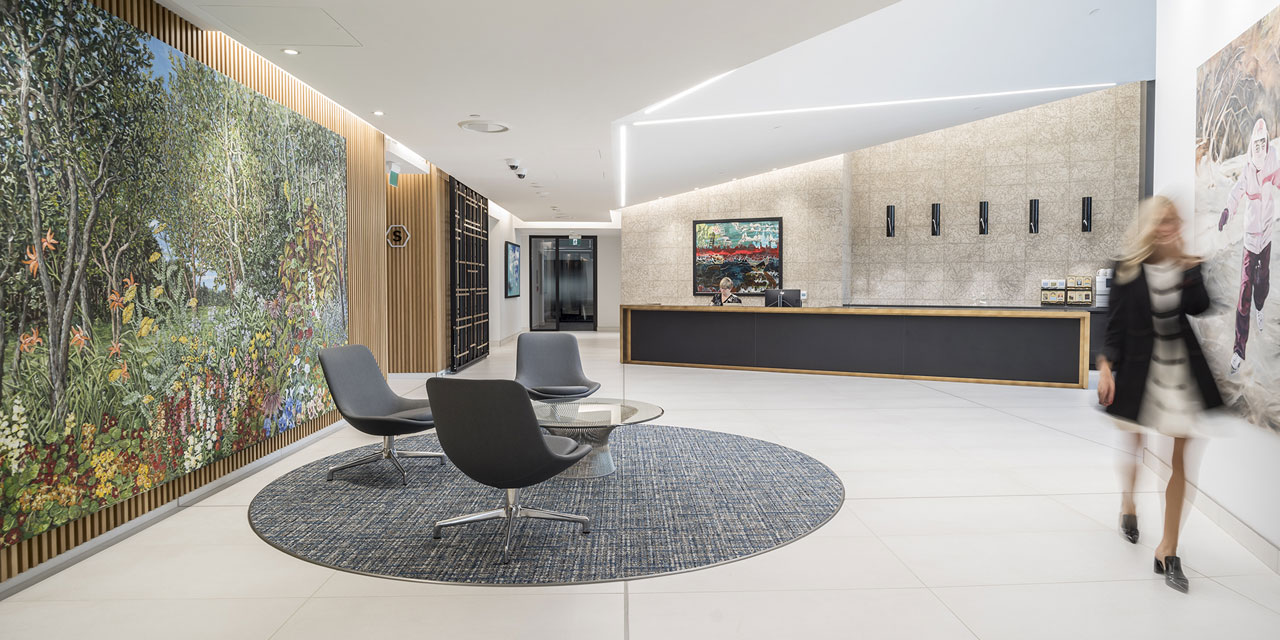
Native materials like white oak wall slats and large-scale ceramic flooring references the city’s
history of modernist architecture and affinity for Scandinavian design. The wall behind the
reception desk is made of Tyndall limestone, a swirling sandwich of burrowing marine fossils
unique to Manitoba, acting as a cross section of the region’s architectural history. “Everyone
responds to natural materials that are simple and honest. They didn’t want it to feel overly
opulent, the luxury comes from the abundant space, light and materials.”

“We wanted to be nimble and future
focused
and I really feel like they designed
for that and it worked.”
/ Alan Fineblit

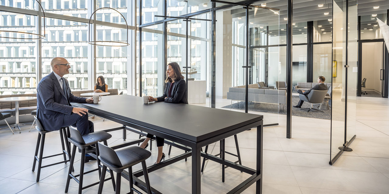
Guinan wanted to play up that transparency with glass partitions but there was some initial
pushback. “The staff asked for frosted glass since they were concerned about being on display.
The offices are a compact 150-square-feet and could feel very enclosed so I suggested a 90-day
trial. Afterwards they said: we love it, leave them open. All transparent glass offices is almost
unheard of in a law firm.”

The previous office was very dark, and everyone worked behind closed doors. TDS requested a
dynamic space that moved them forward with integrated technology. In a nod to modernization,
each office is equipped with standing desks. Features like pivot doors further contribute to the
sense of openness. TDS was looking to break with tradition and make a transition, integrating
technology into a light, bright space that encourages collaboration and movement.

The firm’s previous library (complete with Corinthian columns and spiral staircase) occupied
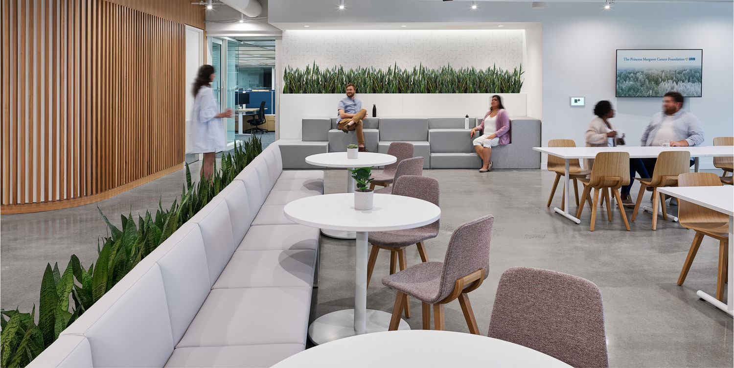
two floors and Guinan shrunk it down to one wall, while the communal space was increased ten
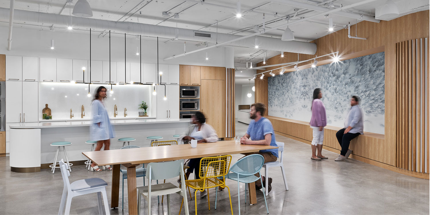
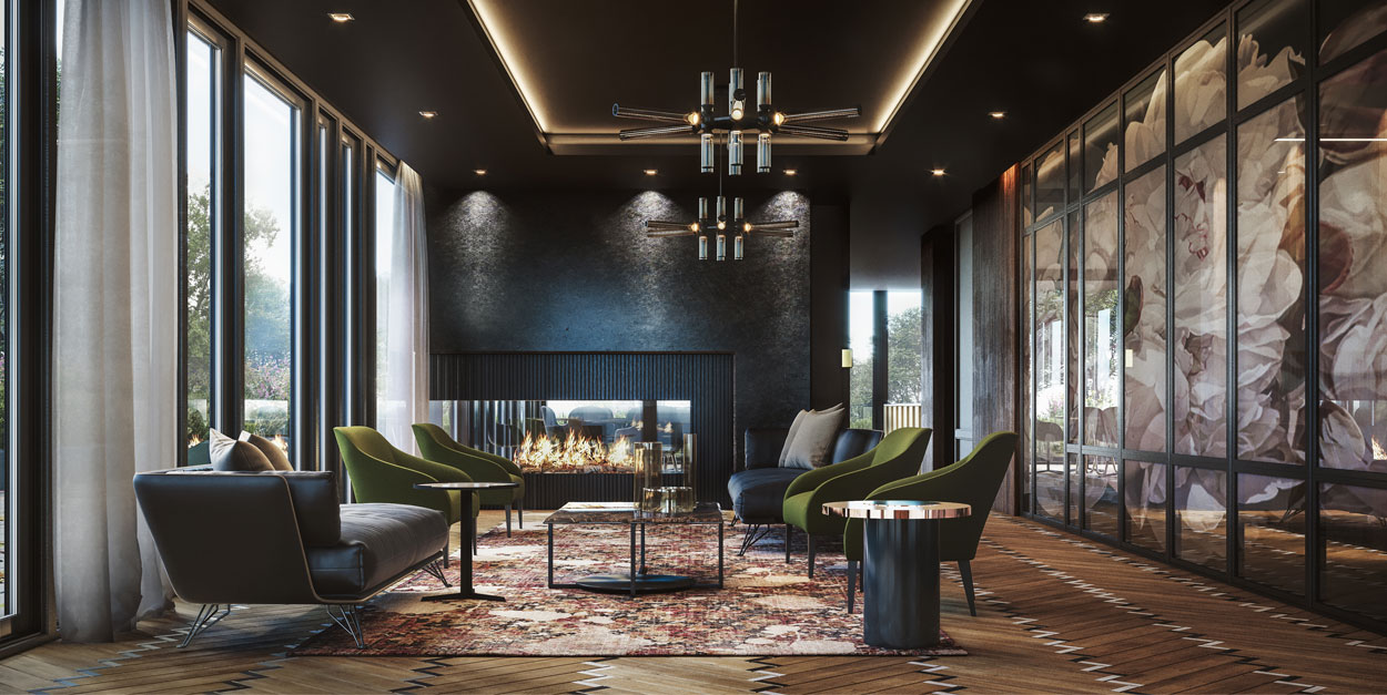
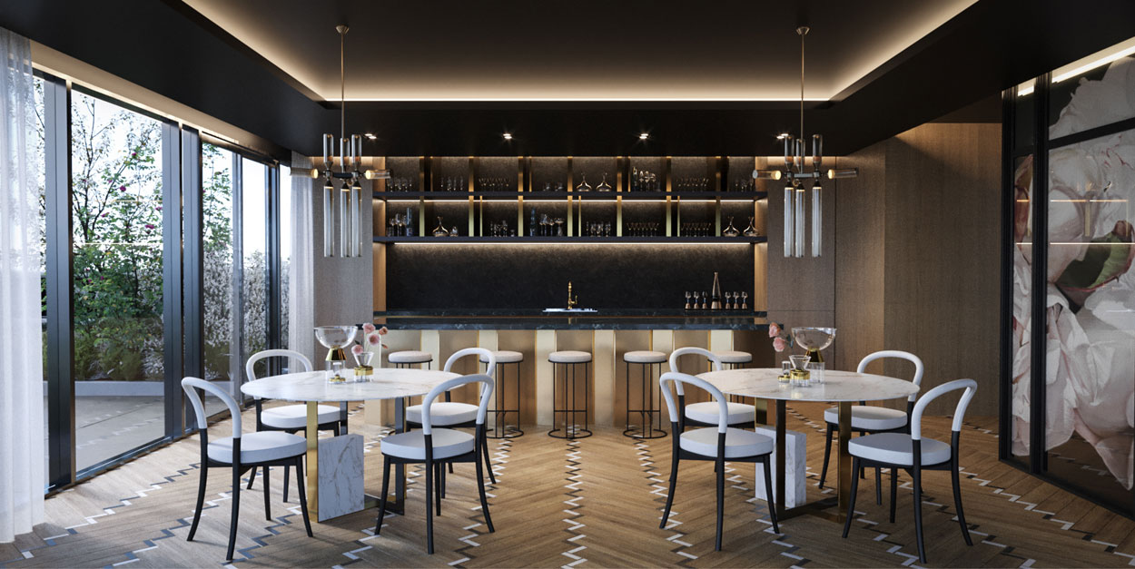
fold. The Manitoba Room, a large lounge/lunch room area on 17th floor, has spots to plug in as
well as WiFi, mirroring the trend for more portable technology. “Lawyers work long hours often
in isolation, so amenities like a coffee bar off the informal reception area encourage people to
step away from their desks and go somewhere.”

Suzanne Wilkinson, principal at Figure3 adds: “TDS didn’t say they wanted a social space, it was a
pleasant byproduct that inspired them to do more. Law firms need to attract talent fresh out of school
or other cities, this new space does that, it’s another welcome outcome.”

“TDS didn’t say they wanted a social space,
it was a pleasant byproduct that
inspired them to do more.”
/ Suzanne Wilkinson

Alan Fineblit, former COO of TDS observes “Lawyers don’t do change well. We are taught to be
risk averse and to follow precedent,” he observes. “Yet as soon as we moved into our space the
culture changed, we became more collaborative, more collegial and we embraced all the opportunities
our new design and new technology presented. It’s transformed our culture, design is the means.”

And there was a strong desire to not only connect employees but the community. To further bolster
the city’s arts scene, works by local and indigeneous artists, such as the portrait of Louis Riel by Franco-Métis
artist Candace Lipischak, are prominently displayed throughout the offices.

Subsequently the TDS office has become a site for arts fundraisers, with hundreds of people gathering in
the public reception spaces. “We are looking forward to when we’re able to resume our events in the Northern
Lights Lounge, hold meetings in our spacious meeting rooms, and enjoy spending time with peers in the
gathering areas throughout the office,” says Keith LaBossiere, CEO and Managing Partner of TDS. The inherent
beauty of the office easily segues into a glamorous setting after hours when the sky is navy velvet, the city
lights are twinkling below and the stars can be seen above.

Inspiration / Princess Margaret Cancer Foundation

AN OFFICE DESIGN BUILT
ON POSITIVITY & HOPE

In 2018, the Princess Margaret Cancer Foundation developed Project Sunrise, an inspiring new vision for
their organization moving forward. Project Sunrise re-envisioned the office space to create an environment
that embodied their passionate mission, motivated their team of cancer fighters, and promoted sustainability,
health and wellness. A new home for the Foundation would be required to deliver their new strategic
plan. These new offices would be designed in a completely new way, enabling the team to collaborate and
innovate to accelerate fundraising, strengthen their commitment to their mission, and serve as a platform to
recruit and retain the best talent in fundraising.

“They were looking for a new beginning that would align with their people, the culture that they created
and future business goals,” says Mireille Metwalli, Senior Team Leader for the project. “They saw this as an
opportunity to reemerge with a much larger presence.”

The design team agreed that the office would be designed as a space to celebrate and bolster the Foundation’s
goals and achievements, while conveying a sense of hope and welcoming through the uplifting range
of spaces, colour and branding.

BRAND

It was important for the Princess Margaret Cancer Foundation to create their own identity within the larger
brand of UHN (University Health Network), giving a spotlight to the human aspects in all the great work
they do.

“The most inspirational thing for us was the people working in this office,” says Norwood. “They’re doing all
these exciting, positive things and so we wanted to bring that positivity and light into this space.”

“They were looking for a new beginning
that would align with their people, the culture
that they created and future business goals.”

Visual features included interactive donor and history walls in the reception, which incorporate physical and
digital elements to inspire and engage donors with the track record of research breakthroughs that have
happened at the Foundation while also highlighting the most critical funding priorities in need of support
from donors. An additional visual feature included shadow boxes inspired by museum displays created and
placed along a wood-slatted corridor where items of significance are on display, such as the iconic yellow
Ride For Cancer bike.

NATURE

The colour palette was carefully curated to take staff, partners and guests on a visual journey that explores
wellness, creativity and movement. Referencing Project Sunrise, the colour journey begins with yellow and
orange hues, evoking energy and hope, as well as symbolically marking the beginning of a new day. The
space then transitions to graduated blues and greens conveying calm and confidence. The end of the journey
is punctuated with the vibrant purples and reds of a sunset. The range of colours is beautifully accented
by natural light, with careful placement of built-out spaces, glass offices and meeting rooms throughout the
office.

“We took the hues, tones, and feeling of how the sun would make its journey, starting from sunrise and going
to sunset,” explains Daniel Norwood, Senior Team Leader for the project.

Another important aspect of the visual journey was the materials. The design team wanted the spaces where
people would gather to be a celebration of nature and life. The use of sustainable wood and biophilic design
elements, a type of greenery, combined with polished concrete, which was maintained from the original
finish, reflects the energy and pace of the organization.

“We took the hues, tones and feeling of how
the sun would make its journey, starting from
sunrise and going to sunset.”

WELLNESS

The team chose an activity-based office to promote movement and support the workforce for their variety
of tasks suited for individual needs. The office is split into differing sections, or “neighbourhoods”, made up of
flexible workstations with height adjustable surfaces and provide a nice alternative to private rooms and offices.
Defined pathways act as “sidewalks”, which connect the neighborhoods together, all while supporting a natural
flow to the way people move throughout the space.

With the inclusion of a custom moss green wall in the reception area plus other biophilic elements, the team
was able to create a sense of calm and belonging within the space.

“Having live plants in a space does so much for people emotionally,” says Norwood.

Each part of the office was designed with a sense of purpose, multi-use and connection. The main café was
designed to be the central hub for staff to gather and interact throughout the day. The cafes, quiet zones, and
meeting rooms were designed to open up into larger spaces so the foundation can host town halls and staff
celebrations. It was important for the Princess Margaret Cancer Foundation to ensure that the overall feeling
was positive and inviting for everyone, whether it be a cancer patient, a donor or an employee coming into the
office.

“The design for this project was really about giving their people pride in where they work,” says Metwalli.
Overall, the new workspace aligns with the Foundation’s mission to fight cancer while promoting collaboration,
innovation, and communication – all needed to deliver on their bold new strategic plan.

With enhanced navigation, an appropriate mix of spaces to support different methods of work, and tons of
natural light, the office staff are fully equipped to work and feel their best.

Inspiration / Distrikt Trailside

LUXURY BUILDING
TAKES CUES FROM TED BAKER
& VICTORIAN ERA

Modern meets traditional in the design of Trailside – a luxurious apartment building surrounded by natural
landscapes and extensive trails in the city of Oakville. While the architecture of the building started
off as quite modern, it was important to Dominic De Freitas, partner at Figure3, to ensure that the city’s
appreciation of the old world was brought into the look and feel of the entire project.

“Oakville as a city is known to leverage the history of England and the different aspects of what the U.K.
was in Victorian times,” explains De Freitas. “They have really retained that appreciation for the interpretation
of Victorian-English style into the Canadian culture.”

Along with the Victorian Era, De Freitas looked to European boutique hotels and the likes of Ted Baker
who have mastered the art of taking inspiration from the old and modernizing it in a way that results in
a beautiful, timeless piece of work.

HISTORY

Originally, the exterior of the building was all glass with lots of grey resulting in a very cold look. To pay
homage to the Victorian era and to add some warmth, a copper band with lighting within it was added
to the underside of the soffit on the roof, becoming the crown of the building. Vertical wood pieces
were then placed around the facade to tie in the base elements of the roof. To evoke a sense of history,
an iron canopy structure with reeded glass creates a major statement to the main entrance. “Before, you
couldn’t see the front door because it blended in with the full glass facade,” says De Freitas. “And we
know in traditional design, the front door is the showstopper.”

Inside, the lobby is grand with tall ceilings and herringbone floor tiles done in a large scale to mimic an
old English estate. Traditional wainscotting on the walls have been modernized here with antique mirrors
between each panel. The white marble fireplace, a popular feature in the Victorian era, embodies
a natural veigning and sharp framing. It is anchored by Tom Dixon wingback chairs paired with coffee
tables that mimic the design of traditional Victorian bird cages.

FASHION

One of De Freitas’s go-to’s for inspiration is fashion. For this project, Ted Baker was a major influence.
His ability to blend men’s suiting fabrics along with feminine notions of florals, silks and satins was the
jumping off point.

“He had a strong floral statement in his patterns that he was using in his clothing and juxtaposing
those with houndstooth, herringbone and pinstripes,” explains De Freitas.

In the party room, a traditional herringbone floor has been connected with marble to create a
zig zag effect to resemble the top stitches used in outerwear. “Almost like a baseball stitch, that was
overemphasized,” he says. The jewel toned furniture and fabrics were inspired by the colour pairing
Baker uses in a lot of his collections.

“He had a strong floral statement in his
patterns that he was using in his clothing and
juxtaposing those with houndstooth,
herringbone and pinstripes”

ART

The focal point in the lobby is an oversized floral piece situated behind the reception desk. It’s a
traditional Victorian image of oversized peonies and roses created from an original painting by Belgian
still painter Jan Davidsz. de Heem. The artist is from the 1600s but his work was very popular in the
Victorian era. “His paintings ended up being used as these floral patterns and wall coverings in Victorian
times,” explains De Freitas.

For the Trailside lobby, the image was oversized and printed on silk, then sandwiched between glass
and inserted into panels. Another floral art piece by de Heem was printed on translucent film and applied
to glass, and acts as a separator between the party room and the corridor.
uses in a lot of his collections.

Jan Davidsz. de Heem

Shay Mitchell interior

Dominic De Freitas, Principal Figure3

TRAVEL

The final look does mimic one of a European boutique hotel, but that wasn’t the goal. It came about organically as the traditional and modern elements were married together.

“The hotels I had been to in London and England, nothing is overly matched,” says De Freitas. “They’re not afraid to mix patterns and colour together. When I look at boutique hotels in Europe, they’re layering different materials together that create the depth in the space.”

Which is a similar result in the Trailside project. Everything is strategic – even the lighting. If you look up, the ceilings have been completed in a dark colour so the light filtered into the room can be controlled to set the mood. “By doing the ceiling dark here, we focused the light to shine exactly where we wanted them and not be reflected off of a white ceiling,” says De Freitas.