Innovation / Division Twelve Chicago Showroom

BRIGHT, BENDY FURNITURE
IS A MOUTH-WATERING ADDITION
TO THEMART IN CHICAGO

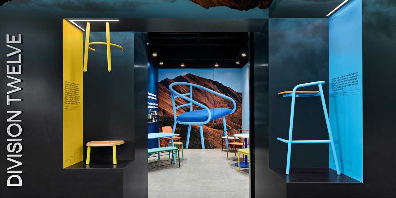
Chicago is an architecture and design mecca; there’s a head-snapping design moment on practically
every corner so grabbing attention isn’t an easy ask. That was the challenge for Division Twelve, a new
office furniture brand moving into a small 170-square-foot space in the Merchandise Mart building,
located just across from Chicago’s iconic Millennial Park. The bendy, lightweight and stackable metal
furniture in an array of Pop Art colours represents a new facet of office furniture, and it was important
to convey the “irreverent joy” at the heart of the line.

Knowing that the target group was designers, this was a chance for Division Twelve to set themselves
apart and create an Instagrammable moment, according to Mardi Najafi, VP, Retail Strategy and Design at
Figure3. “Having a strong sense of place, a unique location, environment and culture that’s easily
readable as distinct and ownable is how you create that moment — but also how you draw people
back,” he explains.

The first steps were literally about first steps: a facade that would catch the eye of designers walking
down the corridor of theMART, and how to pull them in. The previous tenant of the space had relied on
a standard company logo over the door, but Najafi had to persuade the landlord to let the signage
extend into the hallway to hint at the immersive experience within.

“For us furniture is the pinnacle of
what we do, we want to treat it like art.”
/ Meghan Sherwin

“The shopping journey starts from the outside; we wanted that compelling rubber-neck effect,”
said Najafi. “I had been in theMART and no other tenant had extended their brand and signage beyond
the lease-line. It’s a multi-storey story building that consolidates architectural and interior design
vendors and trades under a single roof, therefore there is a ton of competition.”

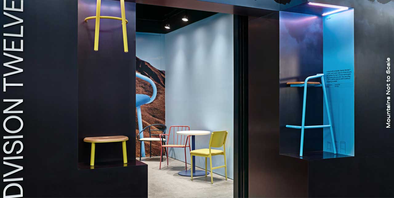
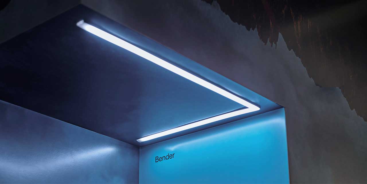
To achieve that goal, a vinyl decal envelopes the exterior and gives the compact space a bigger visual
presence. The signage is often tipped on its side, running vertically for a funhouse touch that plays with
expectations. “One of brilliant things about Mardi’s design was to have a funnel effect into the store.
It brings a communal, embracing feel to the brand,” according to Meghan Sherwin, VP Marketing at
Keilhauer (Division 12’s parent company). “Designers aren’t trying to peek at furniture through a window,
the vignettes work really hard for us and naturally draw them in.”

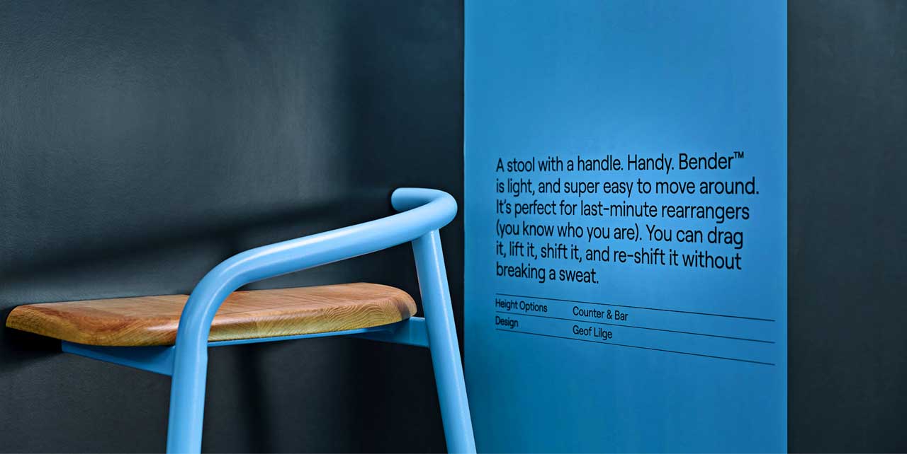
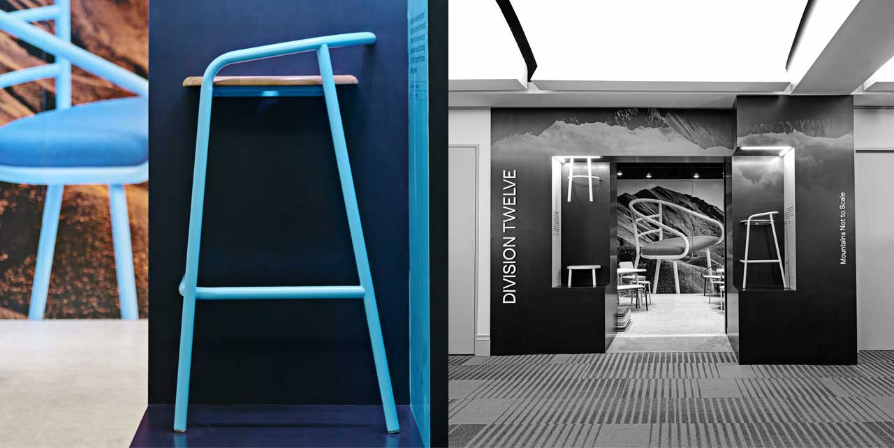
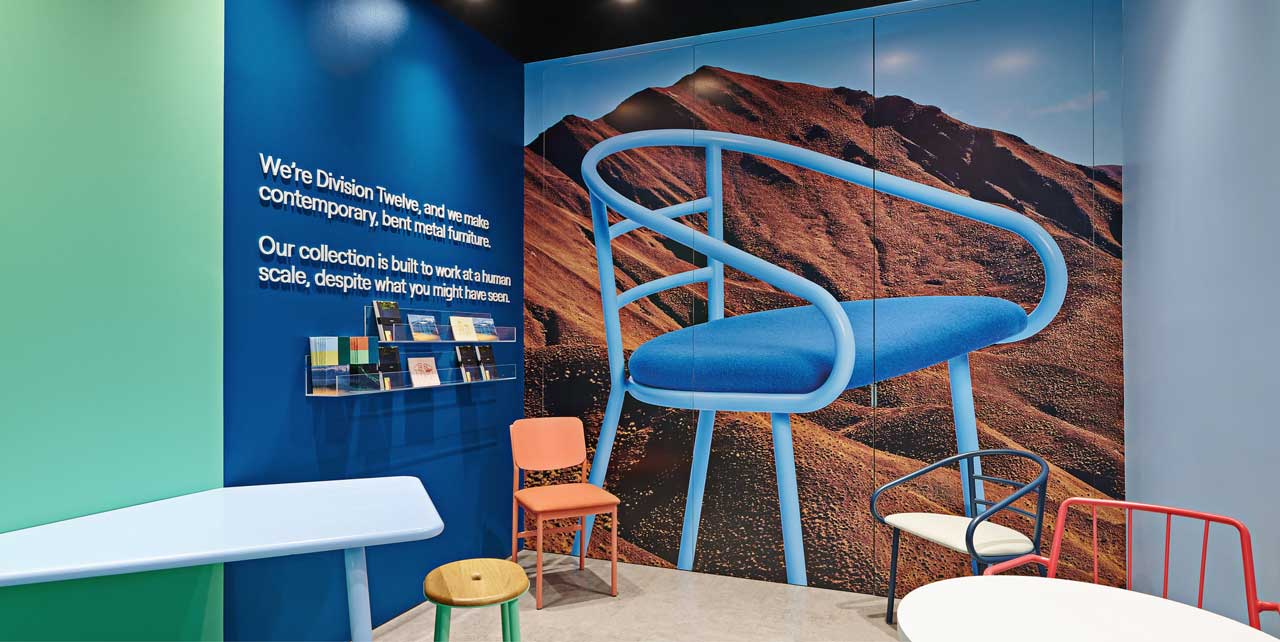
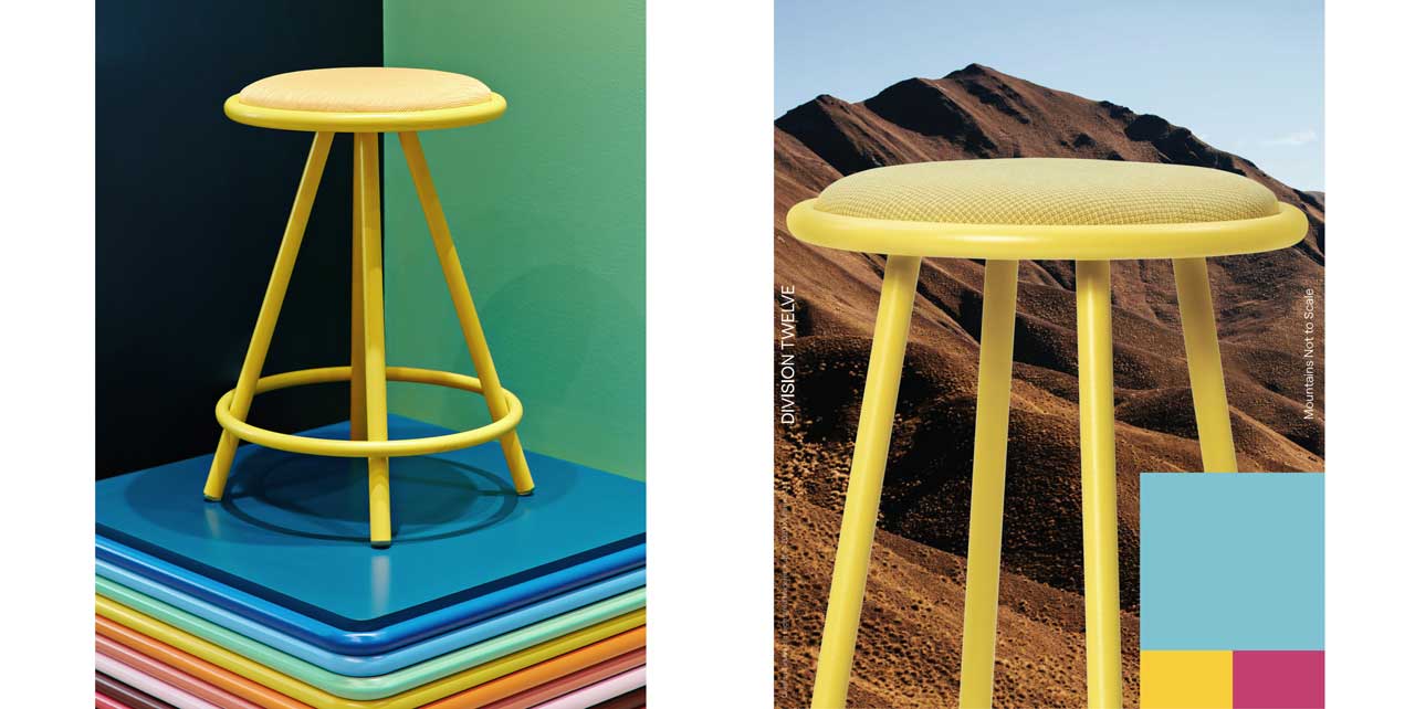
The entrance decal depicts an upside-down mountain, and exploded versions of a Division Twelve stool
spinning through space, hovering from the ceiling and sprouting up through the floor, while a chair is
halved like a magic trick. “When I saw this playfulness in the brand’s tone of voice and colour story, I just
had to bring it to life. Because of limited space we artfully cut some of the furniture in half and applied it
to the exterior niches,” explains Najafi.

Purposely severing a chair is arresting but it also puts craftsmanship on display, tempting designers to
examine the perfectly bent metal tubes, modernist design, joints, details and even its welding. “For us
furniture is the pinnacle of what we do, we want to treat it like art or jewelry, like it’s incredibly special.
But these innovative vignettes showcase the craftsmanship in a different way, breaking the standard
convention of furniture presentation,” according to Sherwin. Designers will sit on a chair or stool in a
showroom, but they won’t flip it over to examine the construction, workmanship and materials. “This
is amazingly simple furniture, but well-constructed. The manufacturing is outstanding,” Najafi explains.
“When you turn it over and touch it, you can see it’s built to last a lifetime.”

“When I saw this playfulness in the brand’s
tone of voice and colour story
, I just had
to bring it to life.”
/ Mardi Najafi

“The entire showroom is designed to constantly evolve and refresh. The furniture in the niches can be
changed as well as the quirky imagery of a rusty mountain range printed on a vinyl mural inside the
space,” explains Najafi. “Nature always gets it right,” surmises Sherwin. “The colour combo of scenic
photography, part of Cosette’s branding, can be iconic and inspiring. Designers look all over the world
for visuals that can spark some creativity. I hope they pick Division Twelve furniture but I also hope the
colours speak to them. I love the friction and juxtaposition: nature with our man-made steel furniture
is just really visually interesting.”

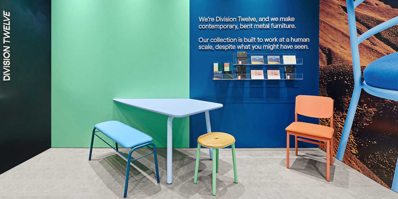
Another standout design element inside is the bold colour blocking (especially inside niches) that ties
in to the palette of the furniture. “Colour sparks emotion,” says Sherwin. “We started with strong,
unexpected colour blocking that complements or contrasts and hope that it sparks creativity with
designers. Colour is a compelling part of the brand.” A teal wall is simply embellished with a mission
statement in raised lettering, creating an art gallery effect.

Crucially, versatility was built in, with space for re-skinning the sidewalls and graphics that can be easily
changed up based on marketing. The Division Twelve messaging can constantly evolve to reflect new
messaging and product. “That’s a really big element in retail, it needs to be able to be refreshed,”
Najafi says.

Next up, elements of Figure3’s design will be on display in Division Twelve’s New York and Toronto
showrooms. The future of office furniture in a post pandemic world is a little harder to foresee.
Candy-hued, stackable lightweight furniture that can be hastily rearranged to accommodate a
shifting, transitory workforce may just be the shot of happiness that employers are clamouring for.

Innovation / Flight Centre

TRAVELLING
THE WORLD THROUGH
THE ABSTRACT

Occupying almost five floors of a 7-storey brick-and-beam heritage building, Flight Centre’s Toronto head office
is anything but boring. Complete with an open-concept floor plan featuring an array of private meeting rooms
and innovative custom graphics, the space fully embodies the brand’s desire for creating a space that connects
the team together and tells a story of world travel.

As you enter the office on the seventh floor, you’re welcomed by Flight Centre’s green-canopied pub cafe
known as the Flight Deck and park-like lounge and lunch area that forms the Central Hub. A bold industrial-style
interconnecting staircase is situated at the heart, connecting each of the floors and team members together.
The overall layout is designed with colour-coordinated neighbourhoods that blend and complement each other
through the office journey. The showstopper in the space is undoubtedly the innovative graphics created by the
Figure3 team. To flawlessly realize Flight Centre’s philosophy, “To open up the world for those who want to see”,
murals of street-view photography, world maps, and experiential graphics are on display throughout.

“We wanted the experience of walking through the office akin to a journey around the globe; an alluring
interpretation of the exotic colours, textures, cultures, adventure, wonders and mysteries we all share through
world travel,” says Steve Tsai of Figure3.

Aerial photography was creatively composed to create contemporary and unique graphic art applications,
featuring landmarks and destinations from prominent locations around the world, that would take form in
full-height wall coverings, supersized canvas art and cushion covers.

“Seeing the world from above is
fascinating, The striking aerial imagery
provides a unique way to experience
the places we travel to.”

“Seeing the world from above is fascinating,” says Suzanne Wilkinson, Principal at Figure3. “The striking aerial
imagery provides a unique way to experience the places we travel to.”

When it came down to realizing the concept, photos from selected landmarks first had to match the various
colour zones throughout the office, and were tested over the course of several months. Various photographers
were sought out during the process for globe-spanning coverage. After the initial selection, a patterning test
assessed whether each photograph chosen had the potential to make an impactful and artful graphic prior
to final art creation.

While each of the aerial images are manipulated and patternized in a similar way, they all exude a different look
and feel. The Chrysler Building in New York City yields an Art Deco feel while the Pudong District in Shanghai
embodies a kaleidoscopic allure. The appearance of graphics from a macro level seem abstract. However, when
the viewer stops to digest the art, the experience is completely different.

“Once viewers are drawn in to each colourful and curiosity-provoking piece, they soon discover that the
intricate patterns are in fact made up of aerial views of landmark destinations,” says Tsai.

Other landmarks chosen for this project included the Eiffel Tower in Paris, Trafalgar Square in London, the CN
Tower and Royal Ontario Museum in Toronto, Sydney Opera House in Sydney, Garden of Stones in Hong Kong,
Hotel Kia Ora in Rangiro, Canada Place in Vancouver, Eixample District in Barcelona and Singapore Opera
House in Singapore.

Storytelling and travel go hand-in-hand, which is why the graphic concept works perfectly in this office. To the
viewer, be it the employee or a visitor to the space, the different graphics can evoke memories of travel or
inspire the person in the work they’re doing. It was all about creating an emotional experience for Flight Centre.

Innovation / Penguin Random House

HOW TO DESIGN A
SUCCESSFUL SMALL FORMAT
RETAIL SHOP

What was once a tiny shoe repair shop is now Penguin Random House’s playful, adaptable and very
Instagrammable store for book superfans alike. Located in the lobby of 320 Front Street in Toronto, the 158
square-foot space proves that size really doesn’t matter. Mardi Najafi, Director of retail design at Figure3, and
his team were tasked to help create a branded environment that could be used by the editors and authors of
the publishing giant.

“Penguin Random House didn’t want a conventional retail store as they were already distributing to Chapters
and other book stores across Canada,” says Najafi. Robert Wheaton, now the chief strategy and operations
officer at the publishing house, put together an in-house task force to help pin-point the goals for the small
format space.

The objective was to create a space that would become an extension of the brand and a way to develop a
direct relationship with the consumers of the publishing house. Sales was also part of the goal but wasn’t
given the highest priority at the time due to its location. “We knew, from a real estate stand point, that we were
limited to only people coming into the building,” explains Najafi. “It was not a prime location; it was not
exposed on the high street, there was low expectation.”

Which is why a simple gift shop just wouldn’t do. The design of the space had to be compelling enough for
their intended target group to come out of their way to visit the store and yet still somehow operate in an
incredibly compact fashion. The design team looked to micro apartments in cities like Paris, New York and
Tokyo to gather inspiration for smart ways on utilising a small footprint – particularly ideas for smart storage.
“It has proven to be a great marketing and brand extension vehicle; and industry visitors from around the
world will ask about the store,” says Robert Wheaton.

“It has proven to be a great marketing
and brand extension vehicle; and industry
visitors from around the world will ask
about the store”

“The clutter of books in a small space would come across as additional visual noise, therefore it was important
to find innovative solutions and to not obstruct the marketing messages,” explains Najafi. During their
bi-weekly touchpoints, the Penguin Random House team each had branded notebooks that featured classic
Penguin book spines on the cover. “Robert gave me one and that was my eureka moment,” says Najafi.
“What would excite a book lover more than large-scale books?”

Oversized, pantry-style pull out storage designed to look like book spines were added to the concept, along
with hideaway spots for the POS and pull-out tables and stools to be used for social events. Najafi and the
team also proposed tech elements which included an after-hours kiosk with facial recognition technology to
help collect data, and an interactive video wall to be placed at the back of the store. The high-level estimates
came in above budget. Therefore, the team went through a value-engineering process aiming to get closer
to the initial project budget. The first step was to eliminate the technology touchpoints. The cost of upkeep
for the hardware updates and creating content would not fit within the budget.

Even without the fancy tech bits, the store is still evolving thanks to interchangeable elements like the magnetic
book spines that can easily be changed for marketing initiatives. The space has successfully been used
for planned events, casual drop-by signing and offers everything from Penguin Random House merchandise
and signed books to special edition copies of some of the most popular classics. “We hosted a full ‘takeover’
for the launch of Lilly Singh’s book, How To Be A Bawse: A Guide To Conquering Life, which the author
shared on her Instagram Stories,” says Wheaton, who is beyond delighted with the result of the space.

The shop has not only created a destination for their book lovers, but is now leveraging social media to draw
and send out signals for book signings. As a publishing house, social media or marketing wasn’t top priority
for Penguin Random House because it happened through their books. The hype generated by the shop reminded
the Penguin Random House team of the power of social media and how they could leverage the amazing
network of book super fans as a great marketing platform.

The attention Penguin Shop received was overwhelmingly positive. From viral on social media to an award
nomination from Interior Design Magazine, and winning the ARIDO Award for Project of the Year; top honours
in the interior design industry.

“Let’s not forget, this was 2015,” says Najafi. “It was such a fresh approach, it was considered a pioneering
project before small format and pop-up shops even became a mainstream trend. It’s amazing to see how
well-received this shop still is today.”