Innovation /
Equitable Hybrid Workplace
AN EQUITABLE HYBRID APPROACH
FOR EMPLOYEE WELLBEING
“Having an equitable workplace doesn’t mean treating everybody the same.
It’s about giving people the tools they need to be as successful as possible.”
/ Suzanne Wilkinson, Figure3 Principal
There is no denying that the way we work has evolved. How we interact with people, and
connect with and within the office environment has changed. As one of Canada’s largest
independent interior design firms, Figure3 has led some of the most exciting, innovative, and
award-winning office transformations, driving change in the workplace design sector.
Designing for what you see, and considering what you don’t.
When looking at the current landscape, data from Returning for Good, a Unispace Global
Workplace Insights report, found that only half of Canadian workers are in the office four or
more days a week and that 41 per cent of employees currently “hot-desk” or share a workstation
with other employees.*
In order to effectively bridge the gap between the remote and in-office work experience, and
create a seamless and equitable environment for all, businesses are looking to reimagine their
physical space to positively influence employee wellness, comfort, engagement, and placemaking.
With these considerations in mind, Figure3 explores the ways in which workplace design itself
must change. “Having an equitable workplace doesn’t mean treating everybody the same. It’s
about giving people the tools they need to be as successful as possible,” notes Suzanne
Wilkinson, Figure3 Principal.
Based on key research findings, Figure3 is implementing strategic design principles in order to
integrate hybrid work considerations into industry leading environments. Designing high-performance
workspaces means evaluating each contributing factor that may impact the design
and efficiency of the space: from room size and shape, to furniture, technology, and the atmosphere
which influences how people engage in the environment.
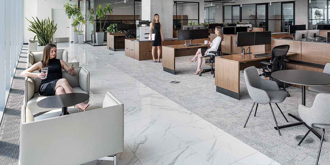
An equitable hybrid workspace creates more opportunities for collaboration and provides
enhanced connectivity.
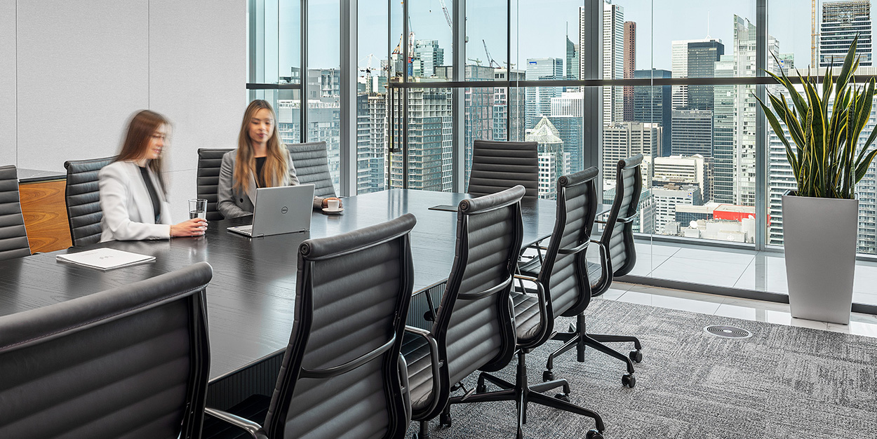
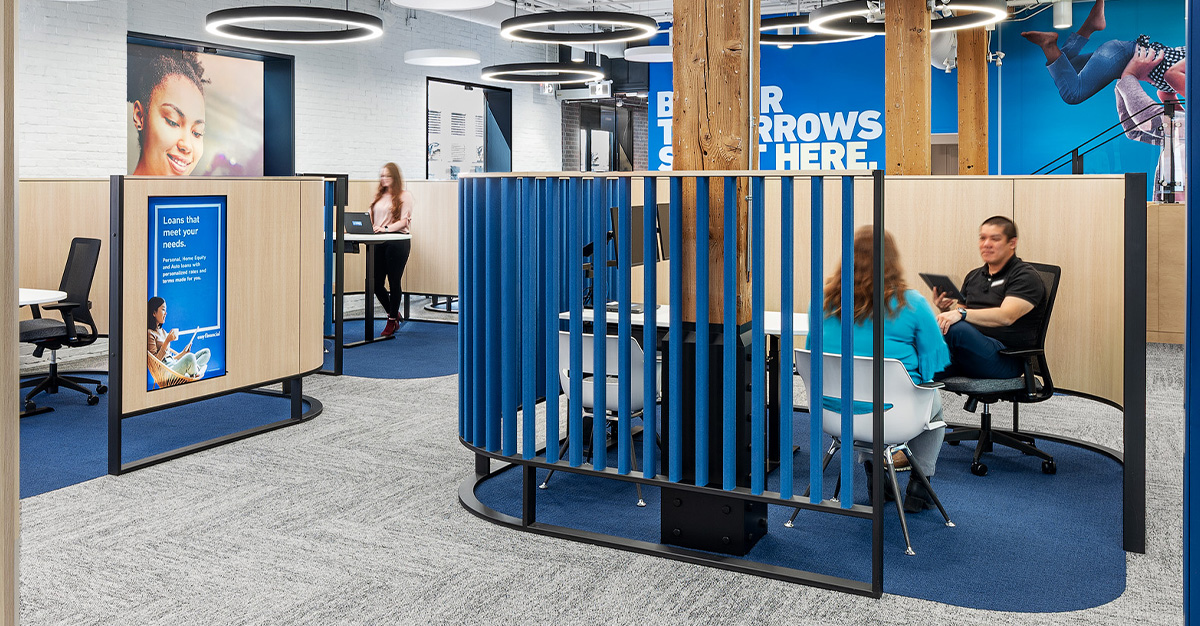
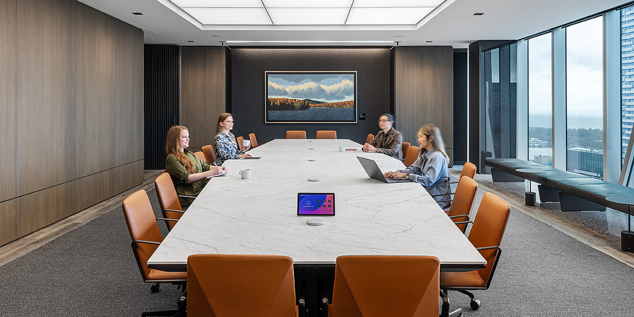
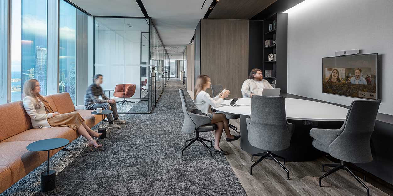
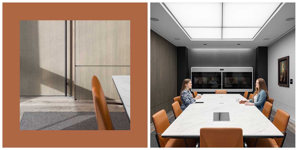
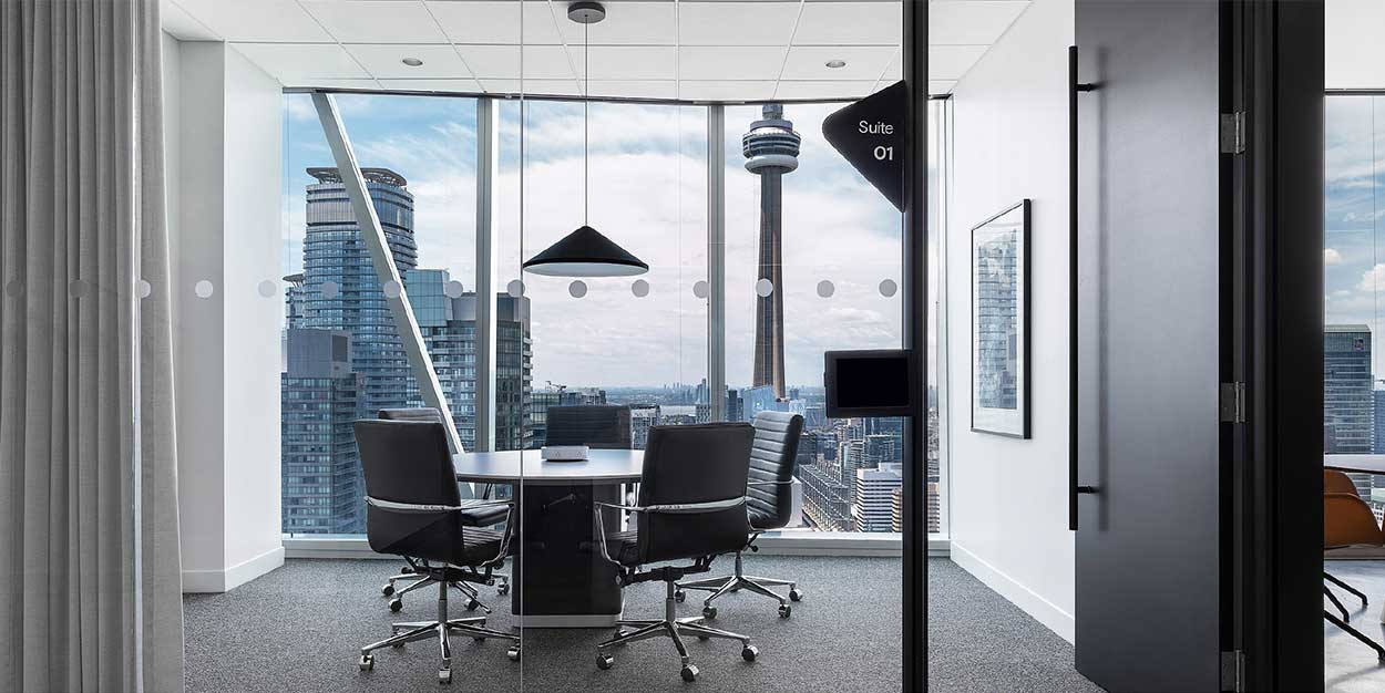
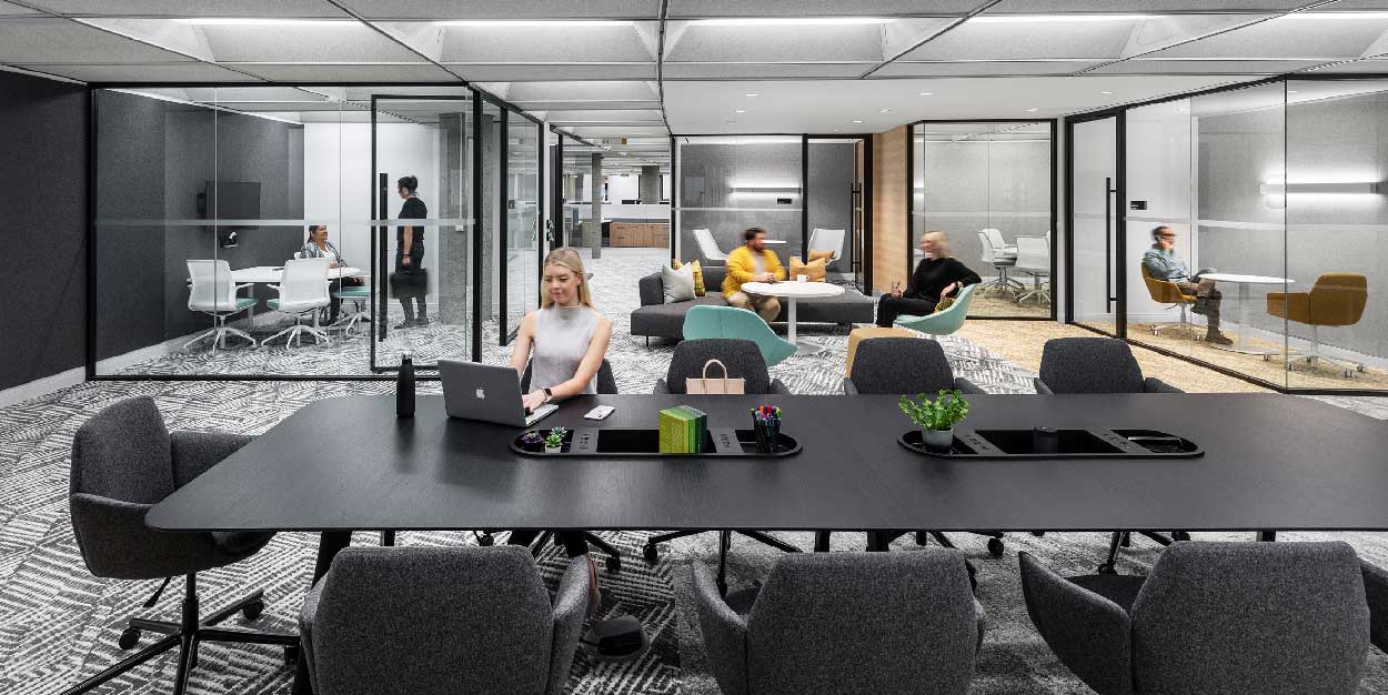
Hybrid considerations are extremely critical in collaborative areas like meeting rooms,
making this a natural starting point for a revitalized design approach. “Recently we completed
an independent study to investigate how we can start designing better meeting
rooms: rooms that give an equal experience to both in-person and remote participants,”
shares Figure3 Workplace Strategy Director, Jillian Warren. The results of this investigation
revealed that over 90% of meetings will have at least one remote participant.
It’s no surprise that face to face interaction generates more ideas and diverse discussion
when compared to telecommunications, so the ability to clearly see the faces of all team
members, present or not, was a key consideration. Placing screens along the longer edge of
meeting tables, and at eye-level can help to create visual continuity and improve collaboration
and participation among hybrid participants.
In addition, fluid, organic shaped furniture also helps to better support flexible room configurations,
improve site lines, and reduces the often-hierarchical implications of traditional
rectangular configurations.
An equitable hybrid approach, however, does not stop in the meeting room. Figure3
approaches workplace design holistically, by breaking down boundaries in the physical
space and infusing concepts of employee wellness and flexibility into the overall environment.
It’s no surprise that face-to-face interaction generates more ideas and diverse discussion when compared to telecommunication.
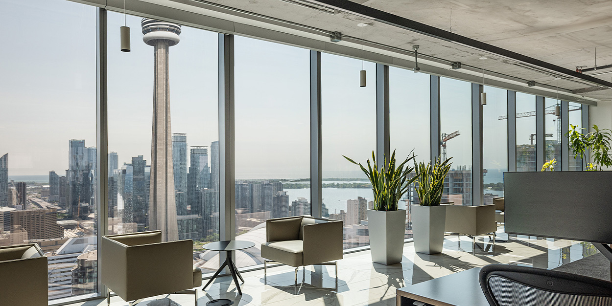
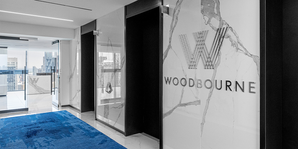
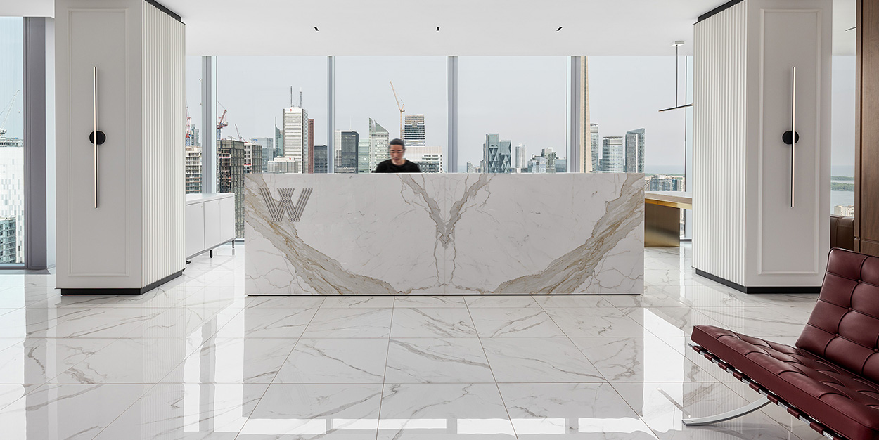
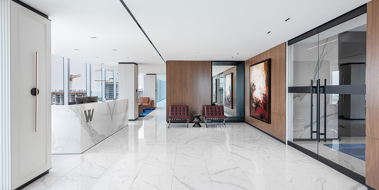
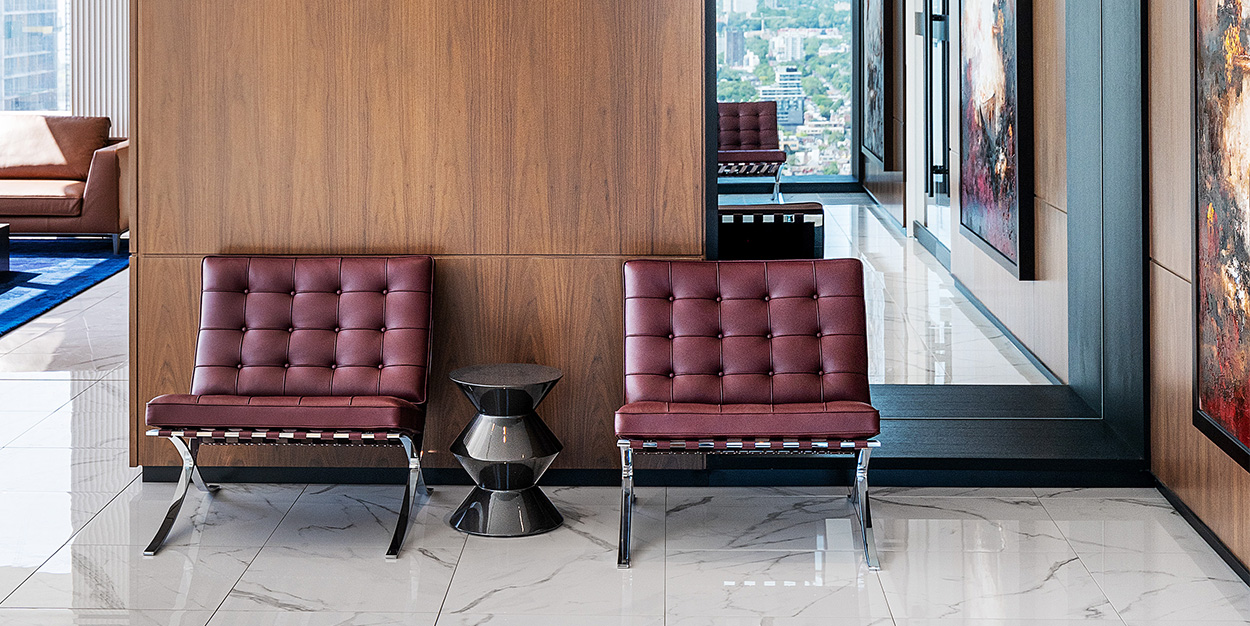
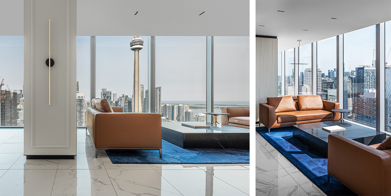
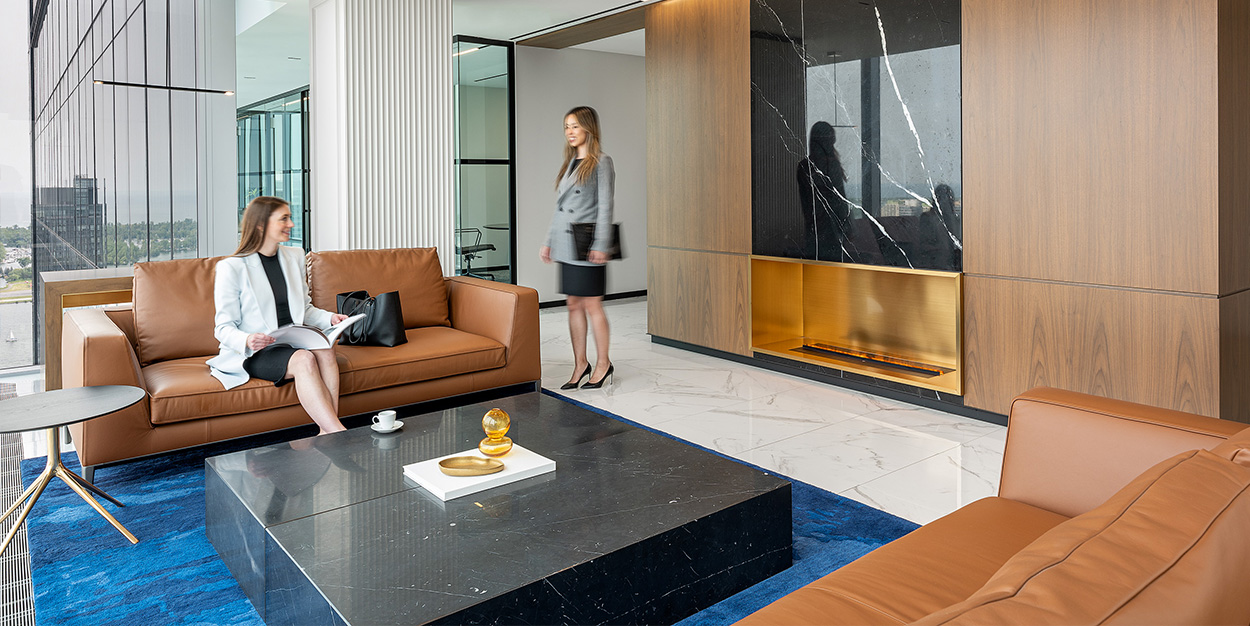
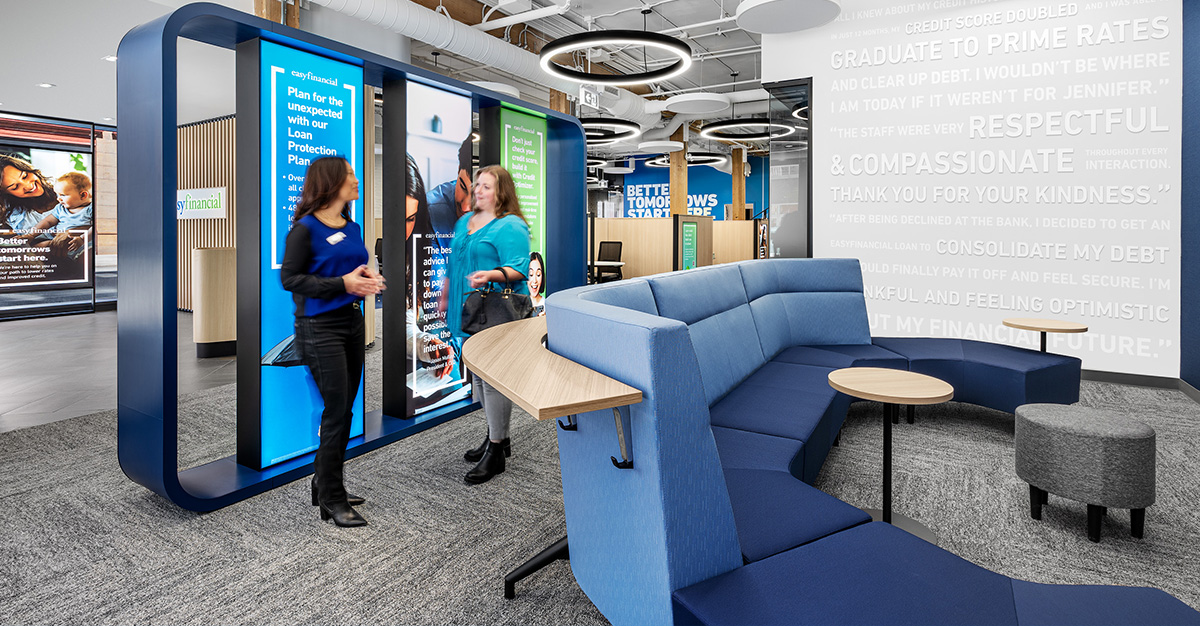
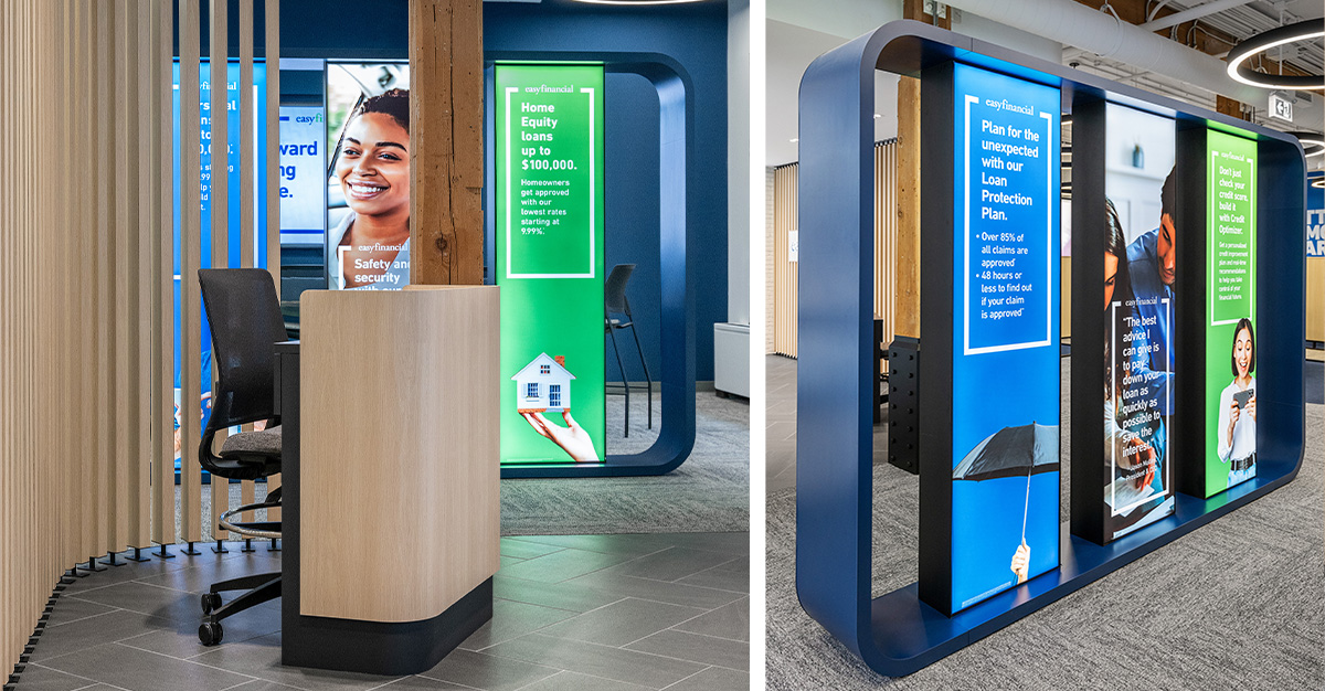
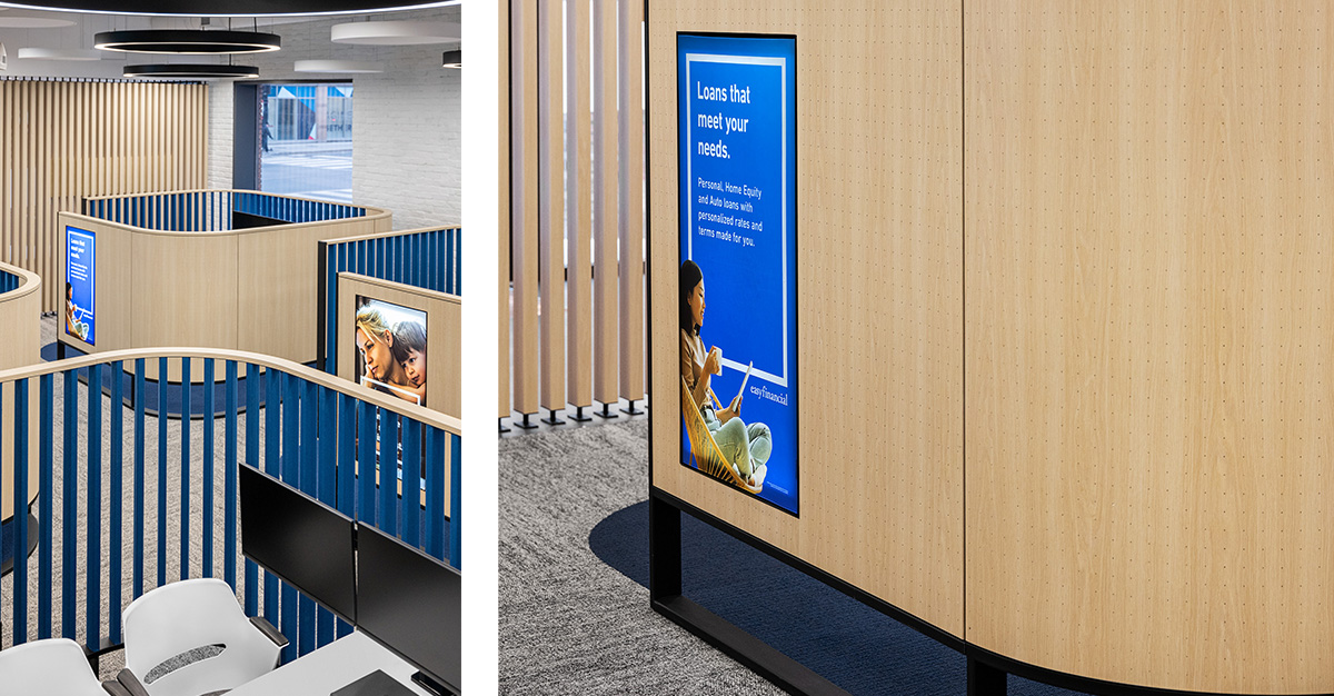
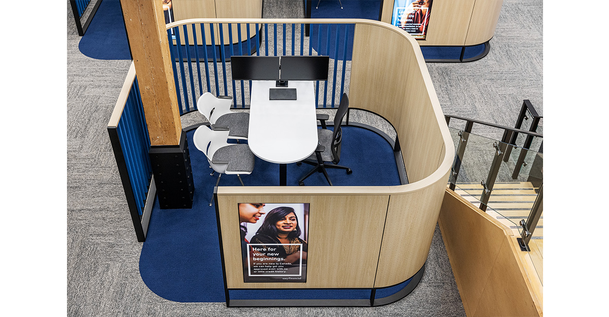
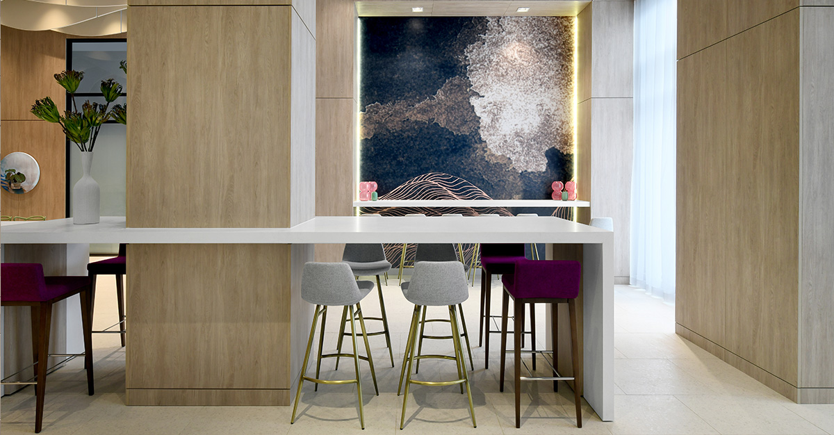
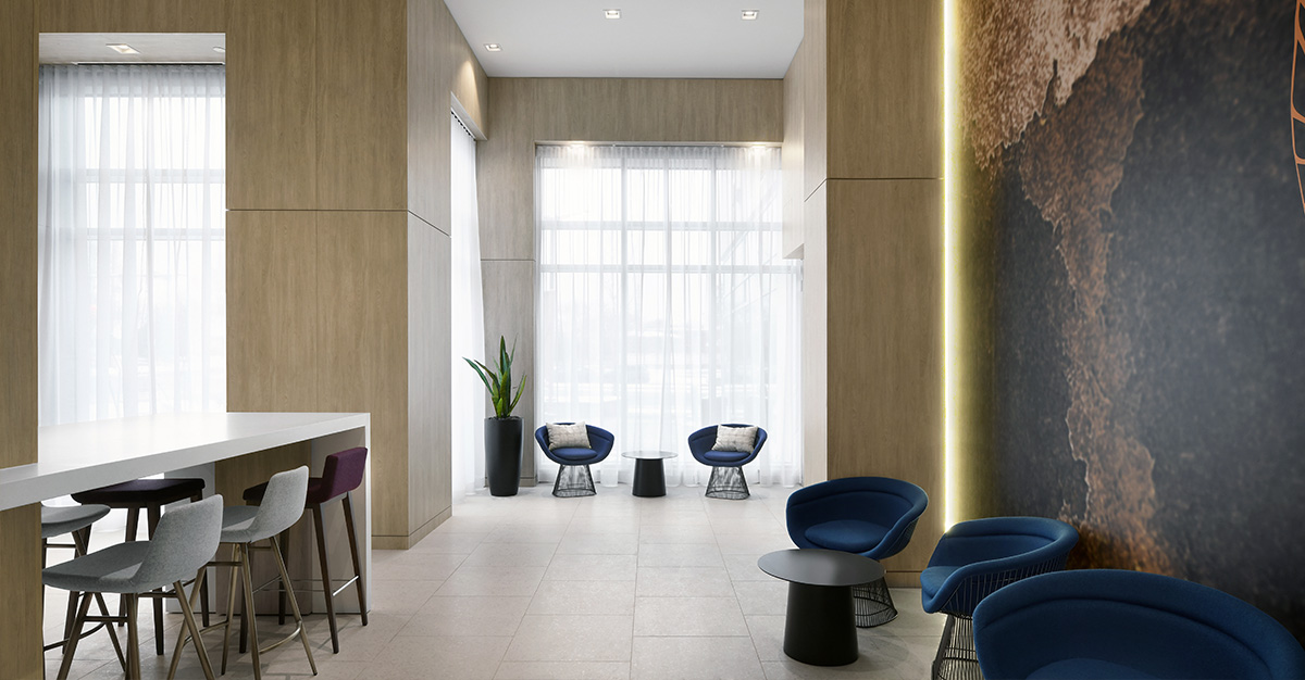
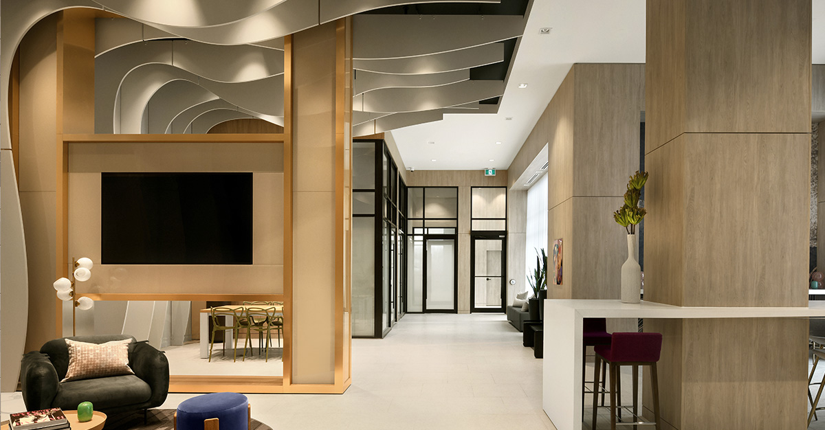
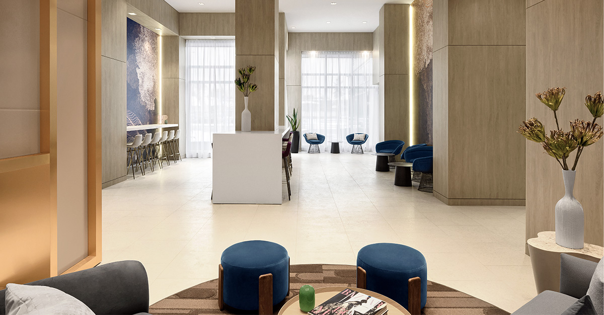
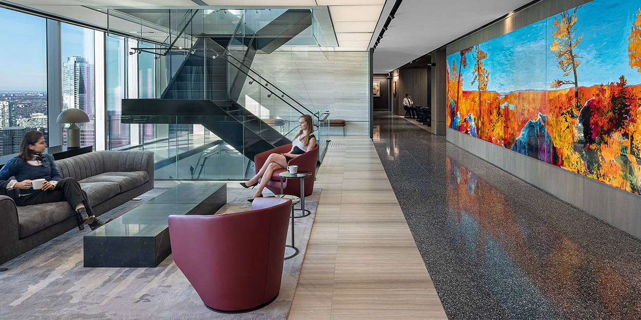
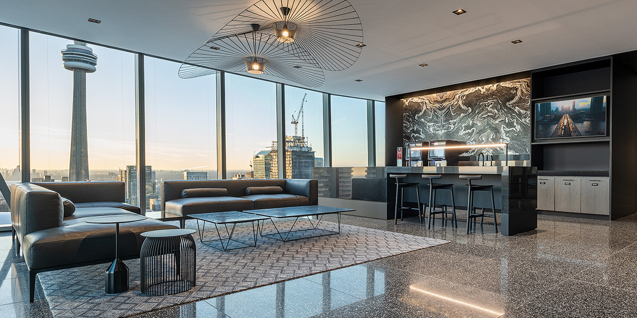
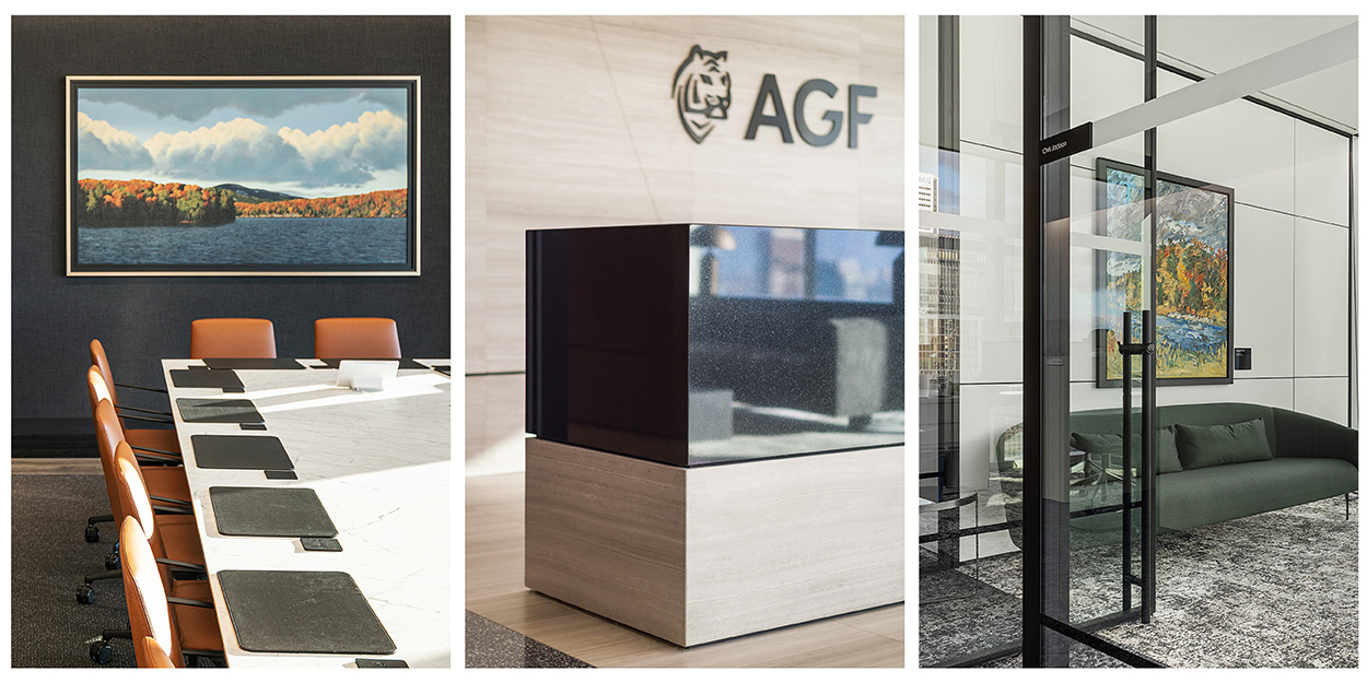
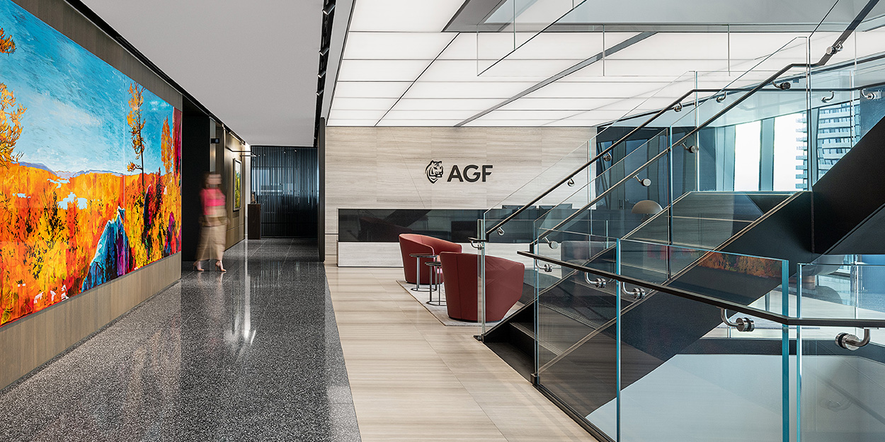
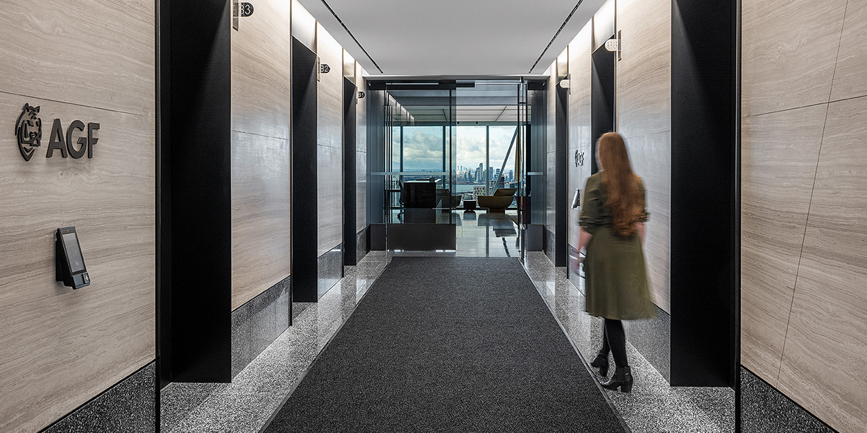
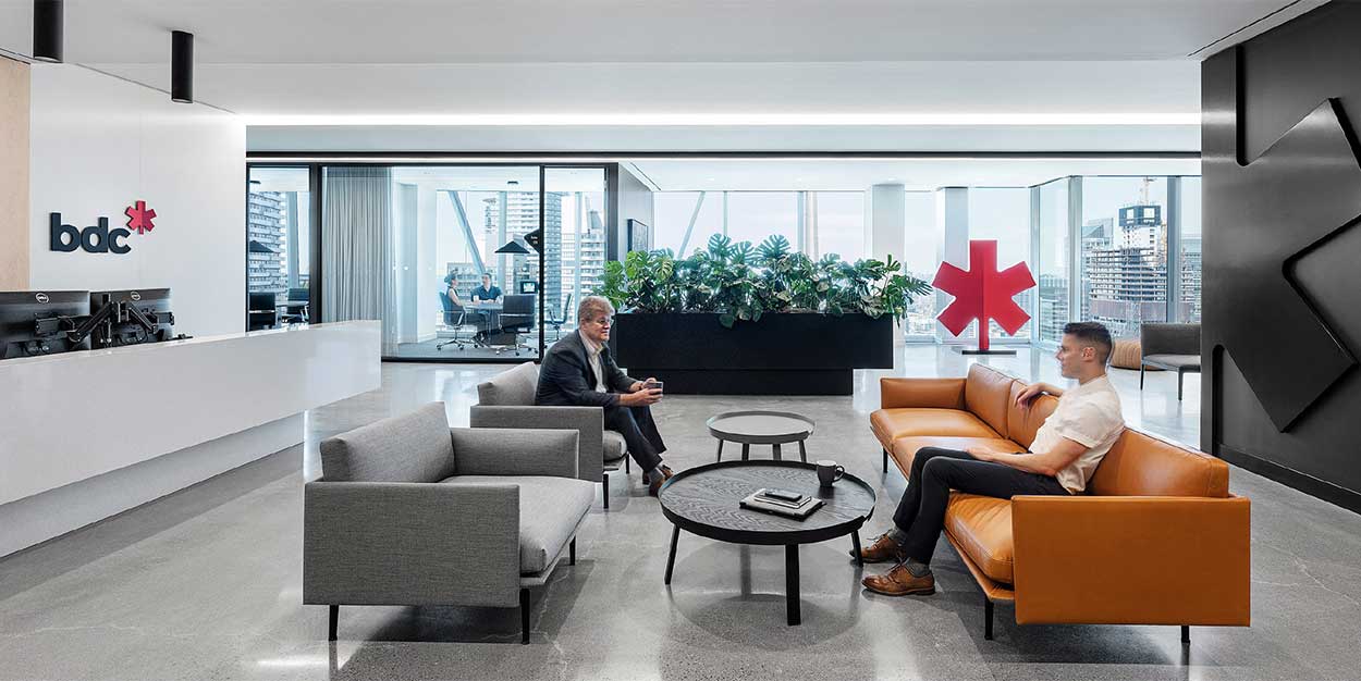
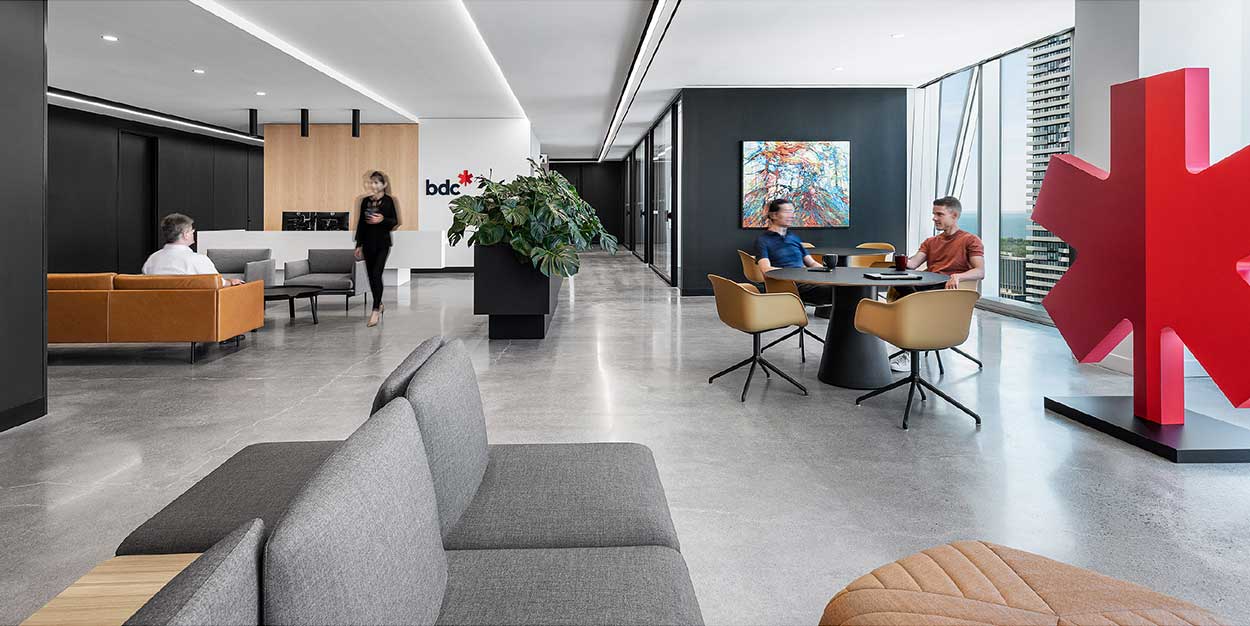
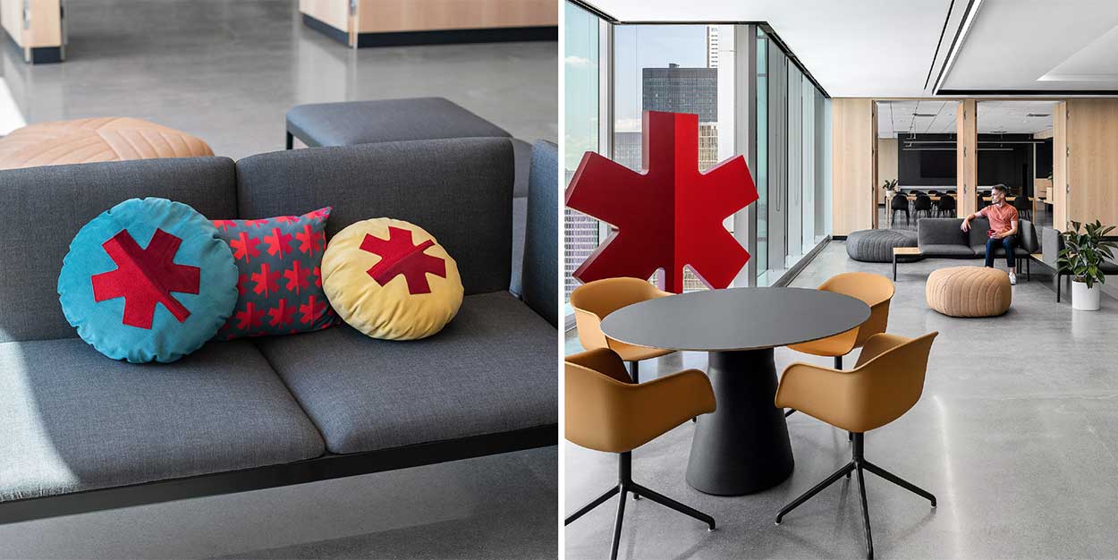
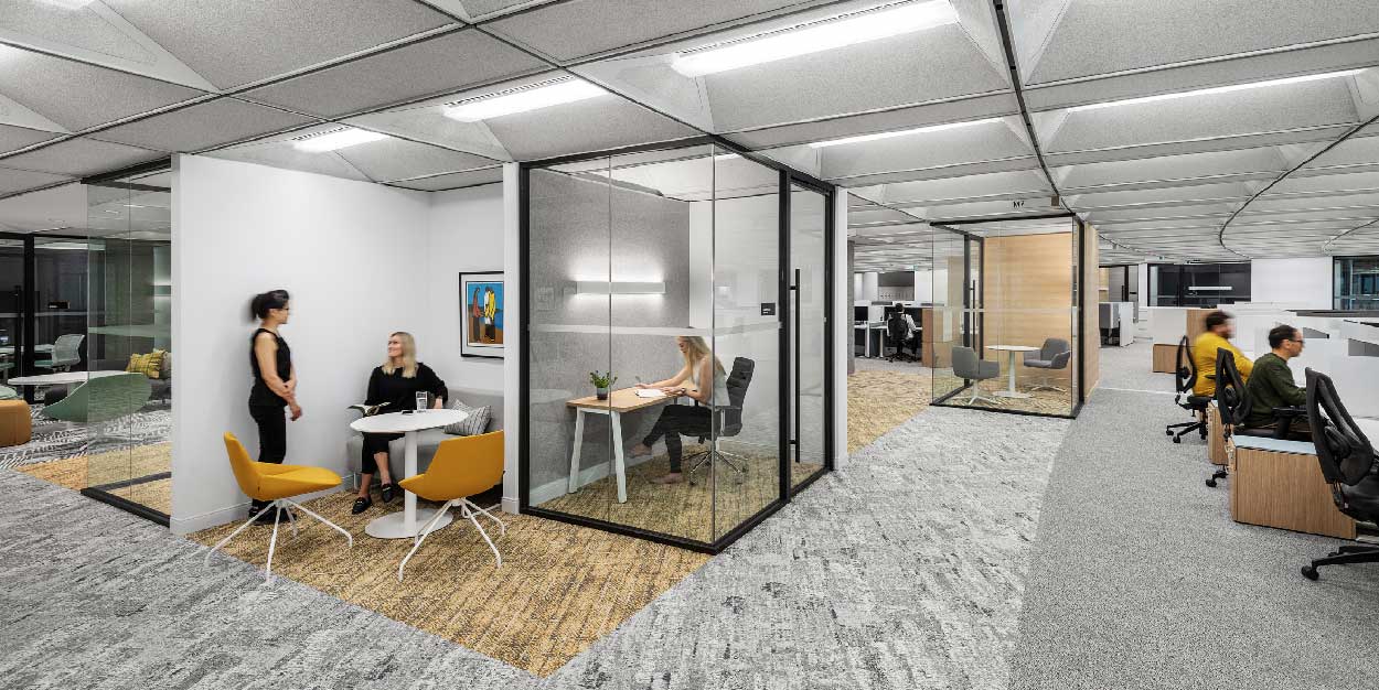
When AGF, an independent and diversified global asset management firm, was looking to
reimagine their Toronto headquarters, they engaged Figure3 to design a space that
embraced a hybrid work culture, and encouraged connectivity and collaboration across
both the physical and remote environments.
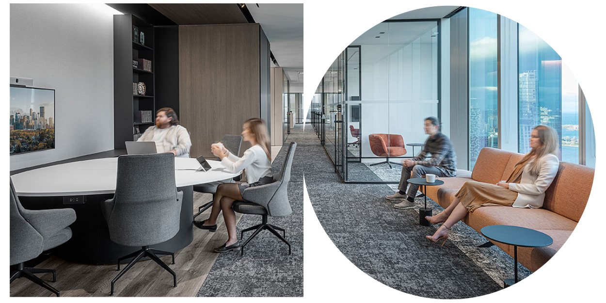
Working alongside Lora Goldberg, AGF Senior Vice President and Chief Technology Officer,
Figure3 explored the ways in which key teams interact within the physical office, an exercise
that would identify four unique types of spaces to address different needs: public waiting
rooms, front-of-house rooms to host clients, back-of-house internal meeting rooms, and less
formal collaborative spaces. Key insights from the exercise helped to define the furniture,
tools, technology, and acoustic considerations required to support an equitable experience.
The result of the new AGF head office is a functional, innovative space that aims to create
seamless connection whether employees are working from the office, home, or outside of
the organization.
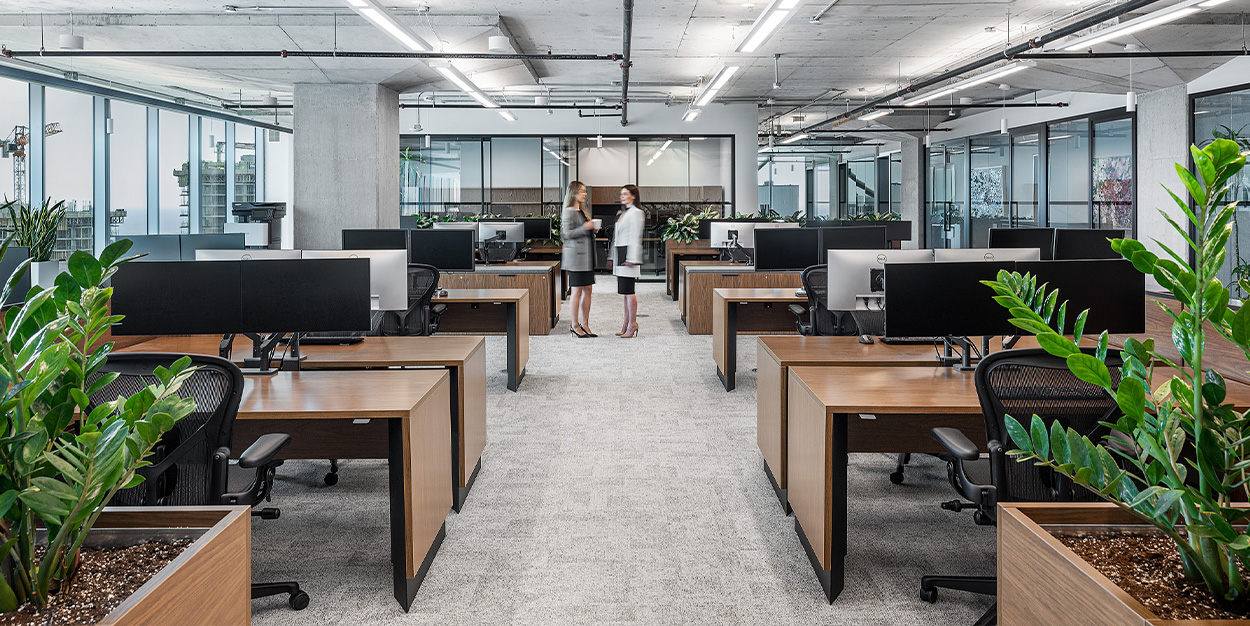
Improving employee wellness, productivity and retention while breaking down the boundaries
within the physical space.
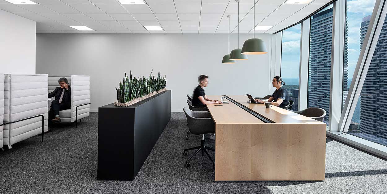
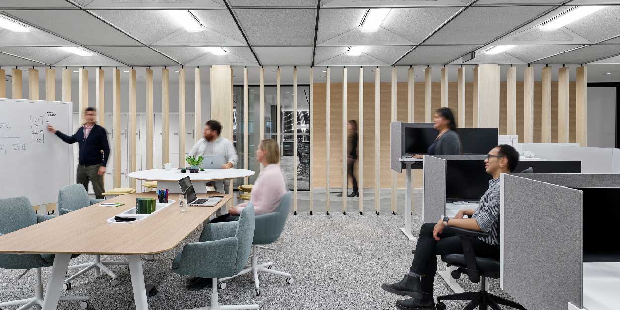
At Manulife’s Canadian head office in Waterloo, a major shift was taking place as they
looked to modernize five existing floors of office space, while the staff of 2,500 carried on
with their daily work.
The Figure3 team approached Manulife’s reimagined campus design with a focus on wellness
and how the physical environment could support the users intended to it. Employing a
collaborative, discovery-based approach, the team developed a master plan that would
propel Manulife from an assigned workstation culture to an activity-based model; inspiring
improved internal collaboration and connectivity as well as supporting a balanced and
equitable, hybrid work environment.
“Employees will naturally use the space
if you design it correctly”
/ Suzanne Wilkinson, Figure3 Principal
When designing for an equitable hybrid work environment, providing a host of unassigned,
or hoteling desks that help reinforce a sense of placemaking for hybrid employees,
can greatly impact corporate culture and improve staff retention. This approach allows
users to function differently and come together to engage as their work requirements
necessitate. “Employees will naturally use the space if you design it correctly,” Wilkinson
notes.
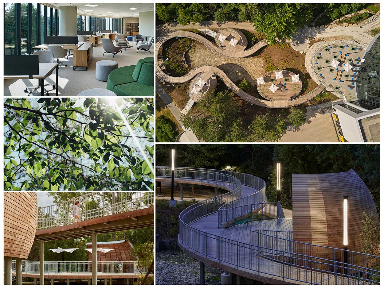
Just beyond the building walls, there is an extensive network of outdoor pods set
amongst a stunning natural landscape. The pods are Wi-Fi equipped, allowing staff to not
only take an outdoor break, but also to work in an outdoor environment that would continue
to support their productivity. The campus design encourages movement and provides
the ability for employees to work close to and within nature.
Amenities are a huge draw for employees, but work flexibility has become just as important
in a world transformed by COVID-19. The pandemic has shifted people’s attitudes and
preferences toward work. The progressive direction Figure3 took with Manulife exhibits an
approach to post-pandemic planning and design of space only now being tested and
considered for adoption by other companies.
Focusing on the social benefits, and infusing hospitality-inspired amenities in order to
improve collaboration and connectivity when in-office.
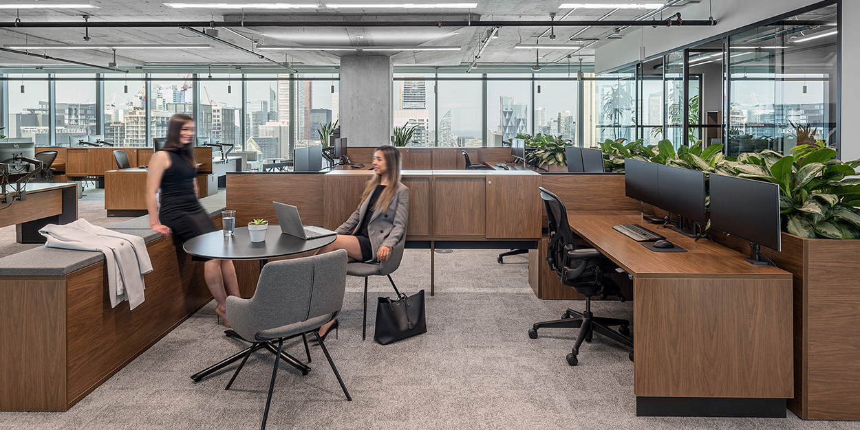
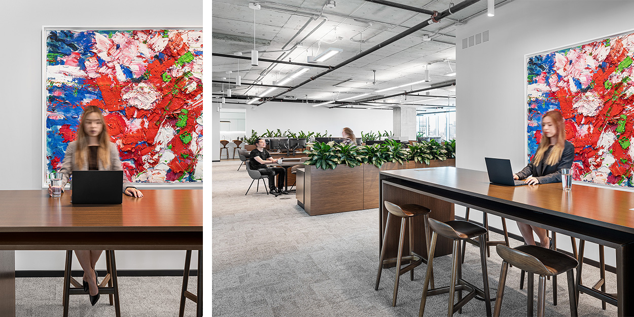
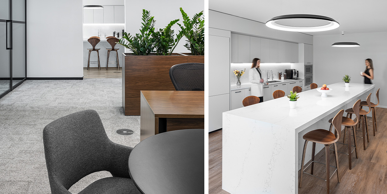
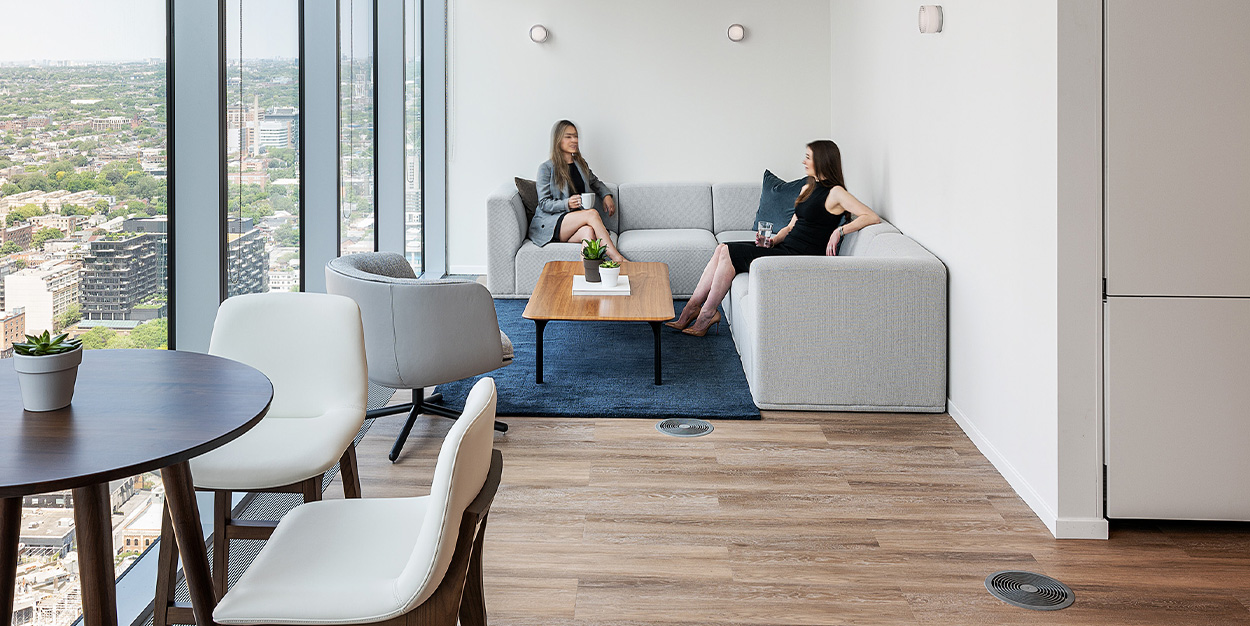
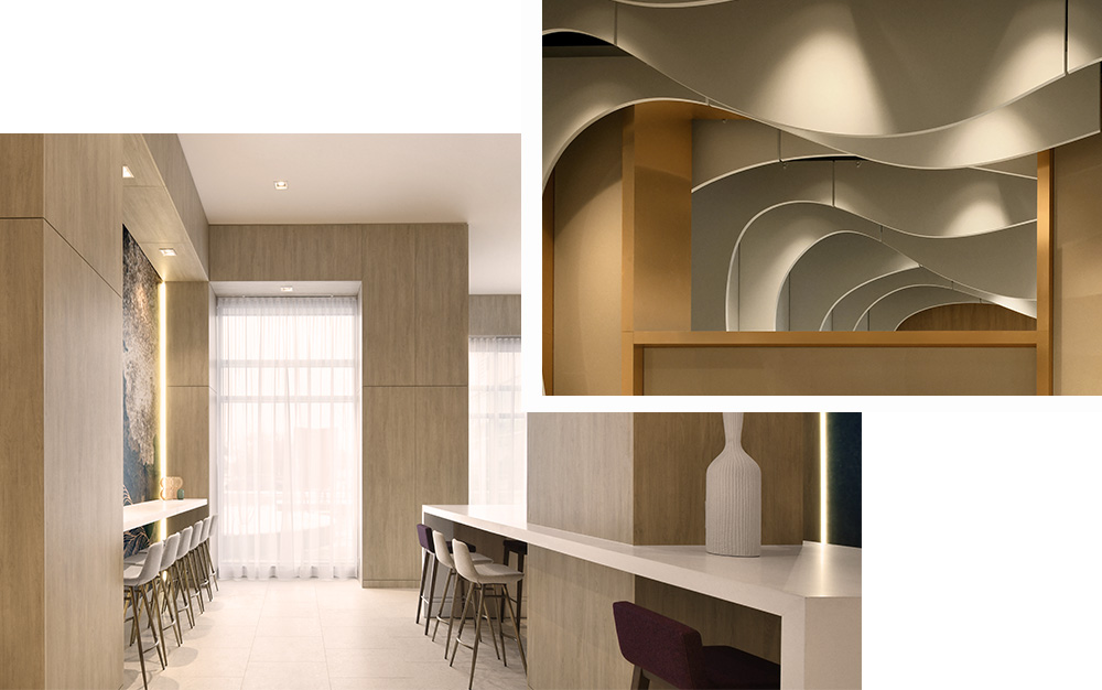
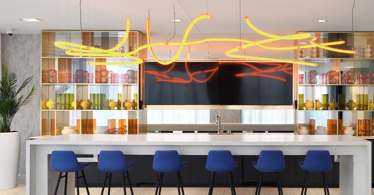
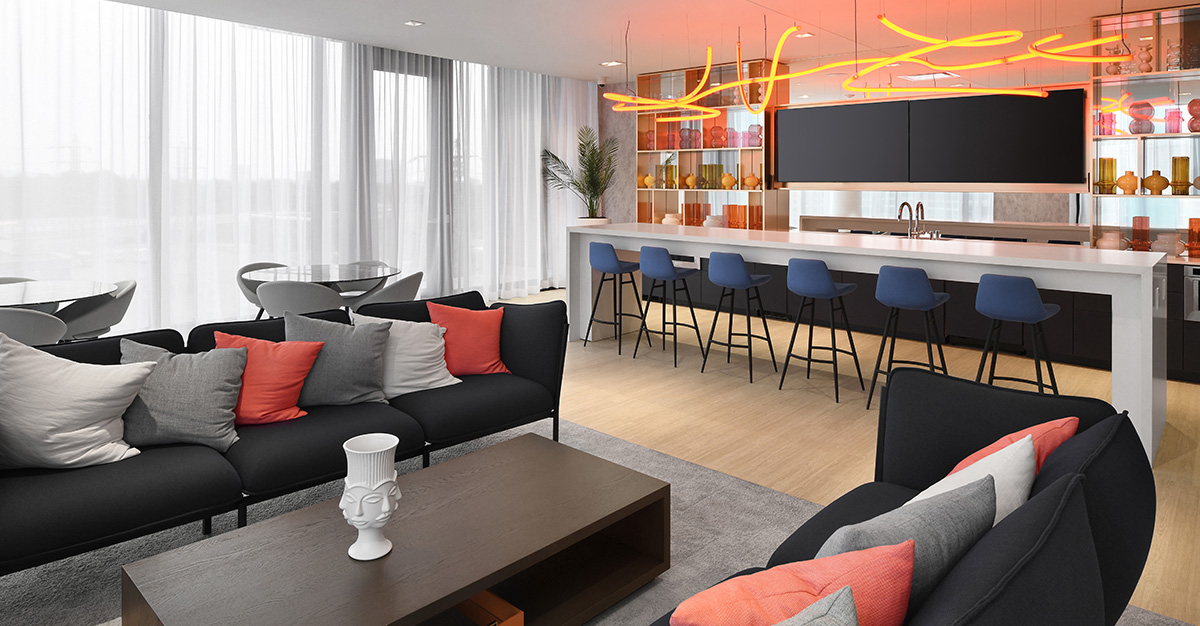
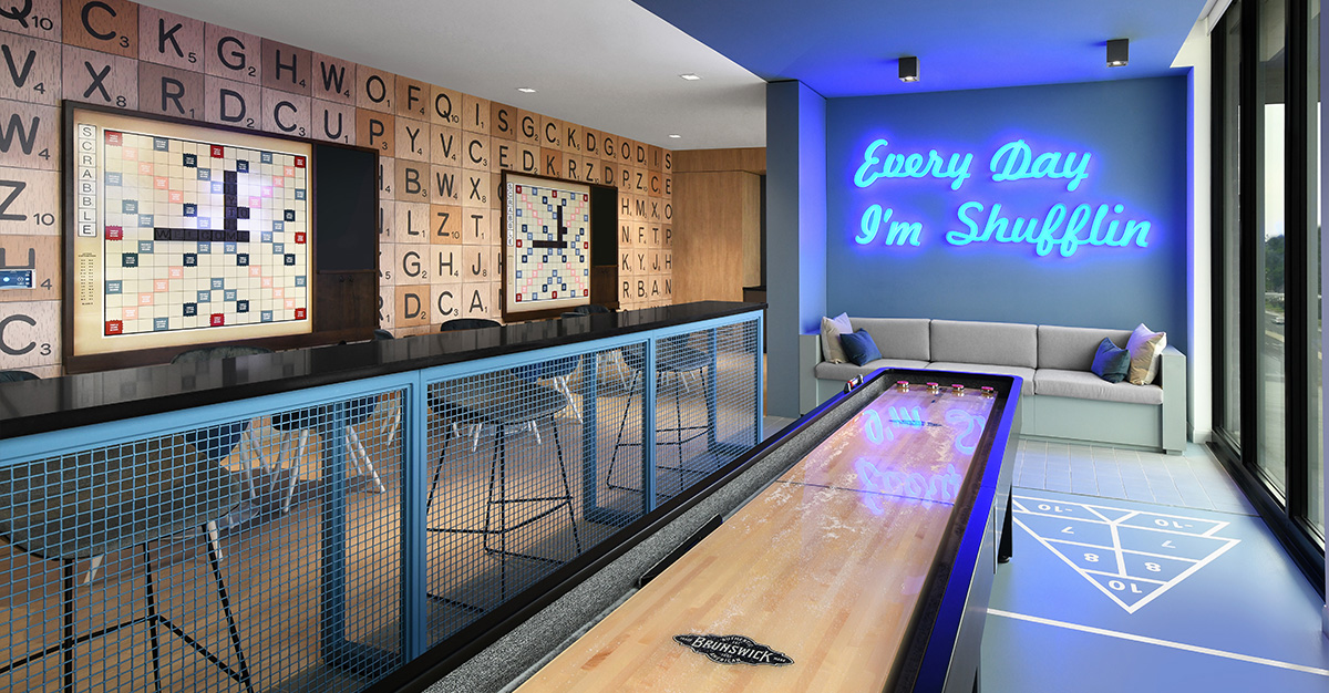
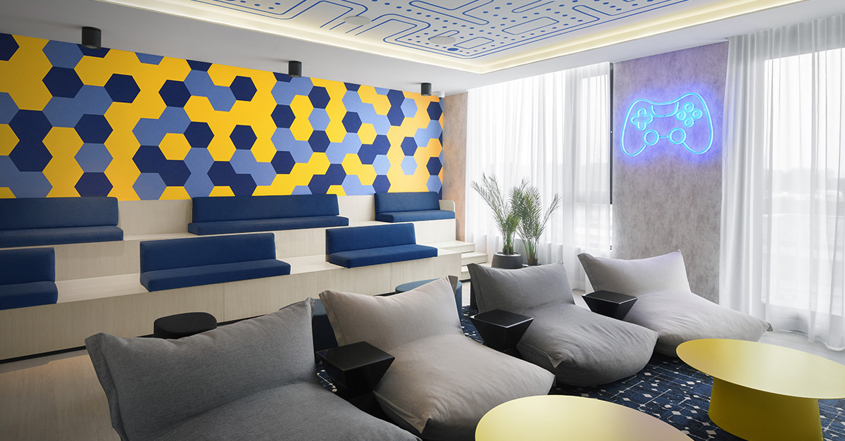
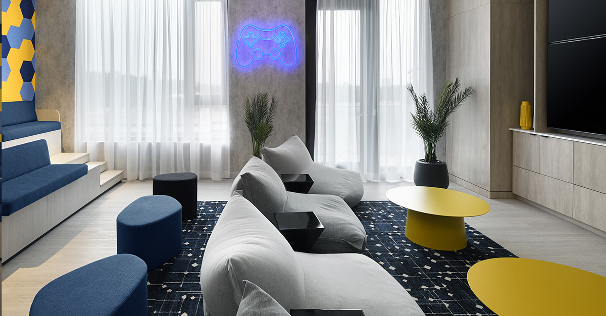
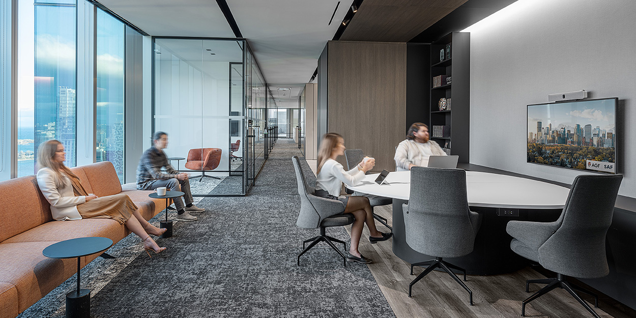
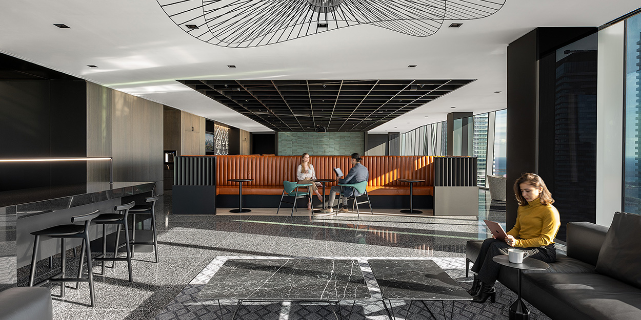
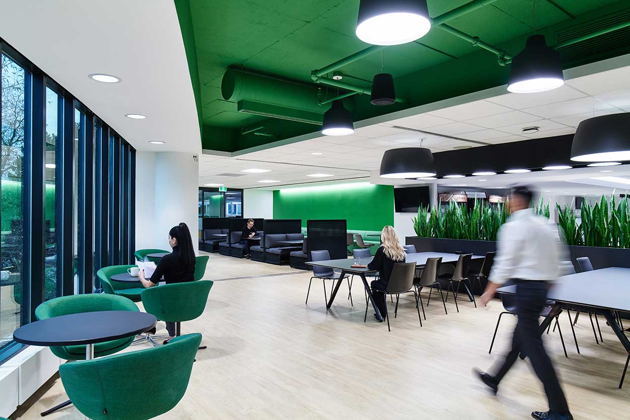
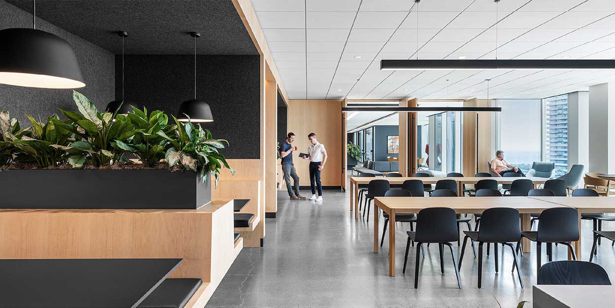
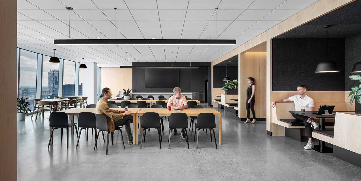
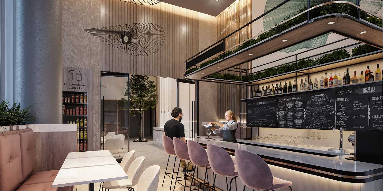
Communal, multifunctional social spaces are becoming integral for the modern hybrid
office, to encourage positive team dynamics and more productive working relationships
regardless of location. Flexibility is at the core of the layout, allowing for the space to
adapt and transform based on the needs of the team.
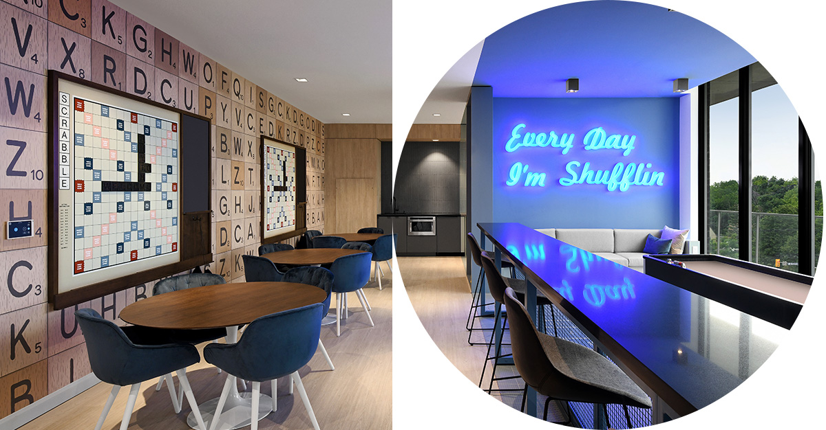
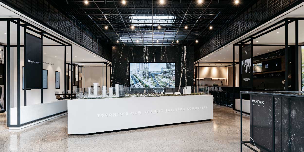
When Bond Brand, a company that focuses on creating customer centric growth for their
clients, was looking to move their operation from Mississauga to downtown Toronto, they
engaged Figure3 to design a space that supports a hybrid work model, encourages
collaboration, and celebrates the character and values of their brand.
As you move through Bond Brand Loyalty’s new downtown Toronto office the playful,
flexible space unfolds into a highly collaborative environment that aims to translate loyalty
into the physical space.
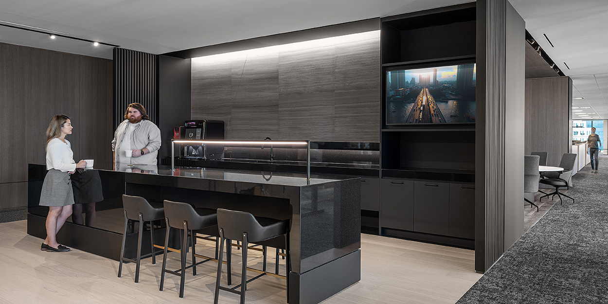
On the 20th floor, a unique social space features a café, equipped with audio visual capabilities
to provide multifunctional use as well as booth seating, and harvest tables providing
a hospitality feel. The café provides the perfect hub for social interactions and casual
meetings.

The idea of collaboration, and how loyalty evolves through this process was key to the design.
Understanding how client relationships strengthen through Bond Brand’s process, Figure3
delivered a space that could unfold to support that progression. The deeper the relationship
Bond Brand has with their client the more integrated they become in their day-to-day workplace
activities. They become more integrated into their business and therefore more present
in the physical space.
In the new era of work, one thing is clear, the importance of an equitable hybrid experience,
one that supports employee wellbeing, cannot be overstated. Companies that choose to invest
in their physical environment are seeing greater engagement rates, a stronger return to the
office, increased productivity, and reduced turnover.
If you’re interested in learning more about how a reimagined work environment can help support
your business, please email us at: opportunities@figure3.com
* The research was conducted between April 3, 2023, and April 14, 2023 and surveyed 9,500 employees and 6,650 business leaders from across 17 countries.