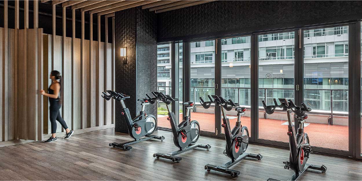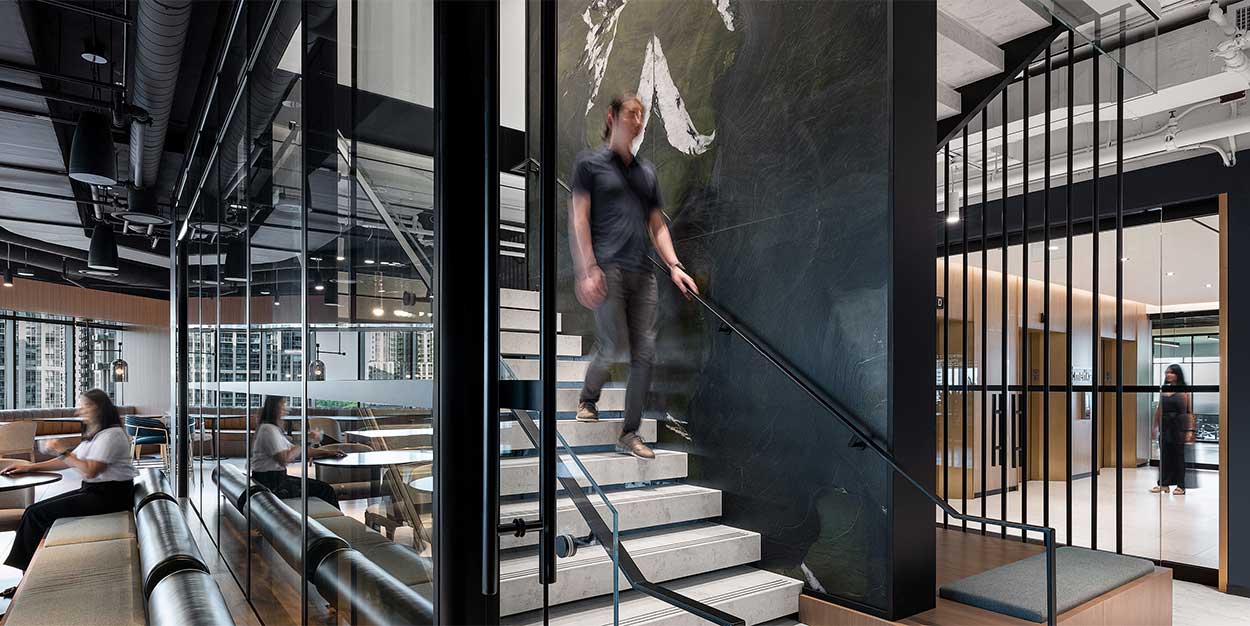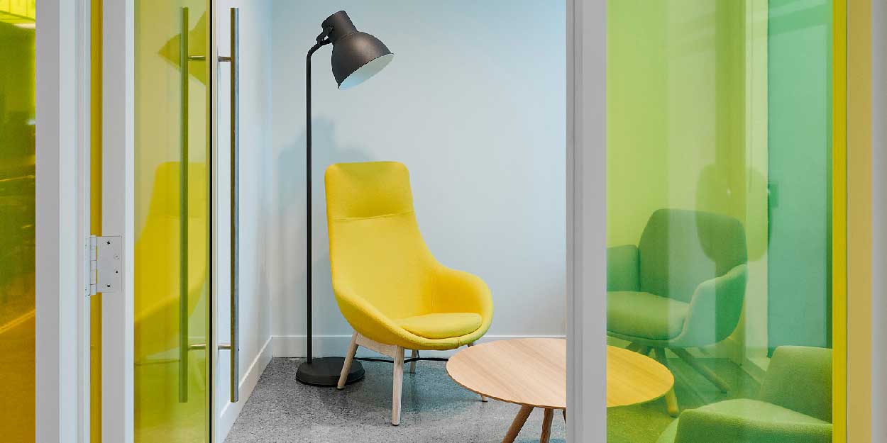
ALL
NATURAL
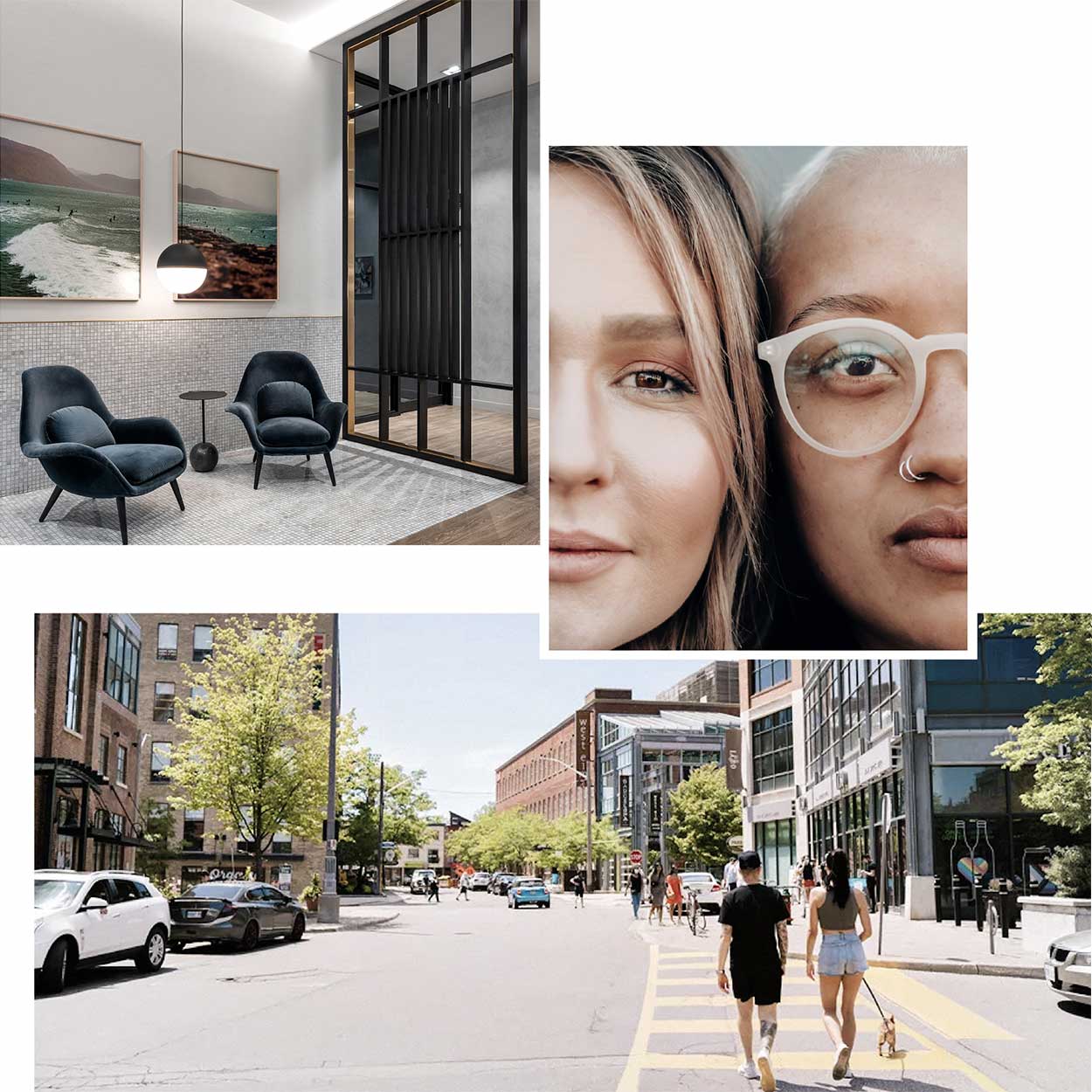
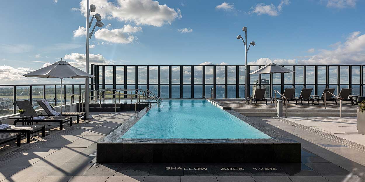
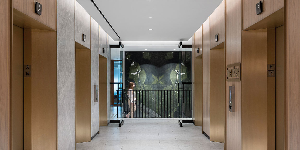
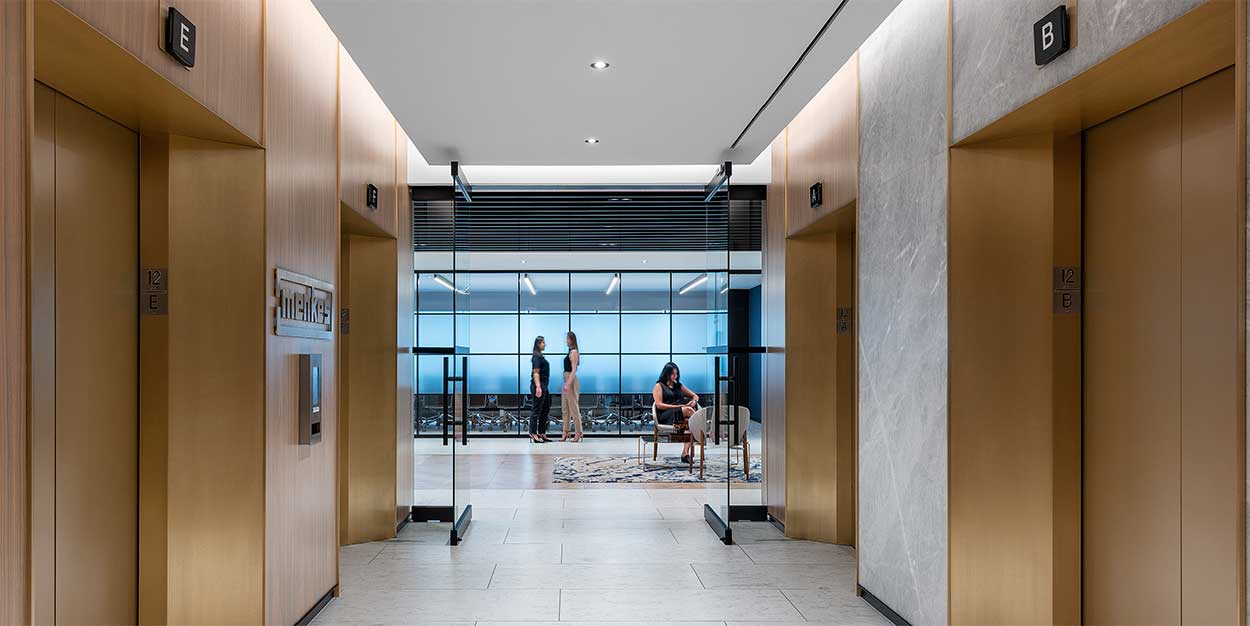
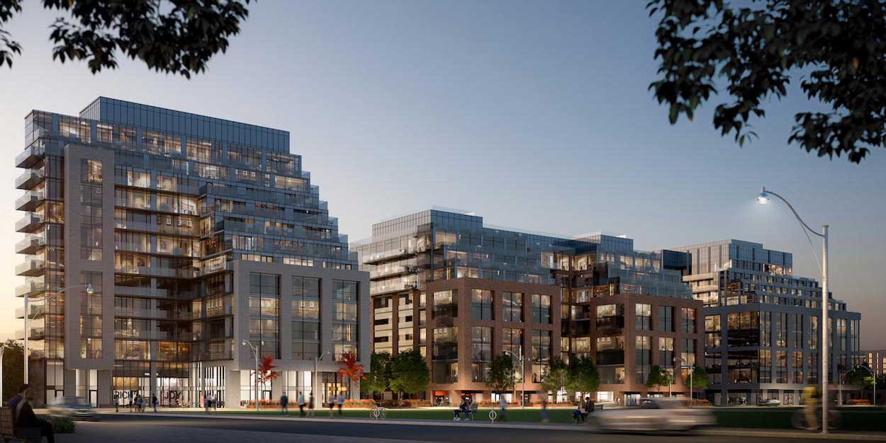
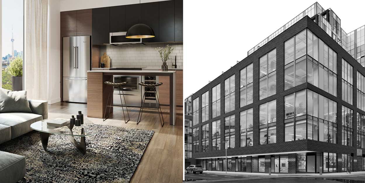
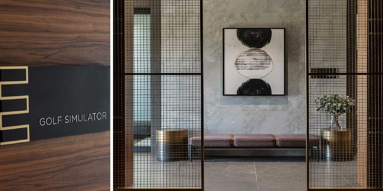
When Figure3 embarked on the BUCA Vaughan project, they aimed to seamlessly integrate a culinary destination within a burgeoning residential landscape. Their collaboration with King Street Food Company, the parent company of BUCA, set the stage for a transformative experience that would redefine the intersection of residential luxury and culinary indulgence. As the interior designers of both the condo and restaurant spaces, Figure3 established a cohesive flow that emphasizes the unique connection between these spaces, bringing energy to the condo lobby and community to the restaurant experience.
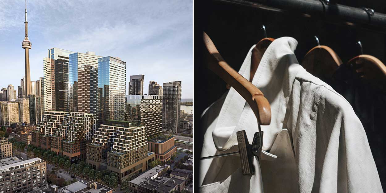
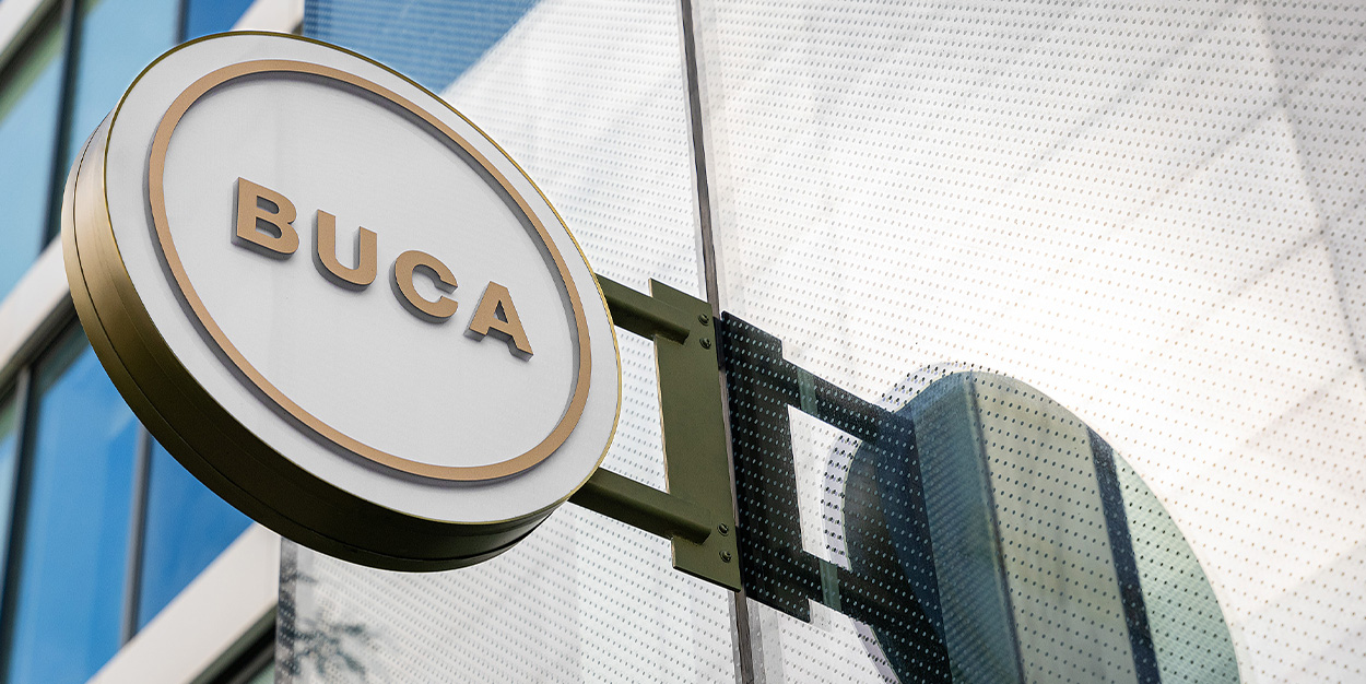
Approaching BUCA Vaughan, visitors are immediately captivated by its sleek and inviting exterior. The project was envisioned as more than just a restaurant; it was conceived as a lifestyle-driven destination within one of Vaughan’s first residential buildings. The decision to eschew conventional retail environments in favor of a café or restaurant was a strategic one, aimed at enhancing the community’s lifestyle.
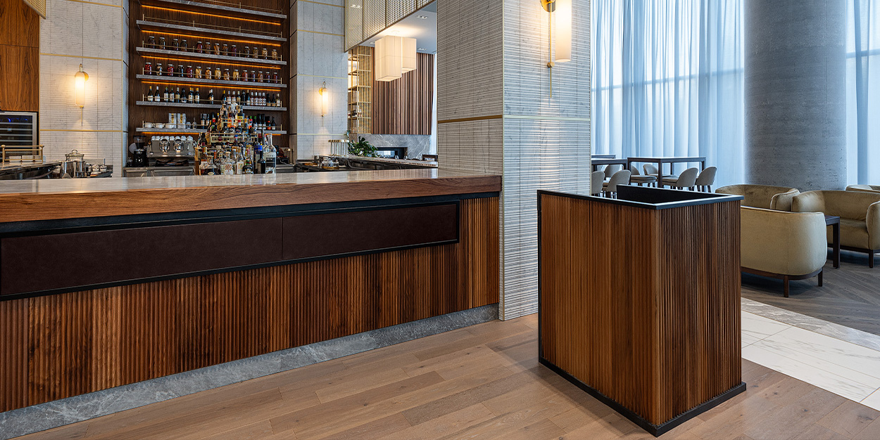
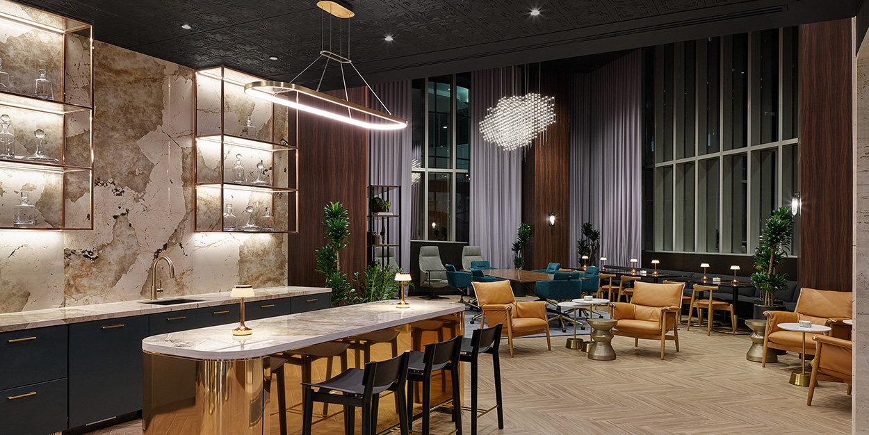
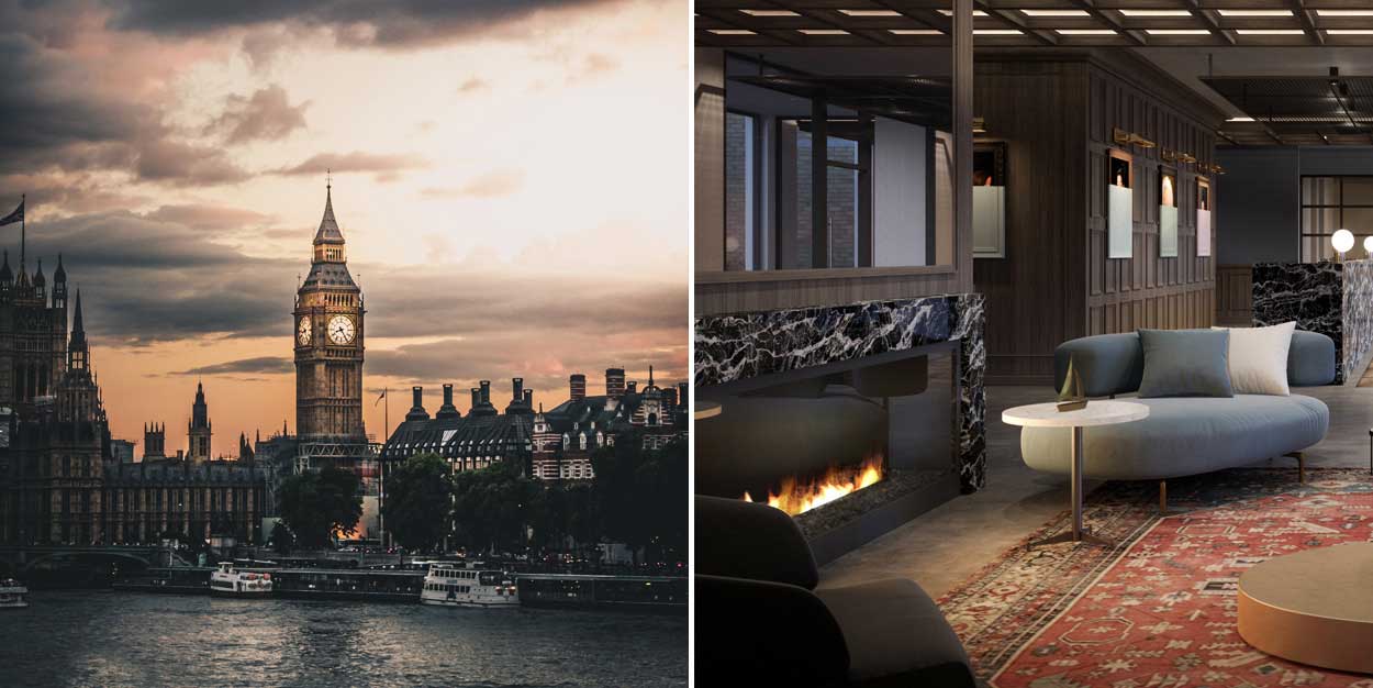
Through the windows, the open bar creates a standout moment as guests enter the condo, creating a distinct curb appeal that invites people to enter.
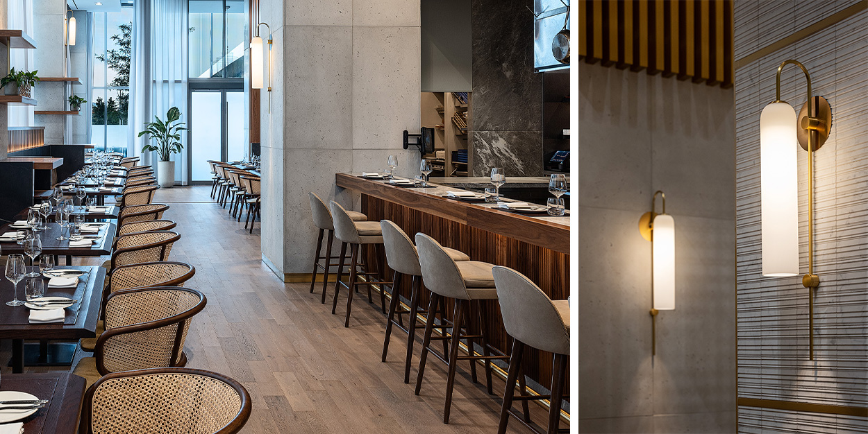
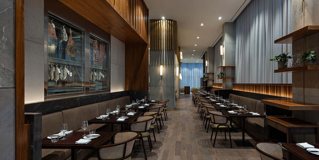
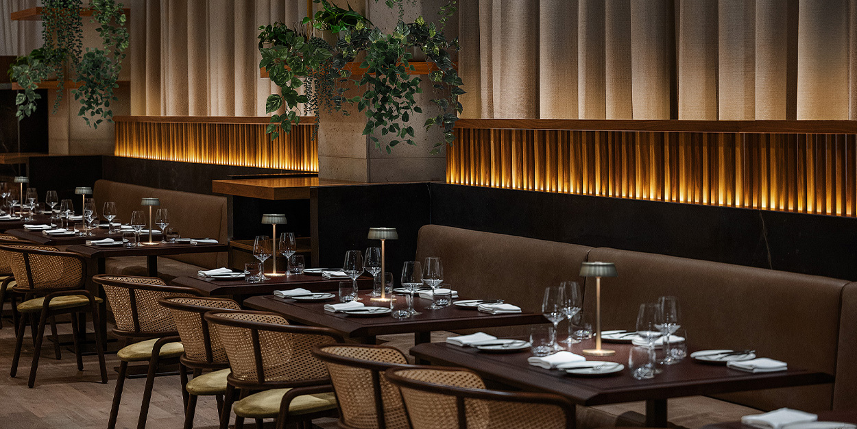
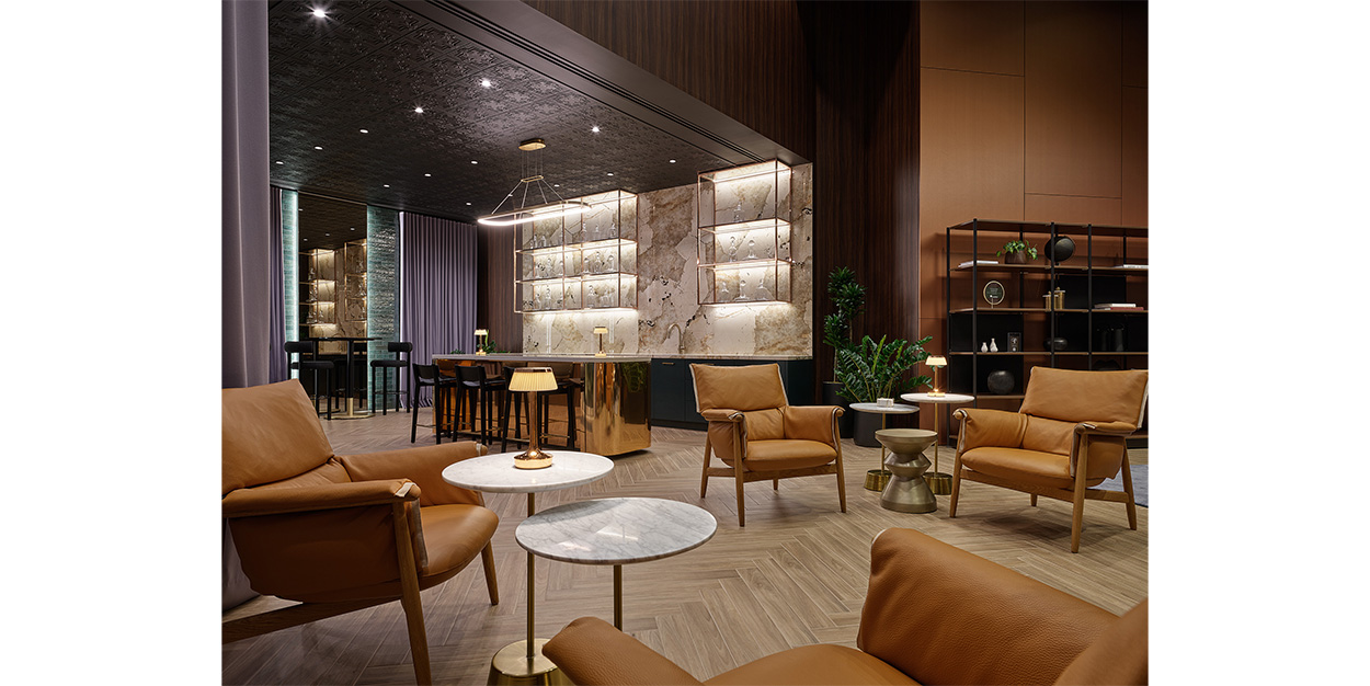
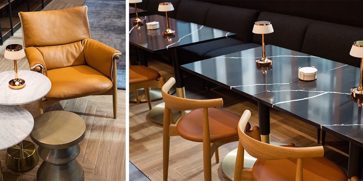
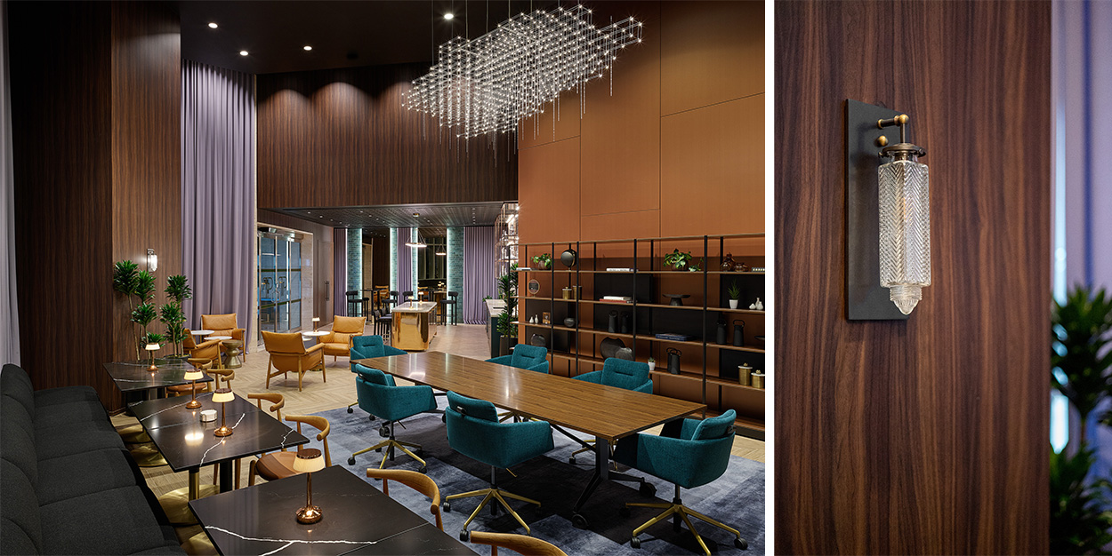
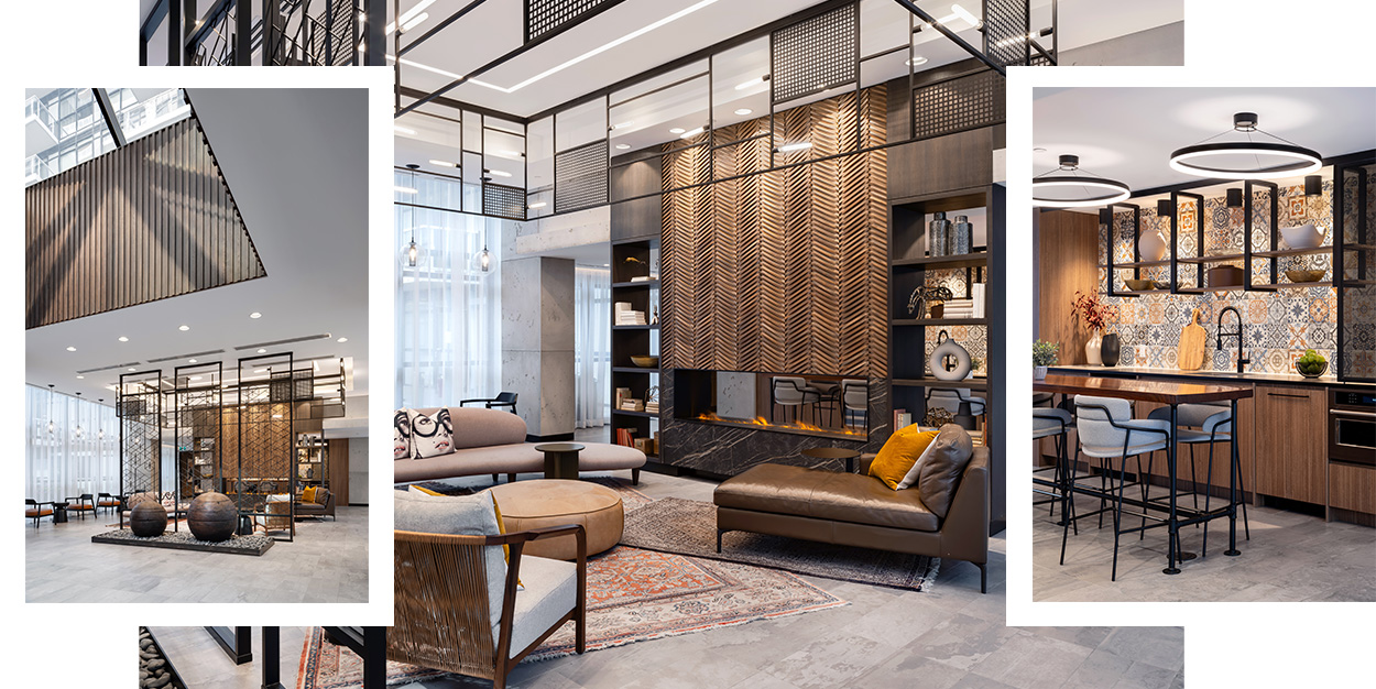
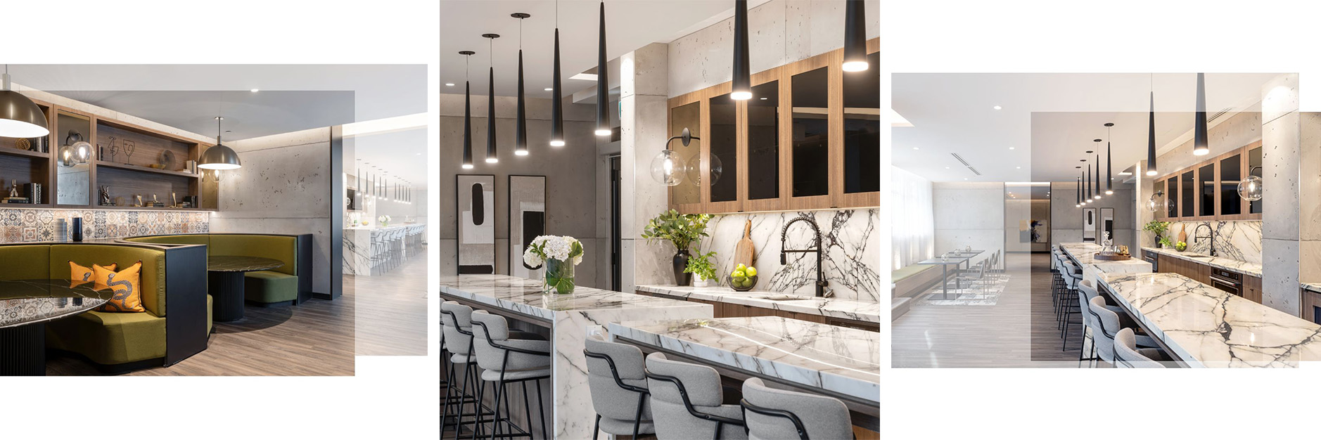
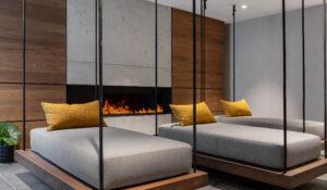
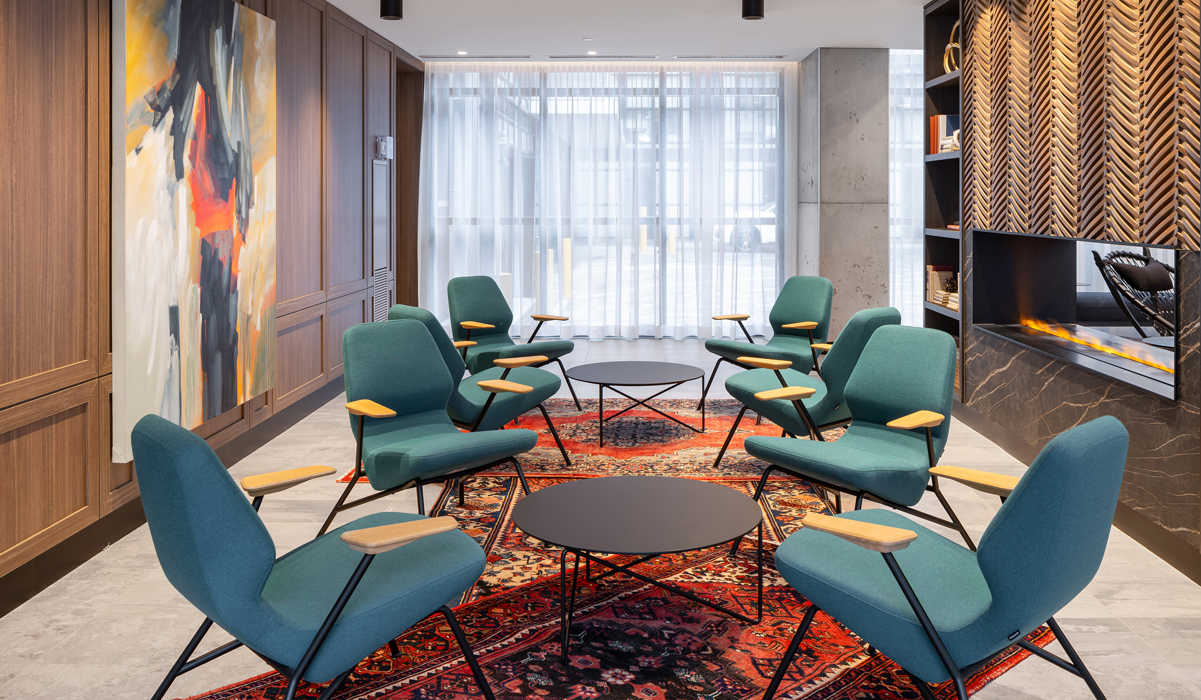
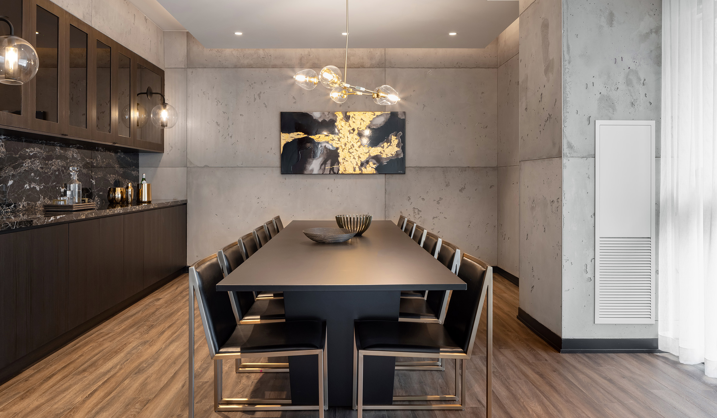
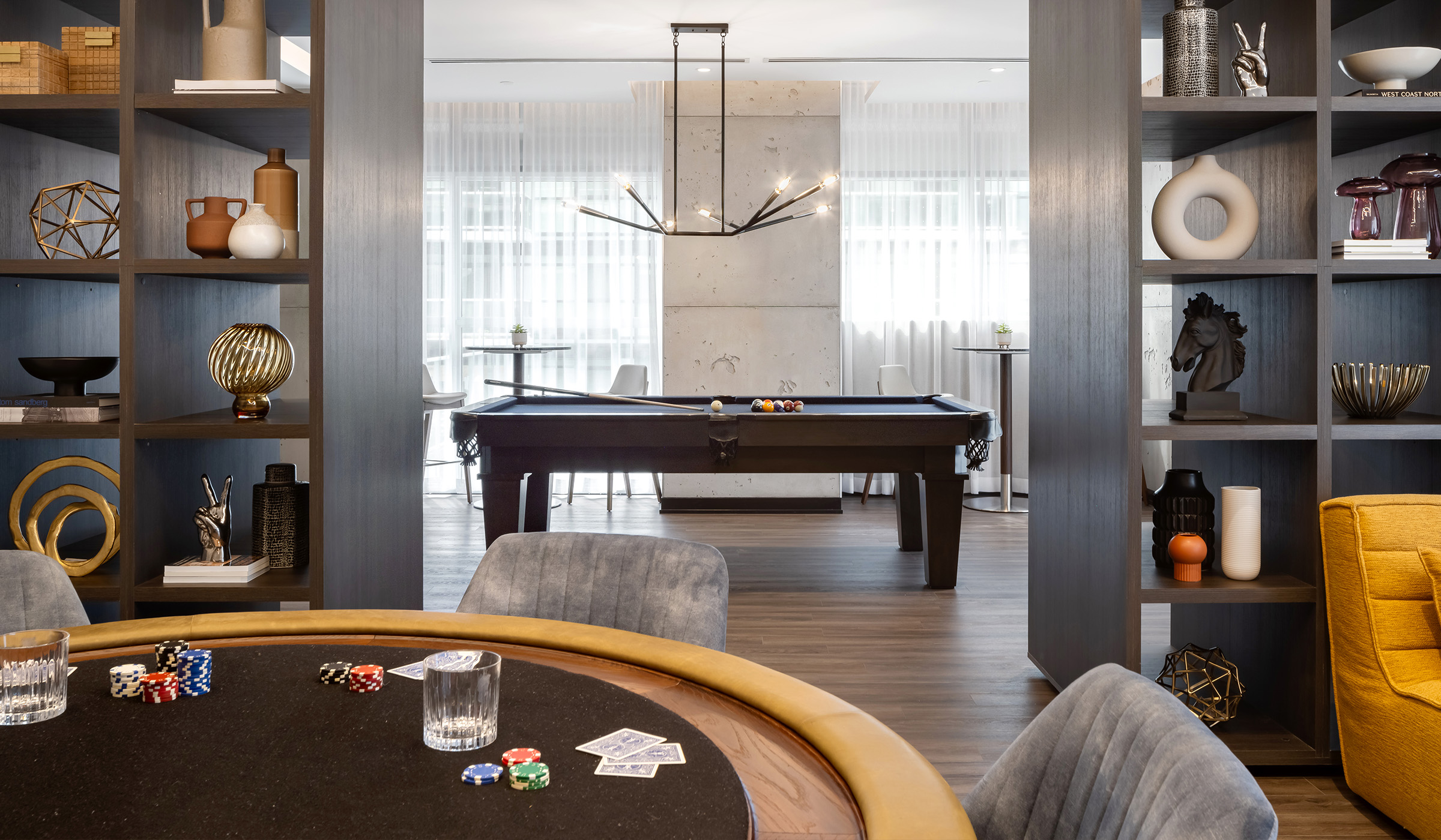
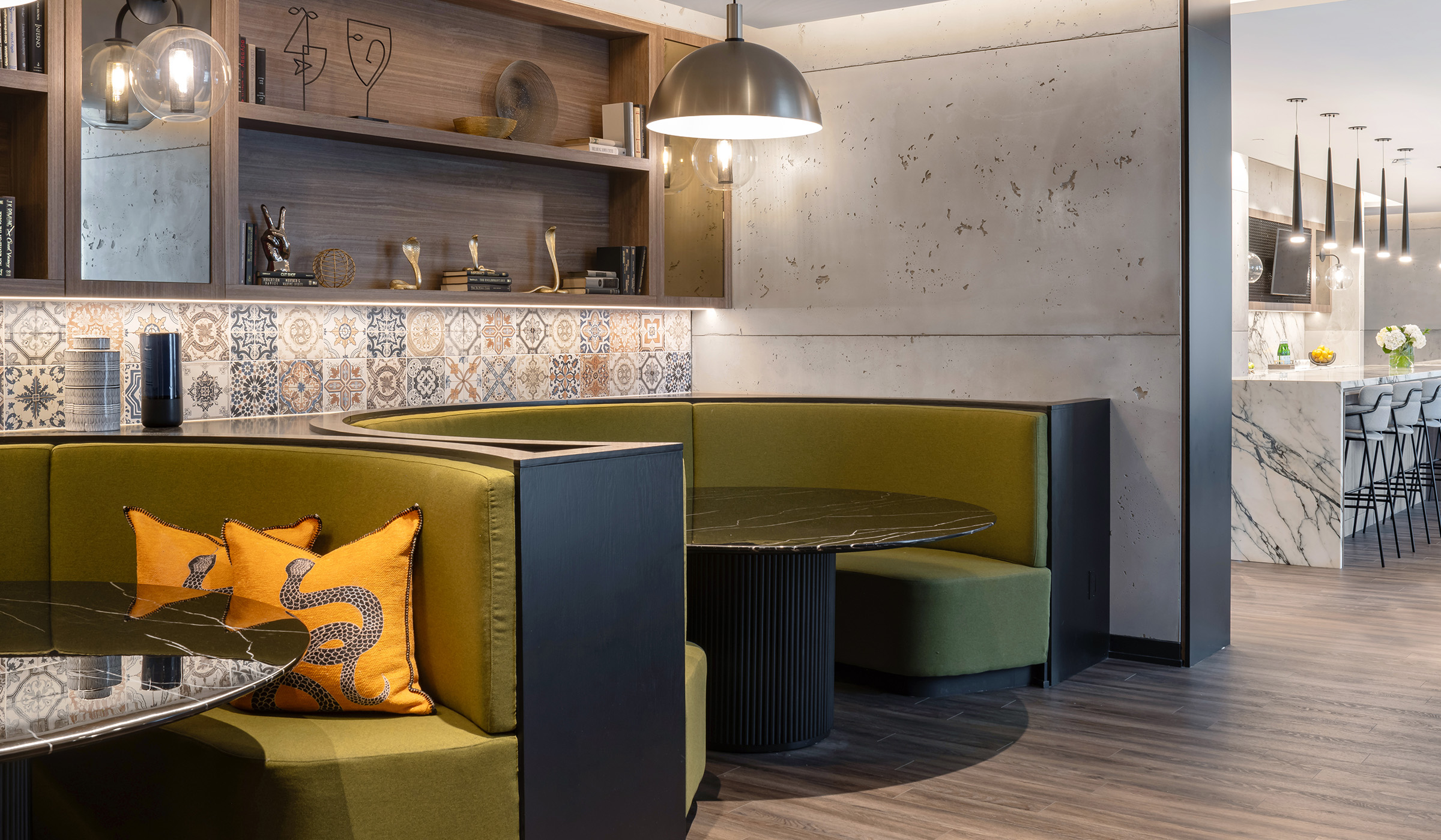
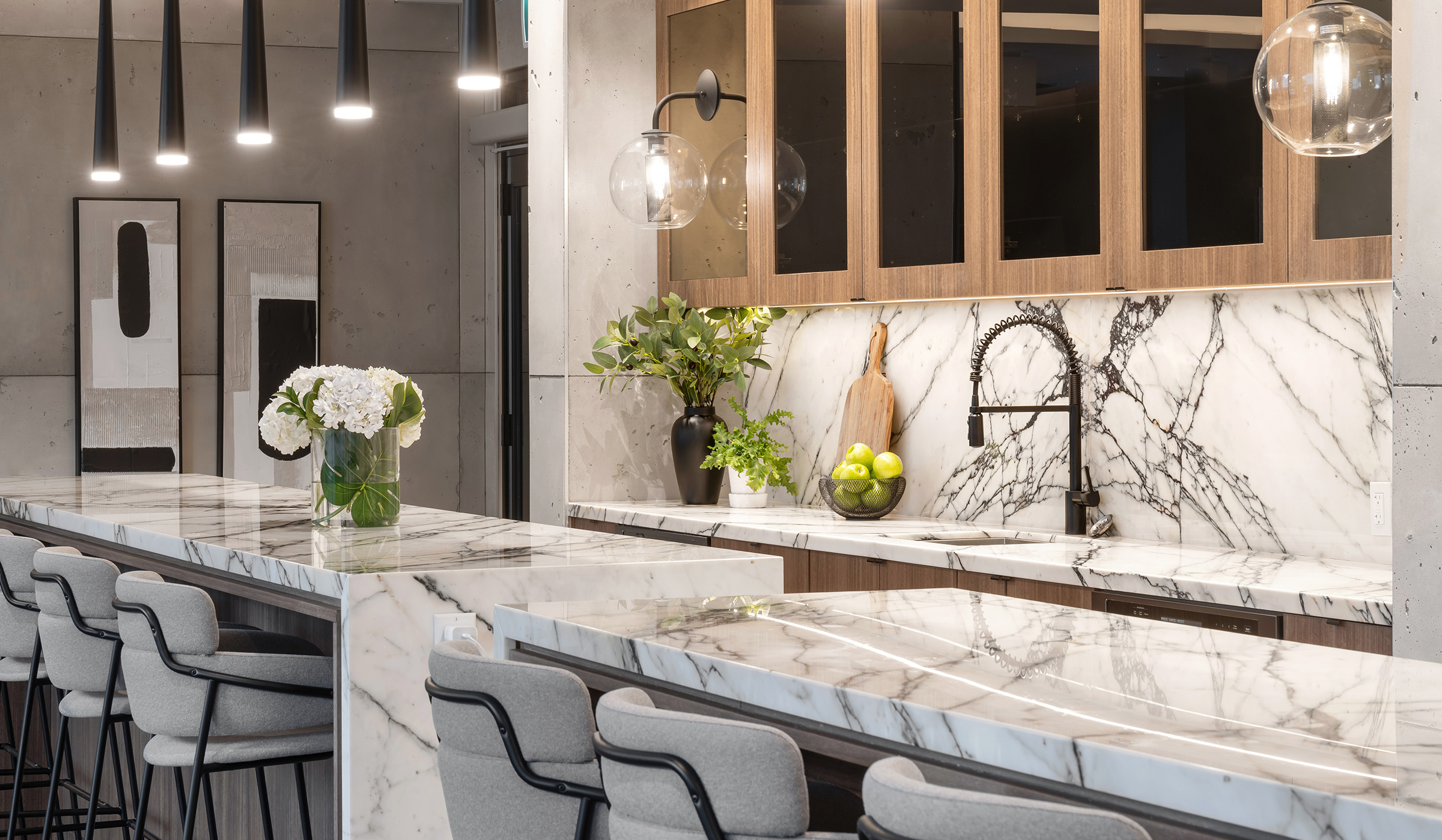
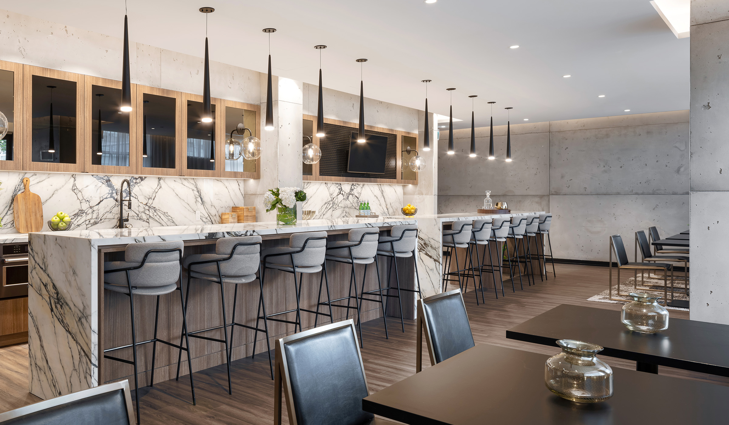
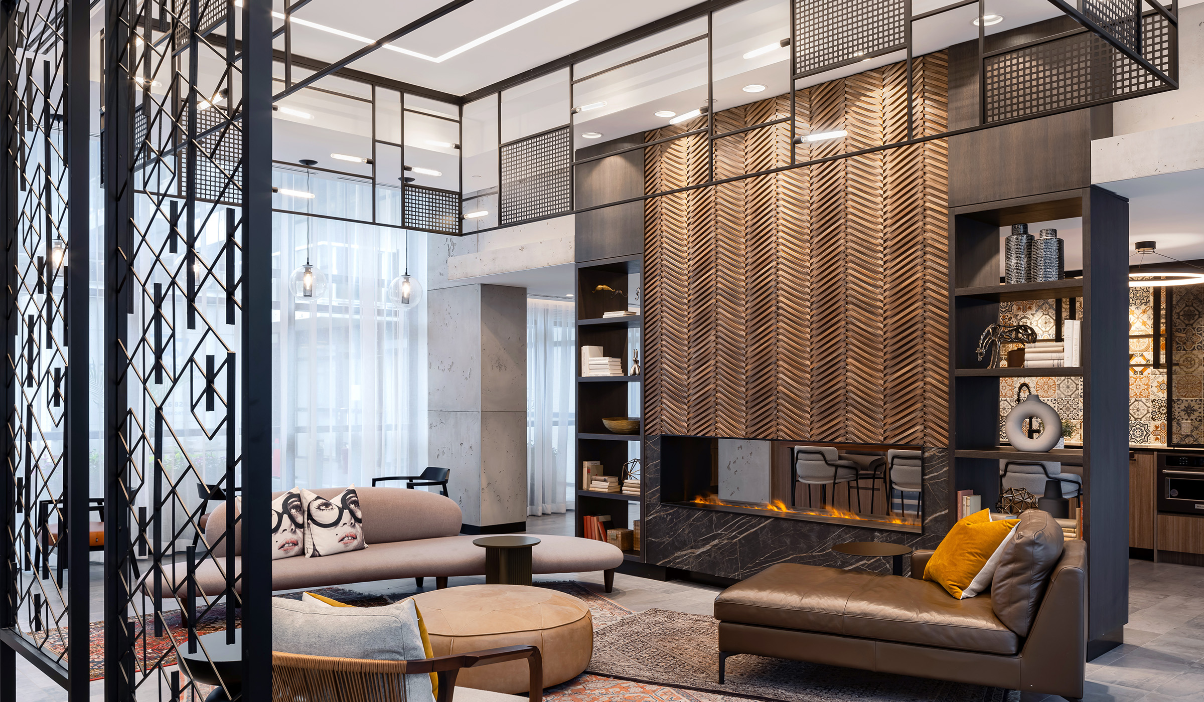
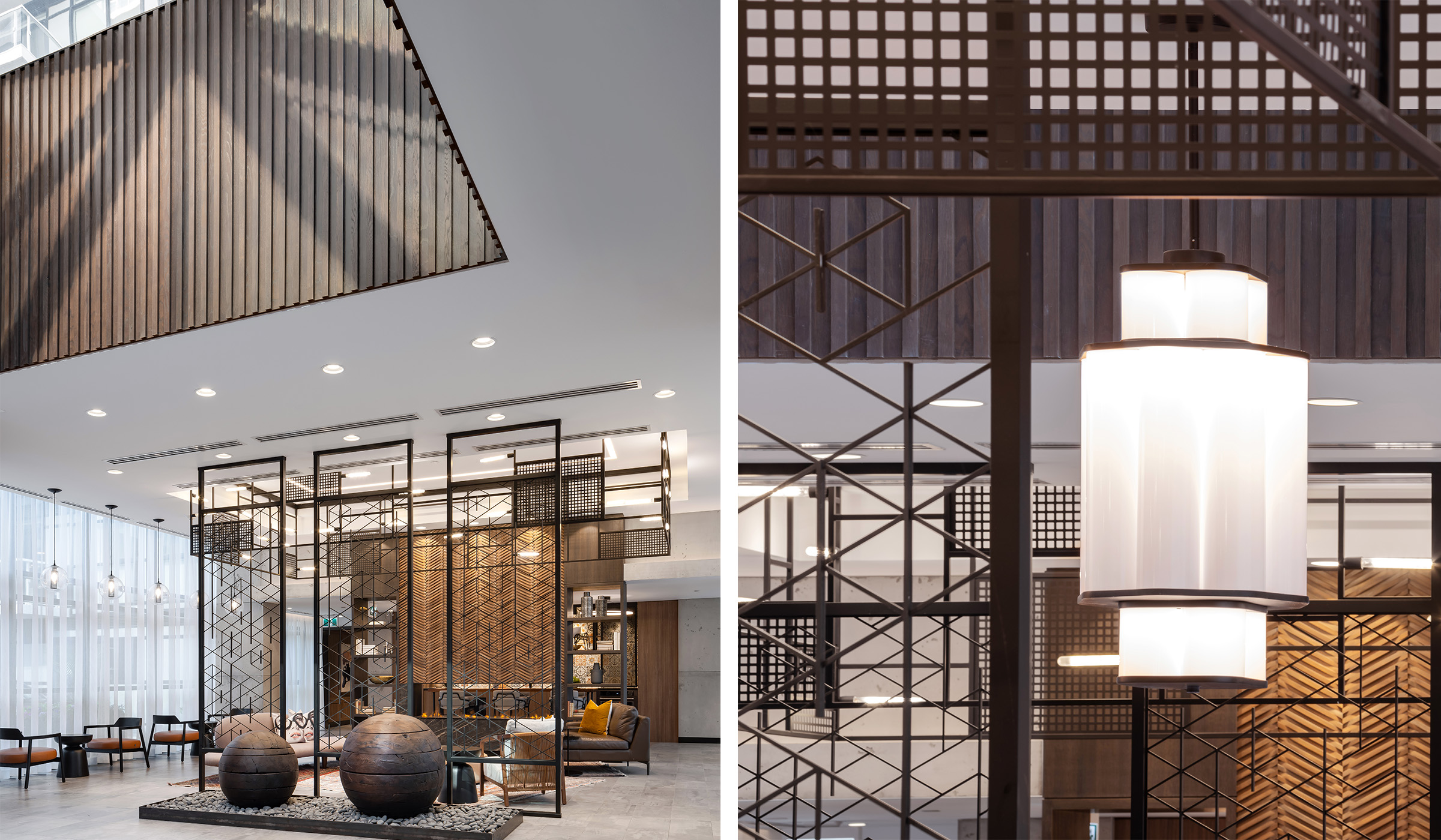
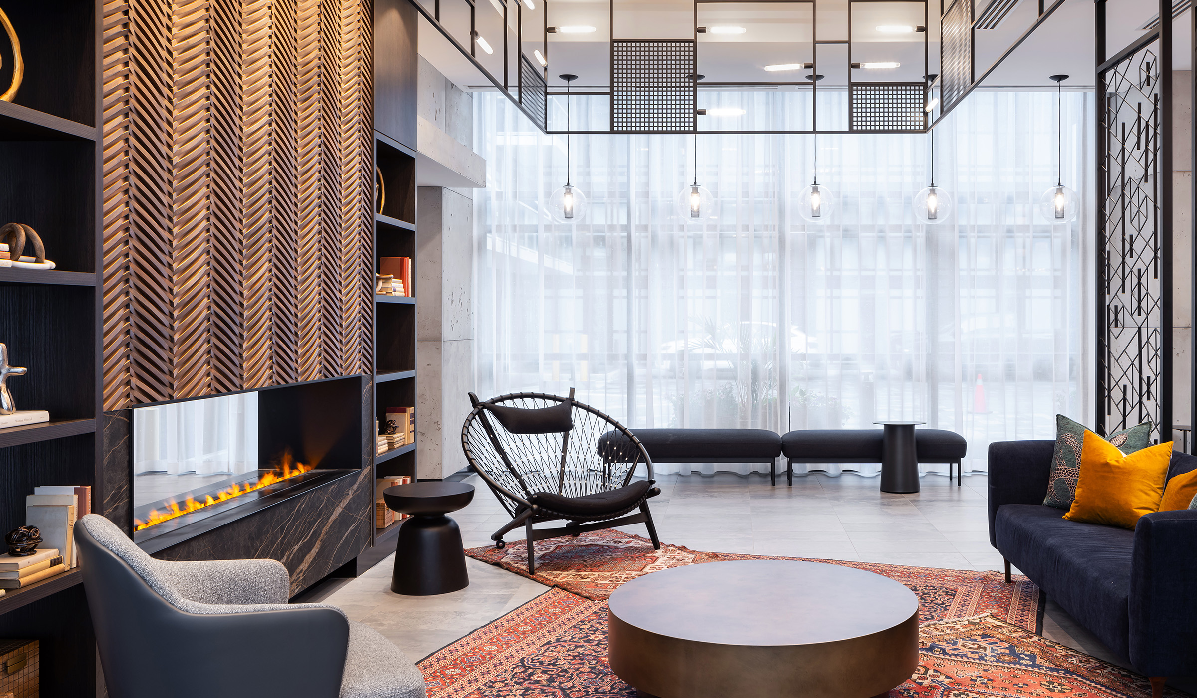
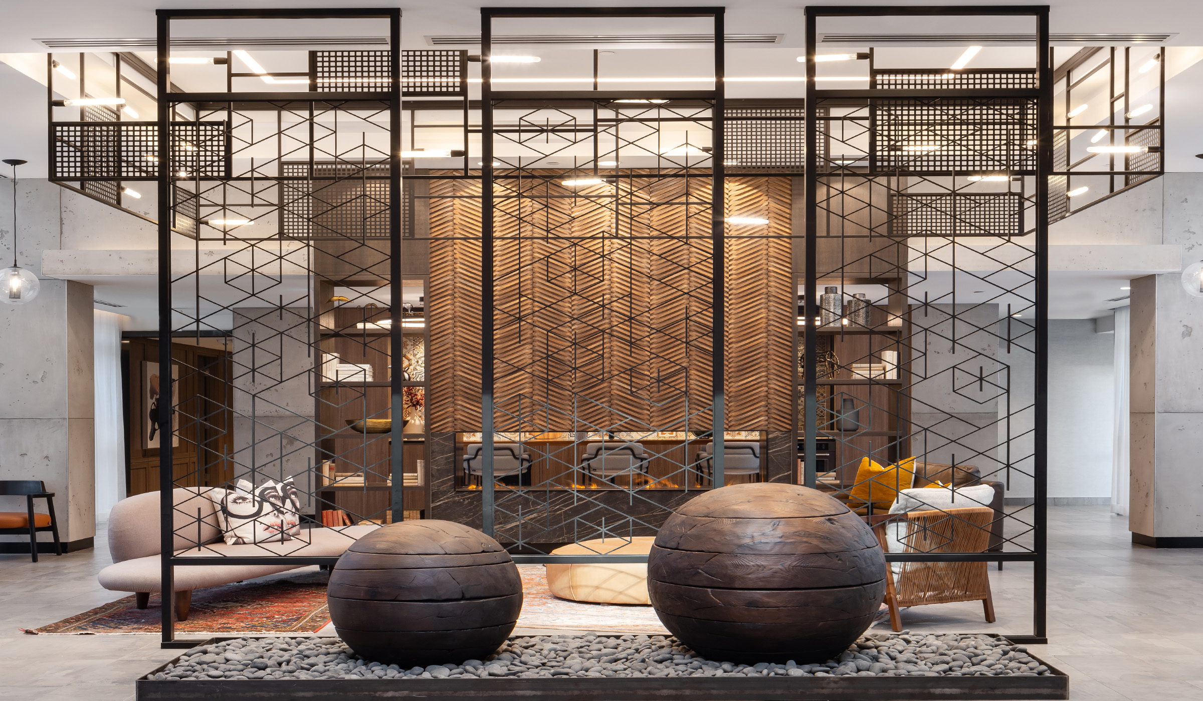
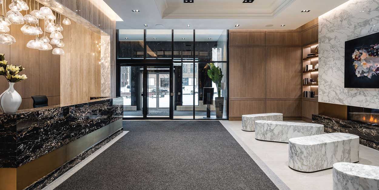
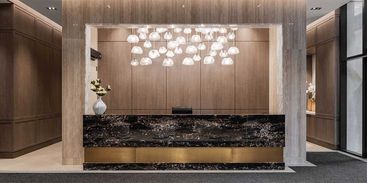
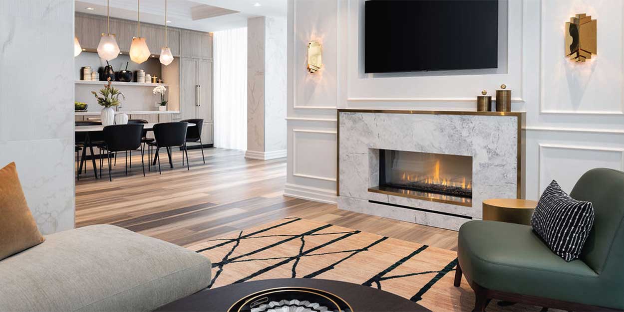
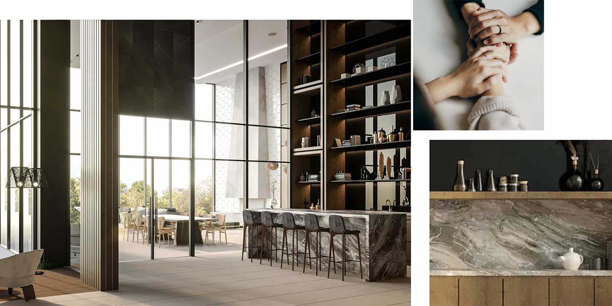
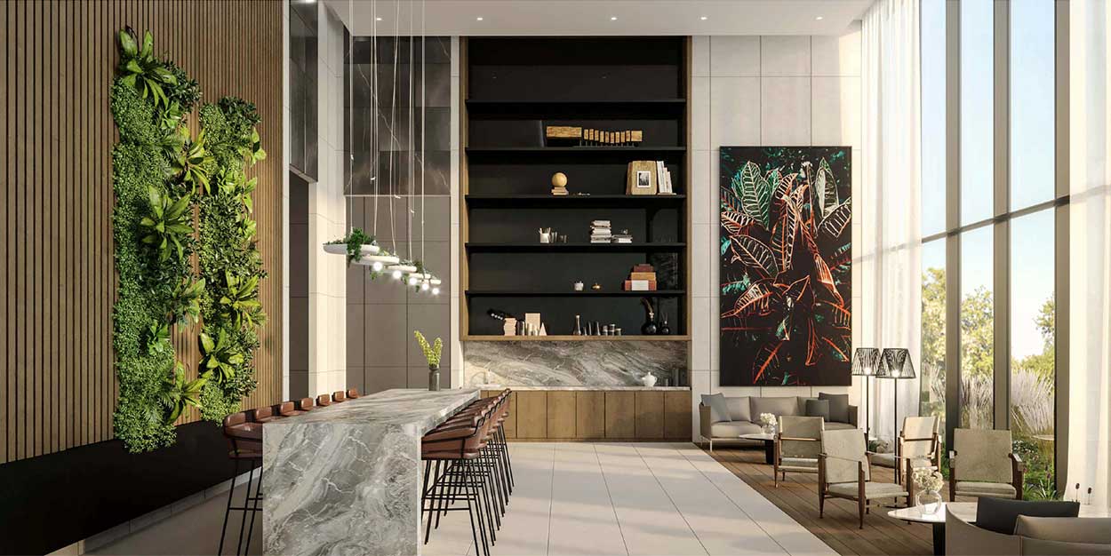
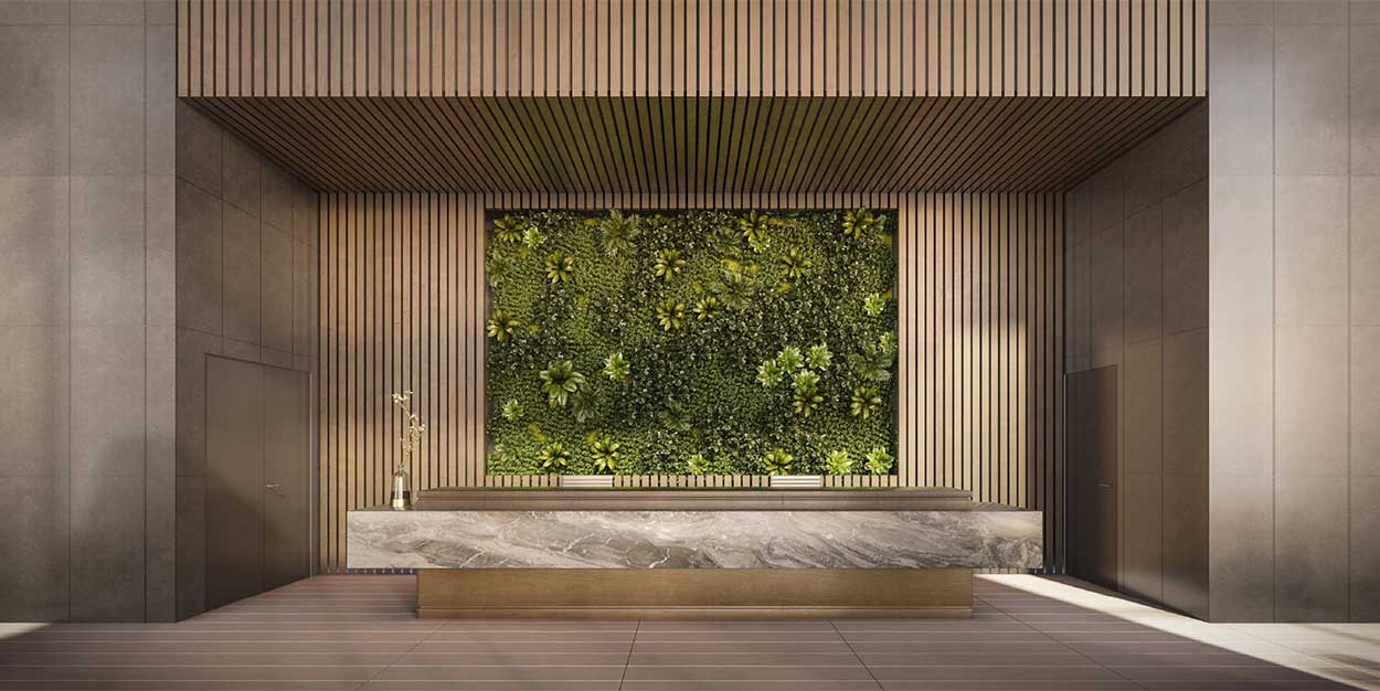
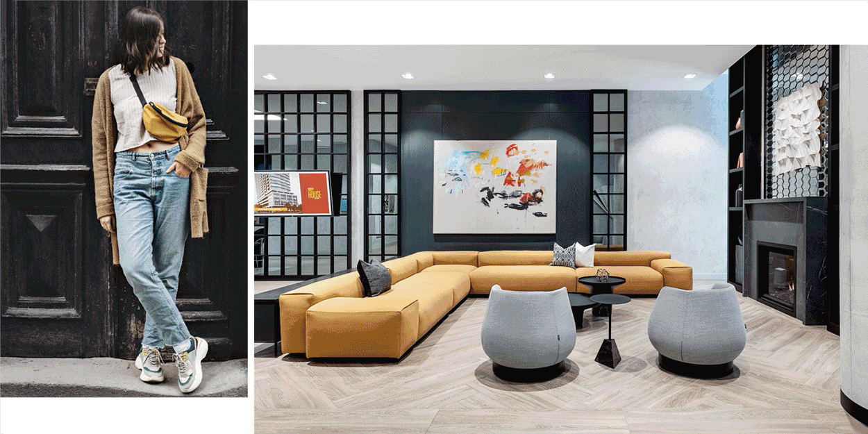
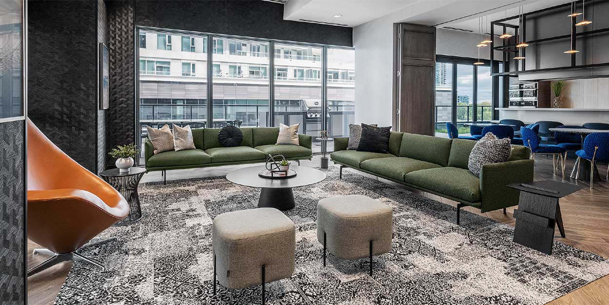
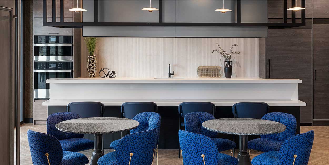
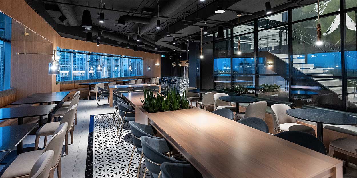
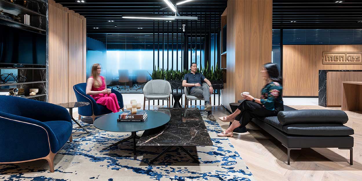
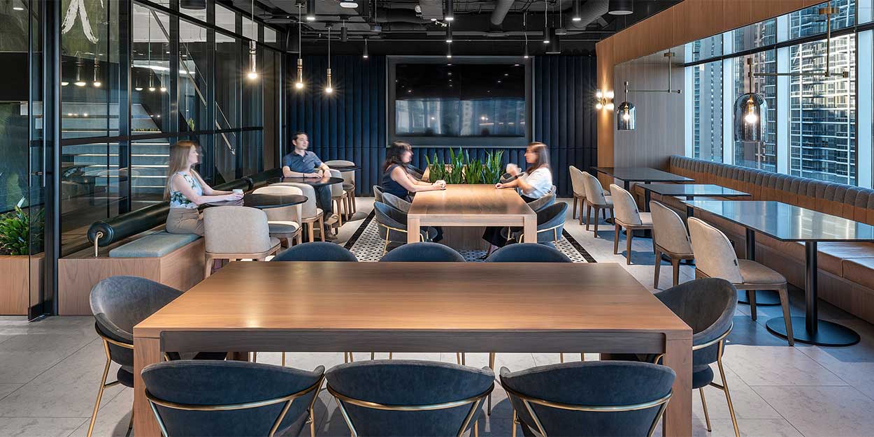
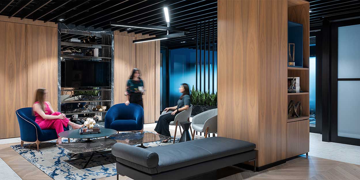
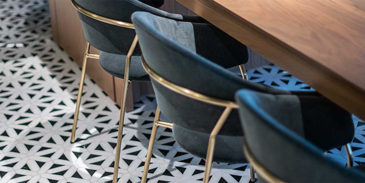
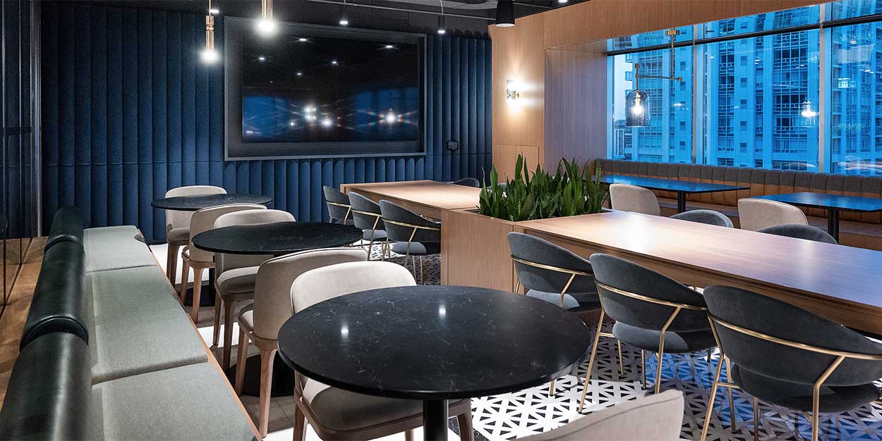
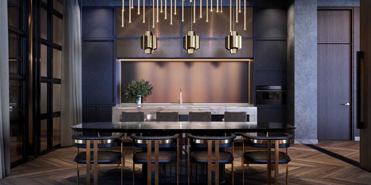
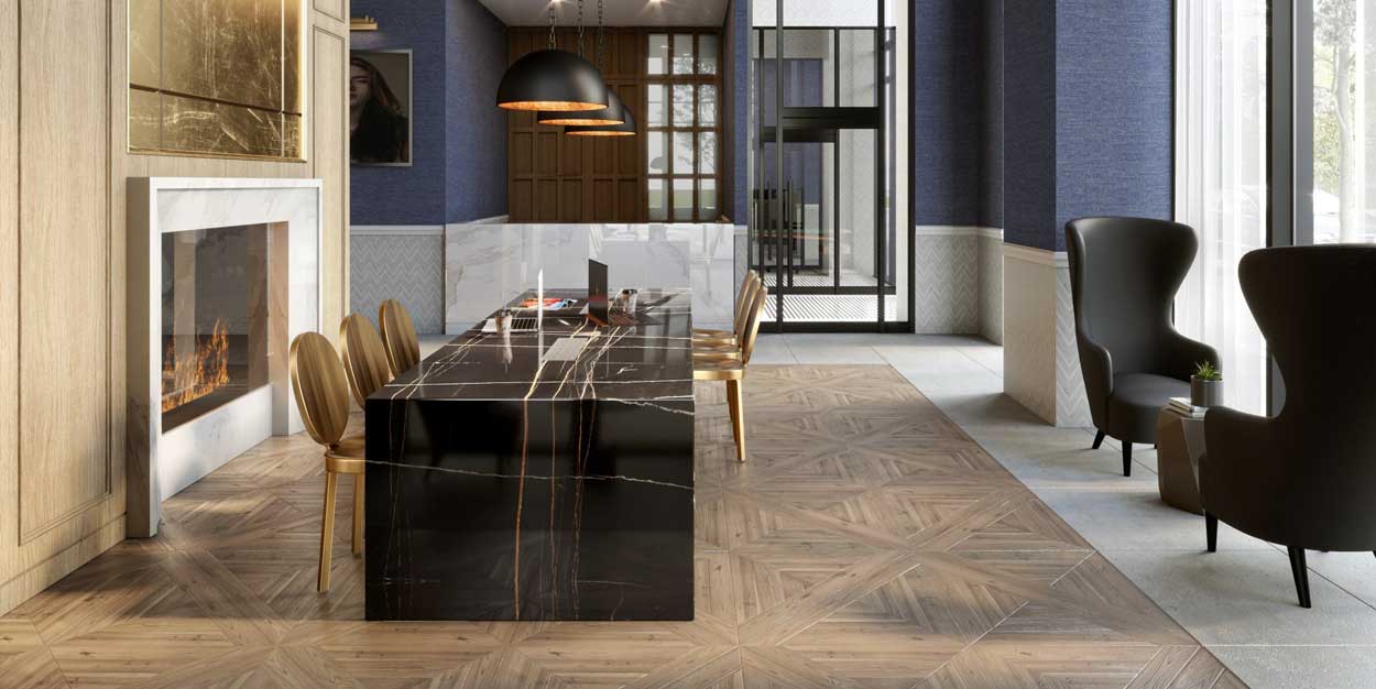
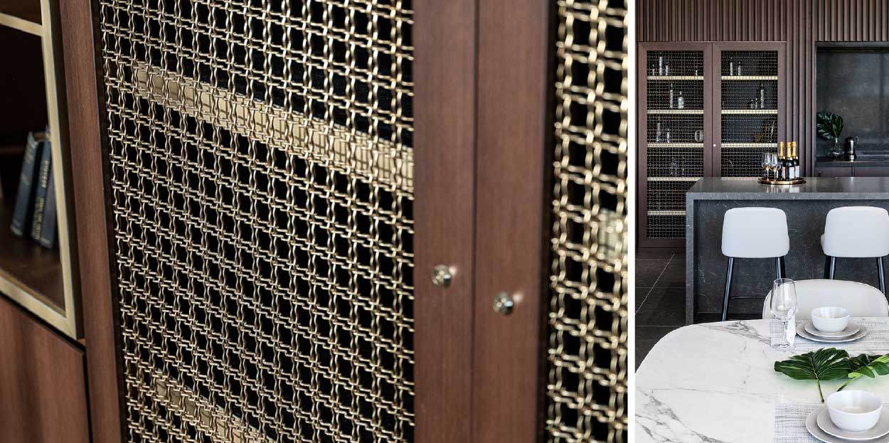
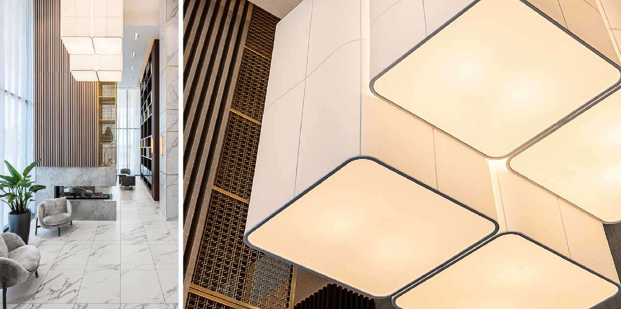
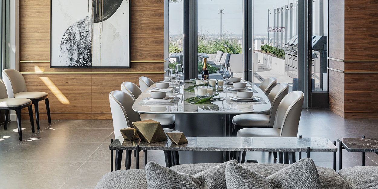
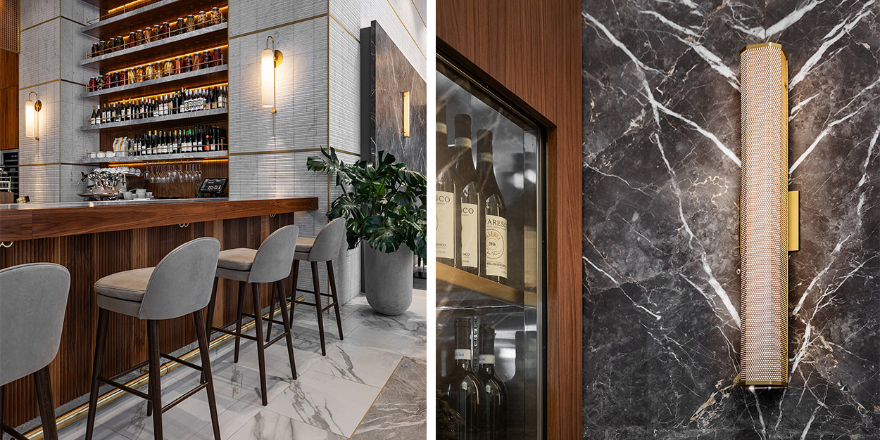
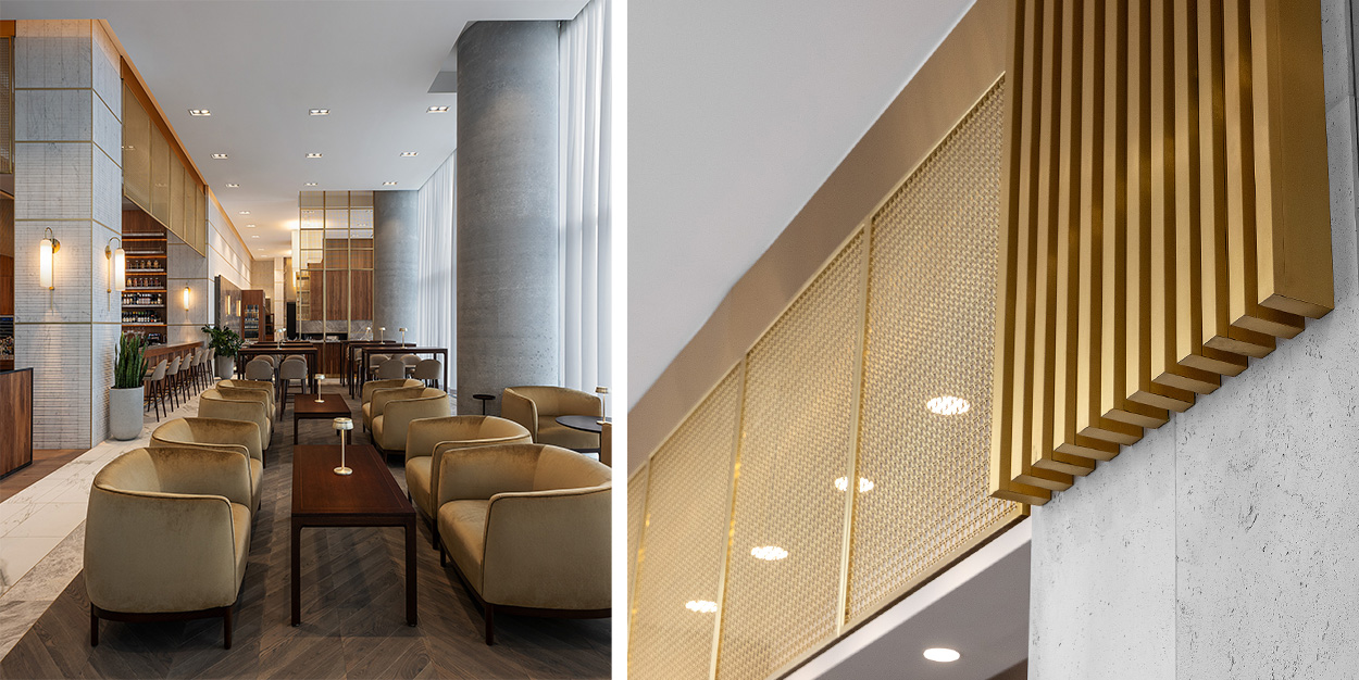
Inside BUCA Vaughan, the design ethos seamlessly blends with the condominium’s upscale aesthetic and the design language of existing BUCA locations. Organic materials, such as natural wood, create a tactile and visually stimulating ambiance, complimenting the open kitchen and chef table that resonates with BUCA’s culinary authenticity. The layout, carefully curated by Figure3, encourages exploration and discovery, with distinct zones for dining along one wall and a bar lounge environment along the other that flow effortlessly with each other.
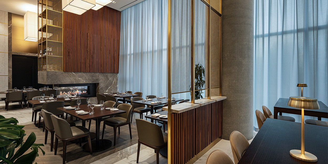
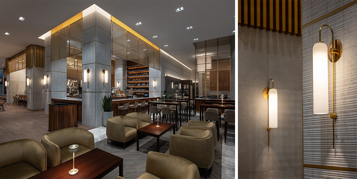
Residents can essentially have a glass of wine in the Buca lounge, directly connected to the condo lobby, or meet up with friends after work before going upstairs, it’s a play on romanticism that allowed the space to become a true extension of the living experience” states Dominic De Freitas,
Dominic De Freitas, Principal, Figure3.
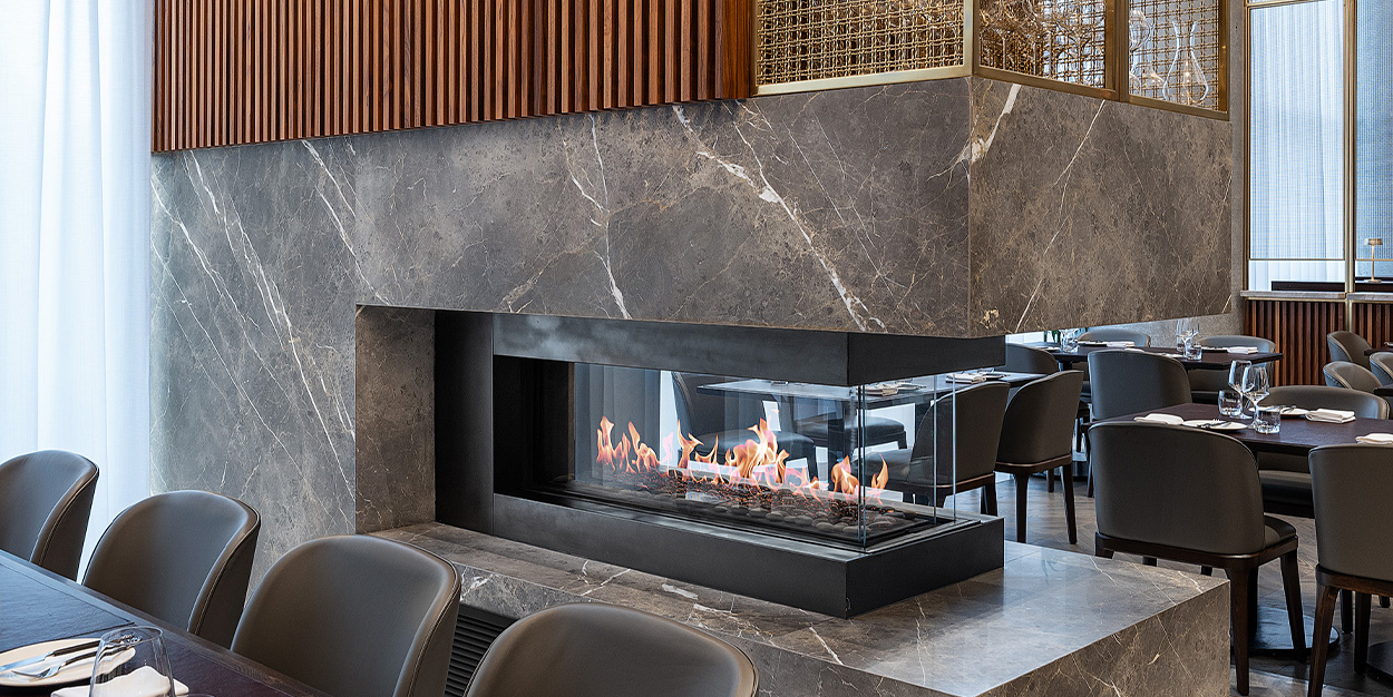
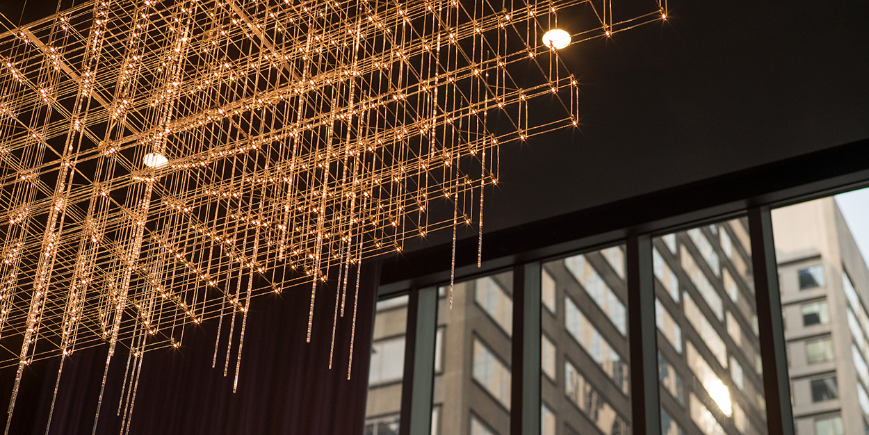
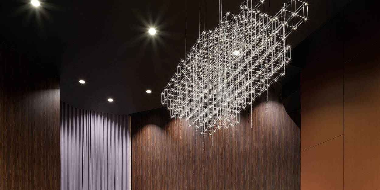
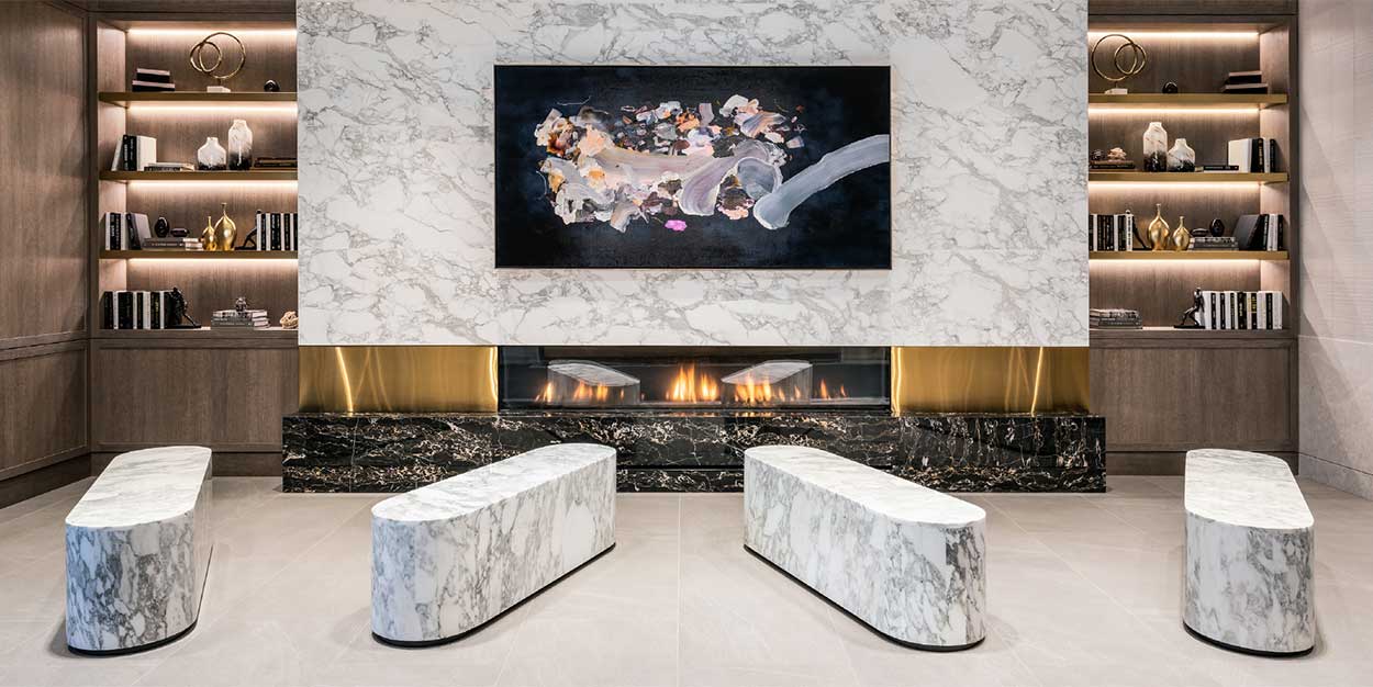
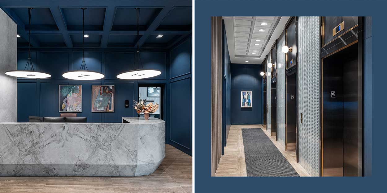
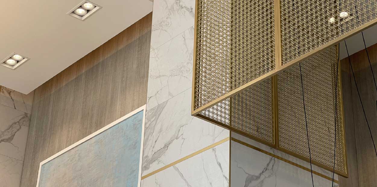
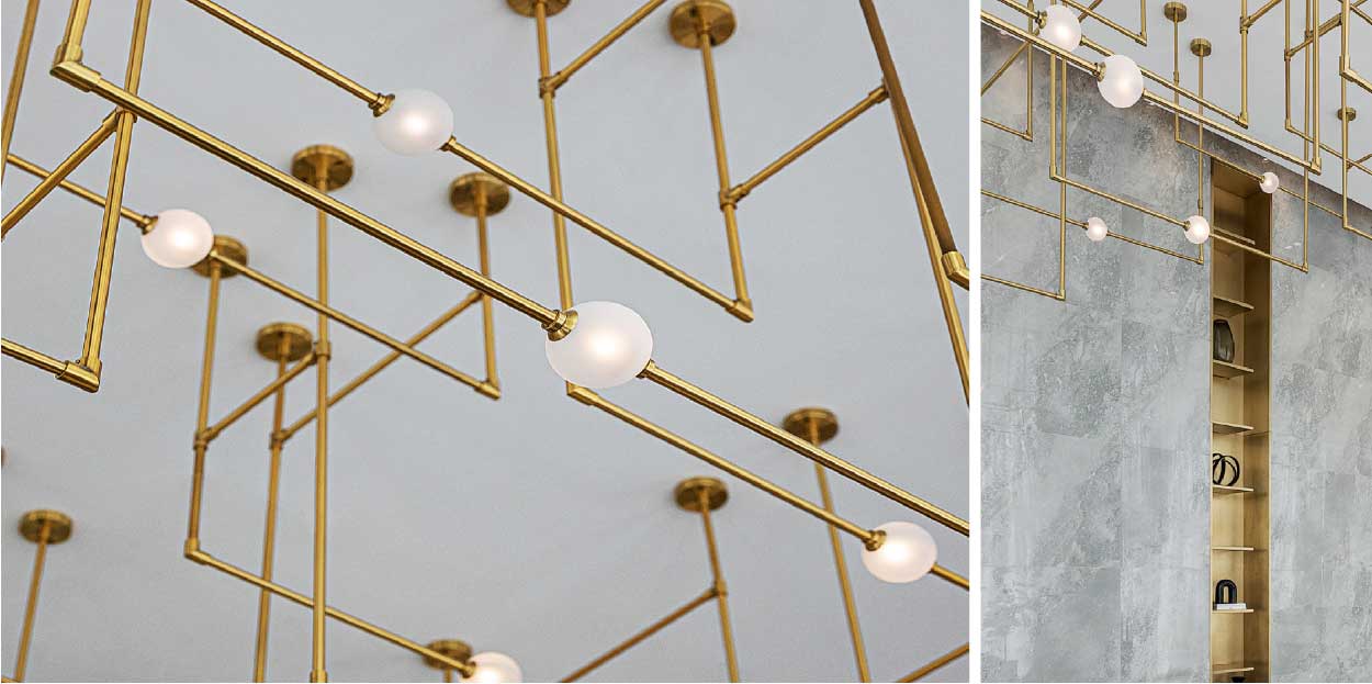
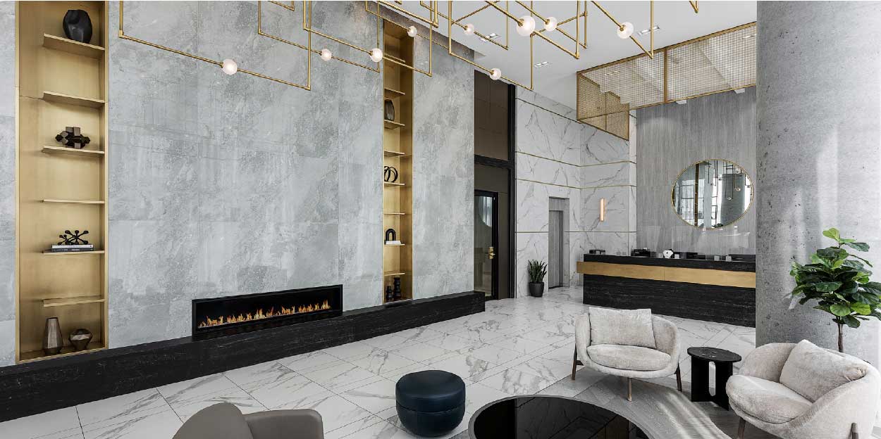
The restaurant’s interior design pays homage to BUCA’s culinary philosophy, promoting transparency, while elevating the space to complement the condominium’s upscale look and feel. Rich wood, dark veined marble, and brushed gold accents evoke a sense of refinement and sophistication, setting the stage for an unparalleled dining experience.
BUCA Vaughan’s success lies not only in its culinary excellence but also in its seamless integration within the residential fabric. By forging a more organic relationship between living spaces and culinary experiences, Figure3 has redefined the concept of luxury living in Vaughan. As patrons enter BUCA Vaughan, they are greeted not just by a restaurant but by a lifestyle destination that embodies the essence of contemporary living in this blossoming community.